|
|
This video shows a true insight into street photographers. It explores the reality of what street photography means and the dedication it takes to be one. Including street photographers: Bruce Davidson, Elliot Erwitt, Jill Freedman, Bruce Gilden, Joel Meyeorwixt, Rebecca Lepkoff, Mary Ellen Mark, Jeff Mermelstein, Clayton, Ricky Powell, Jemel Shabazz, Martha Cooper.
|
Mary EllenMary Ellen is an american photographer, known for her photojournalism, portraiture and advertising photography. Her work has been published and exhibited in galleries and museums worldwide. She has also been awarded with a number of accolades including Robert F Kennedy Journalism Award.
At the age of nine Ellen was regularly capturing her ideas with a box brownie camera and often enjoyed to paint and draw. She later received a BFA degree in painting and art history from the university Pennsylvania at the age of 22 and a Masters degree in photojournalism. The following year, she received a scholarship to photograph in Turkey and from then onwards travelled around the world taking photographs, some of her images marked important events such as the women's liberation movement. |
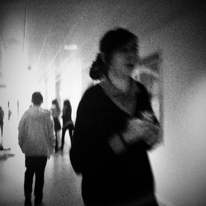
Here are a collection of some of my favourite images of Mary Ellen's. I love how her photographs really capture the reality of humans behavior and how they act in different environments. For example in the image where the woman is standing with a hat and bag, leaning into a mans hands, she pulls an interesting expression at the camera as if to say 'why are you taking a photo' This puzzled expression on her face really gives the image character as it adds to the sense of reality Mary Ellen is trying to perceive.
|
Evaluation of one of Mary Ellens photographs
|
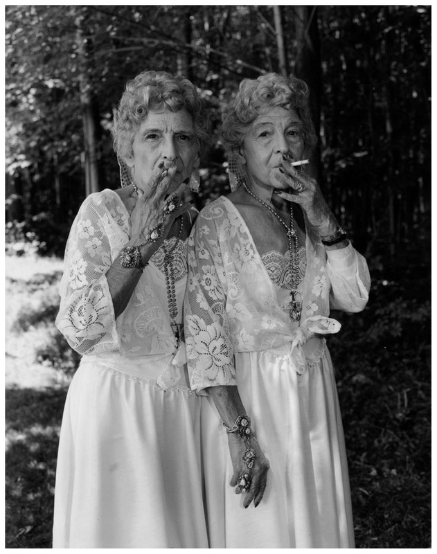
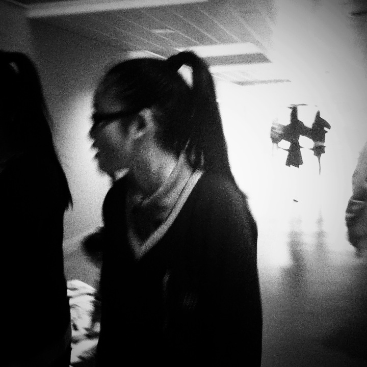
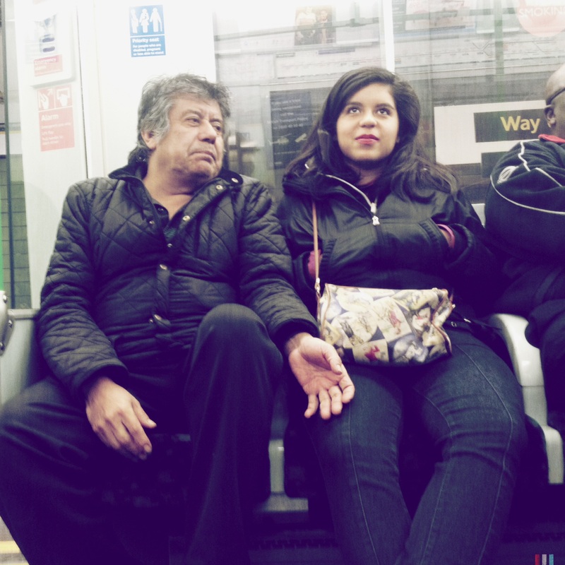
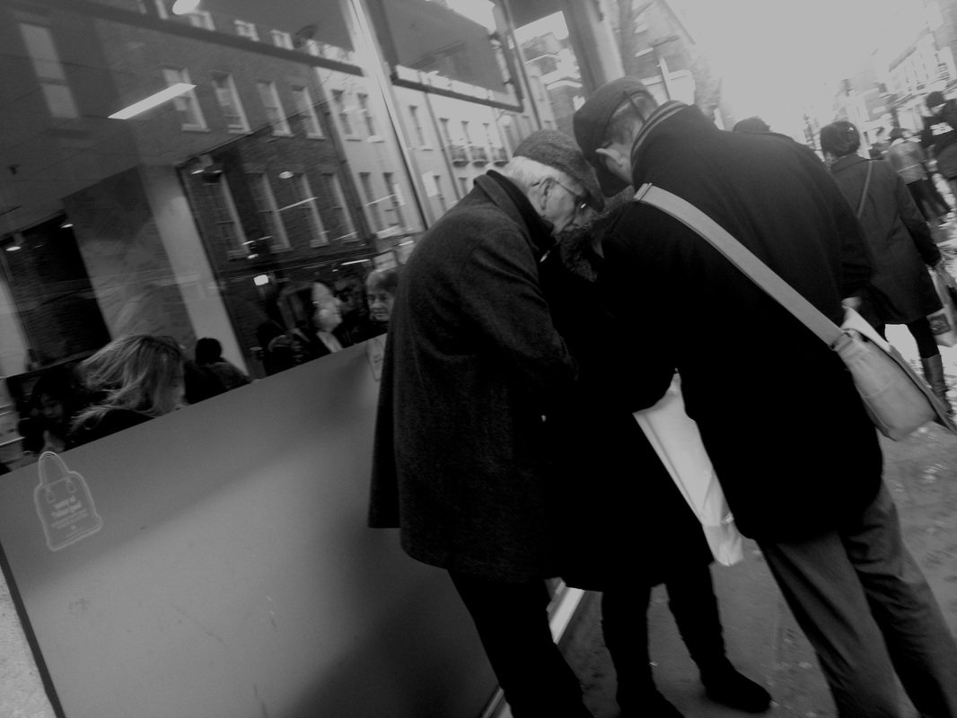
This is one of my favourite images by Mary Ellen. The two elderly, in focus figures are standing close, fixated to the camera, both holding cigarettes. They are dressed in white long gowns and seem to have many pieces of jewellery on them. Overall they look fairly over the top and seeing as the rest of the scene, which is out of focus seems quite ordinary we cant help but question what they are doing. Are they in a forest? Why are they wearing such extravagant clothing in an environment like that? Are they sisters? The subject of this image is quite poignant as the whole idea of two elderly woman dressed in elaborate clothing, wearing lots of jewellery, smoking together, looking very content, contrasts with the stereotypical idea many people have of older woman. Although this stereotypical idea is wrong many people still perceive old woman as being less interesting than younger people as there is a huge emphasis on youth in society. This photo in some ways adresses this issue because of the way they are asserting themselves. There clothes make them stand out and there is no chance of this couple being invisible or fading into the background which contributes to the idea of older woman in society being able to express themselves. The woman are confronting the camera and clearly aren't shying away. The photographer has put emphasis on this, as the camera has been put on a certain exposure so that we can clearly see there faces and emotion. This is the same with the dresses as they are also clearly in focus and they are made prodominant in the image. The contrast in this image is another element that really makes the woman stand out, although there is contrast in the background because it is out of focus we are more drawn in to the contrast on the foreground.
|
My First Set Of Photos
After exploring into many street photographers work I thought it was time for me to take some of my own images, using influences from other photographers. Overall I took 41 images, using a digital SLR camera. Although I regret not using an iPod, as the images on them usually come out higher in contrast, I'm quite pleased with the outcome of my images as I have made them look like they have not been set up and just taken in the moment instead of directing people in the image which would make it a lot more fake and wouldn't capture the moment as well.
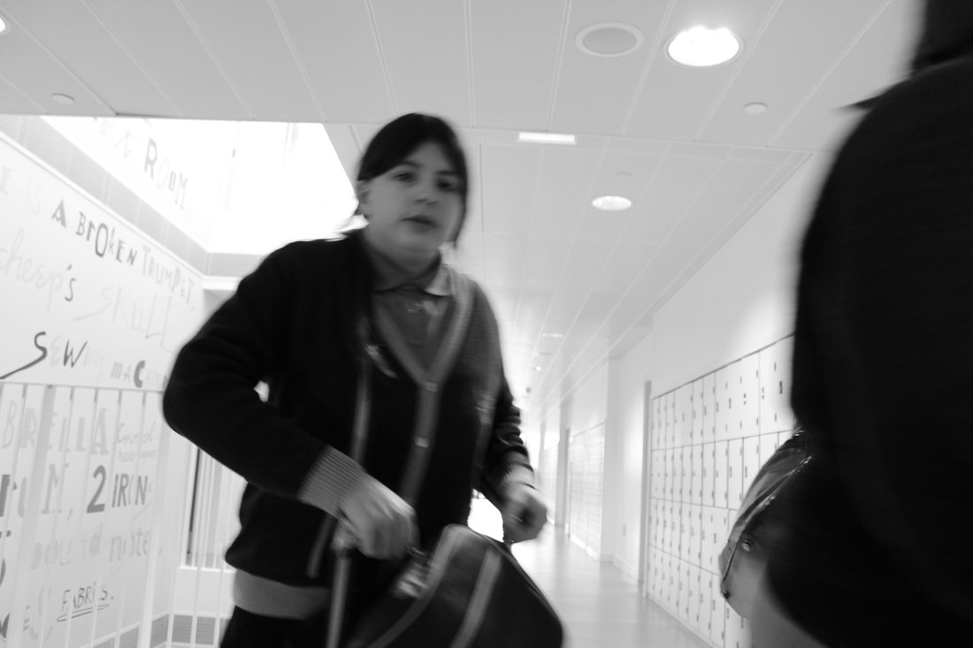
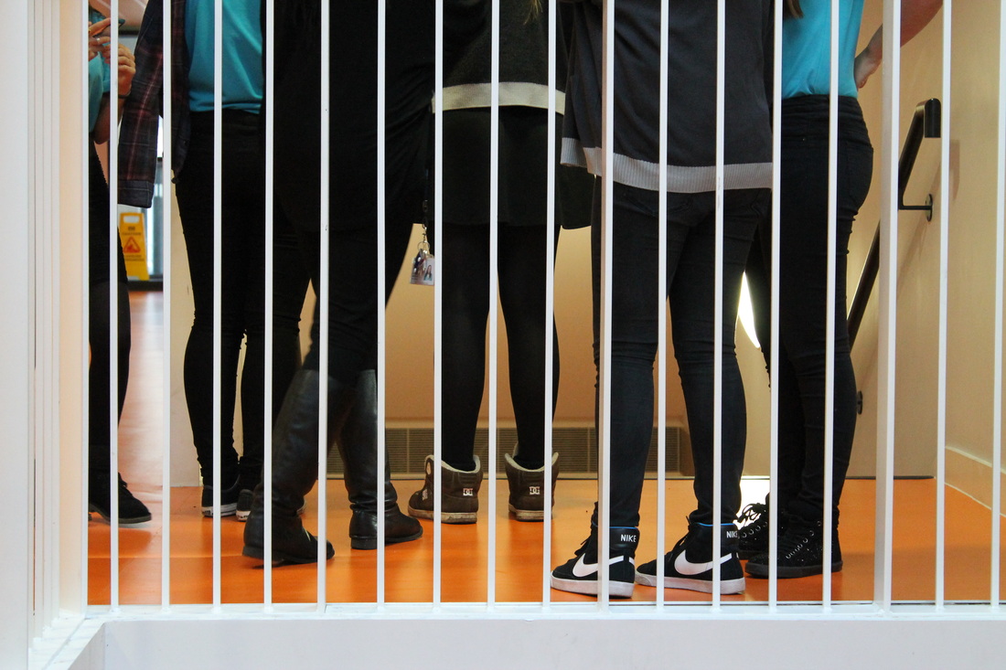

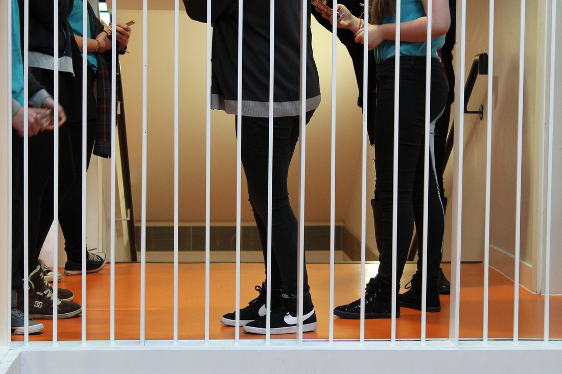

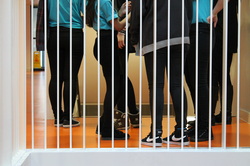
This is my favourite image I have taken mainly because of the fact that it has good composition and contrast which leads the image on further to be a lot more vibrant and captivating to the eye that some of my images did not have. I thought a lot about angles in this image and decided to take the image from about waist downwards as it would capture the movment of the legs and the way people stand which I thought was very interesting. This image also has a lot of character as we get the feel for people through the gestures or stances they are making, whether it somebody communicating with somebody or somebody pointing to one or another. The contrast in the image adds to the different layers of depth as there is a clear distinction between the orange, blacks, blues and whites. I took this image so that it had quite a shallow depth of field as I wanted the image to be quite flat, the reason for this was because I wanted the image to be quite simplistic in the way that we can clearly distinguish each figure seperatley from one and other.
|

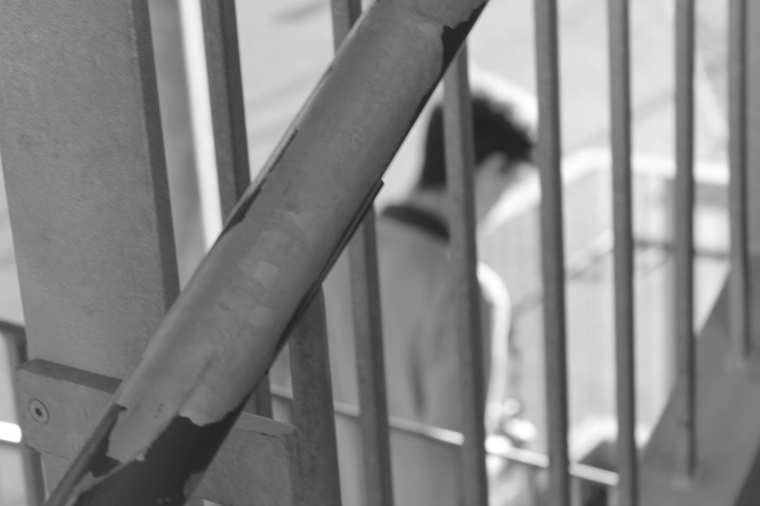
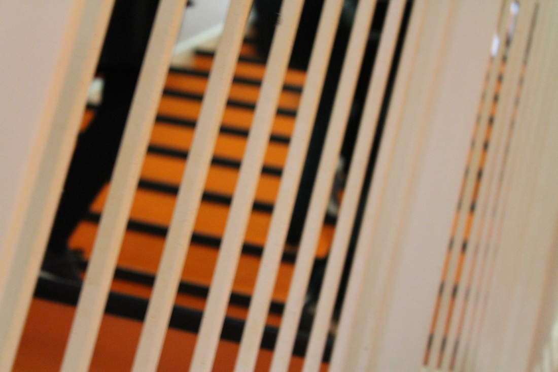
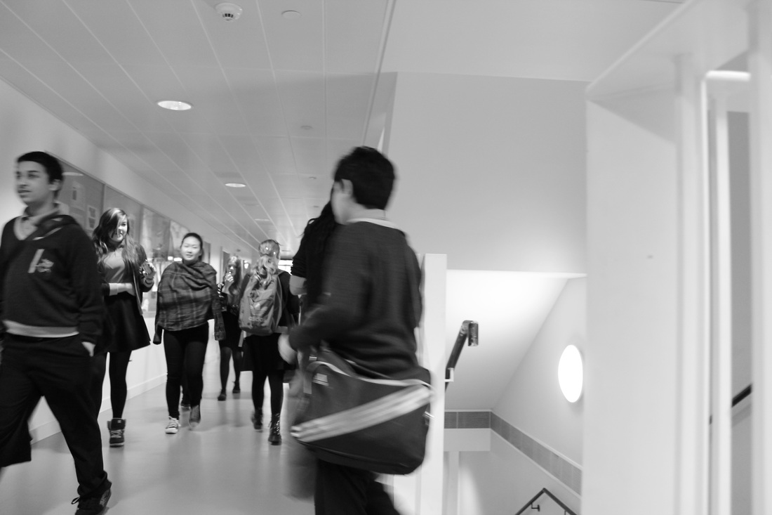
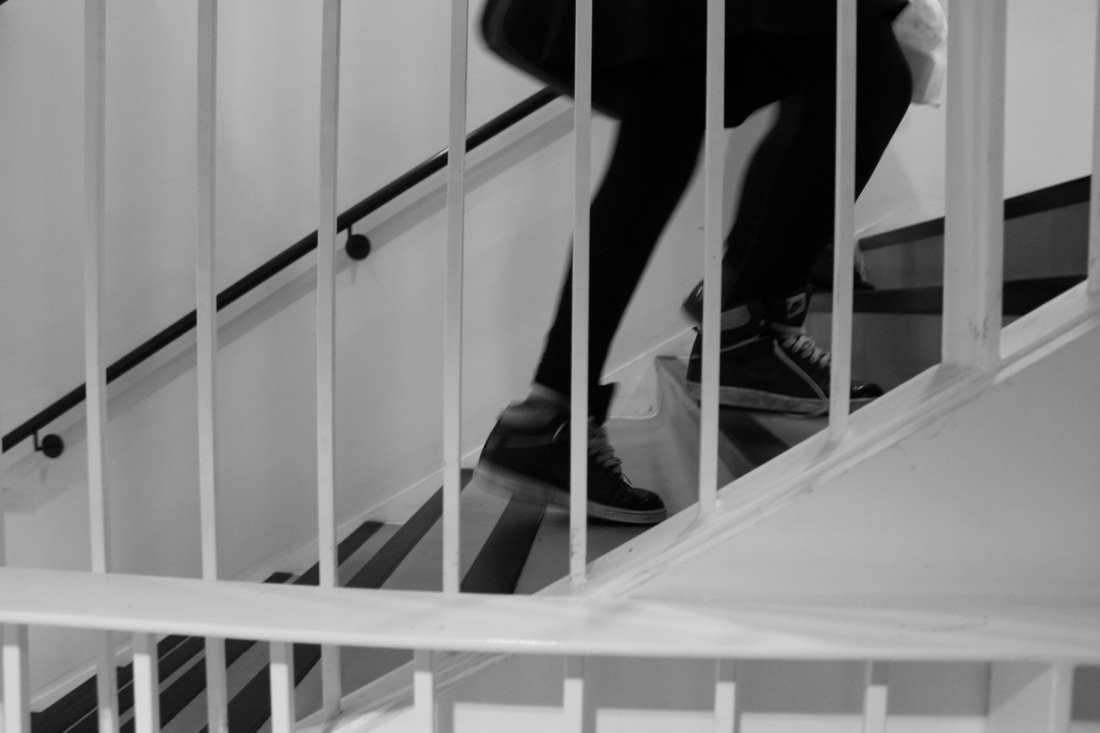
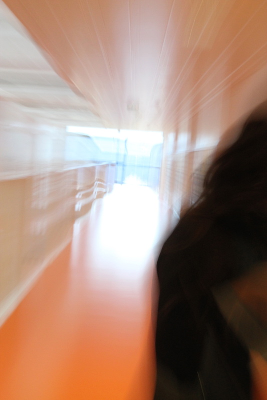
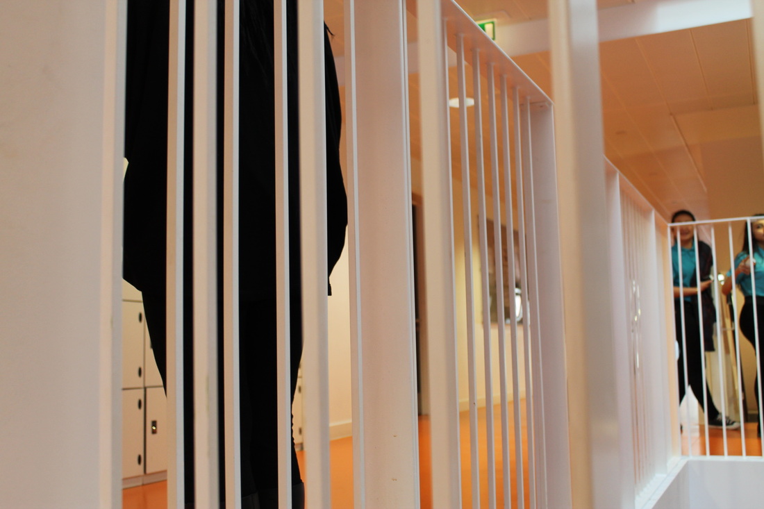
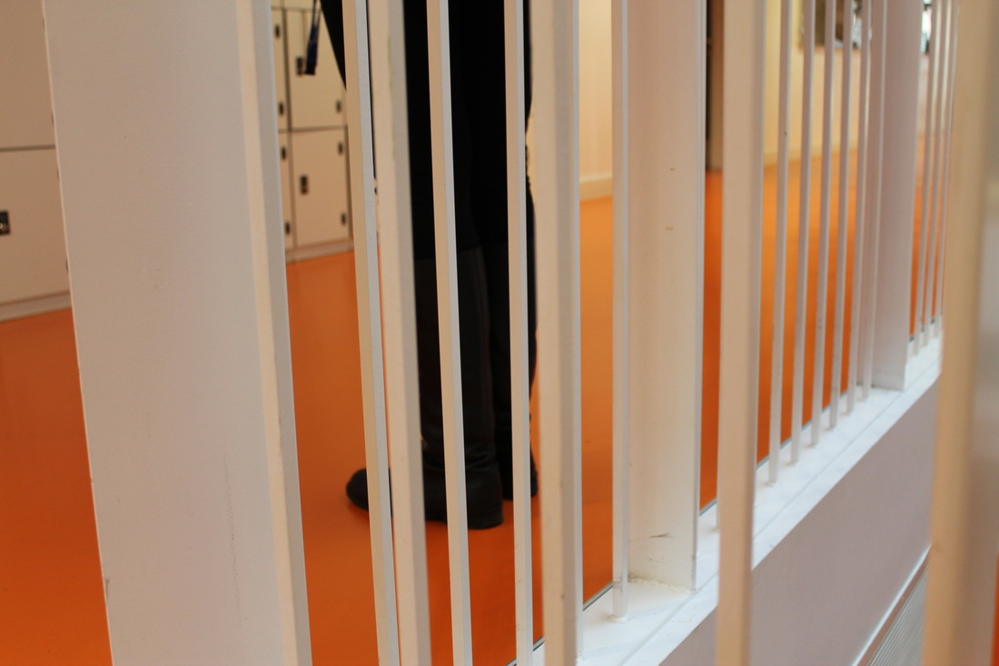
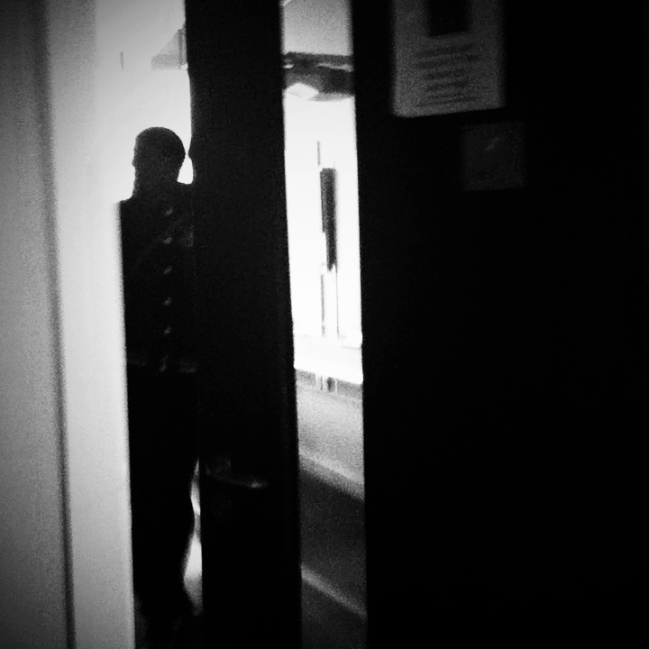
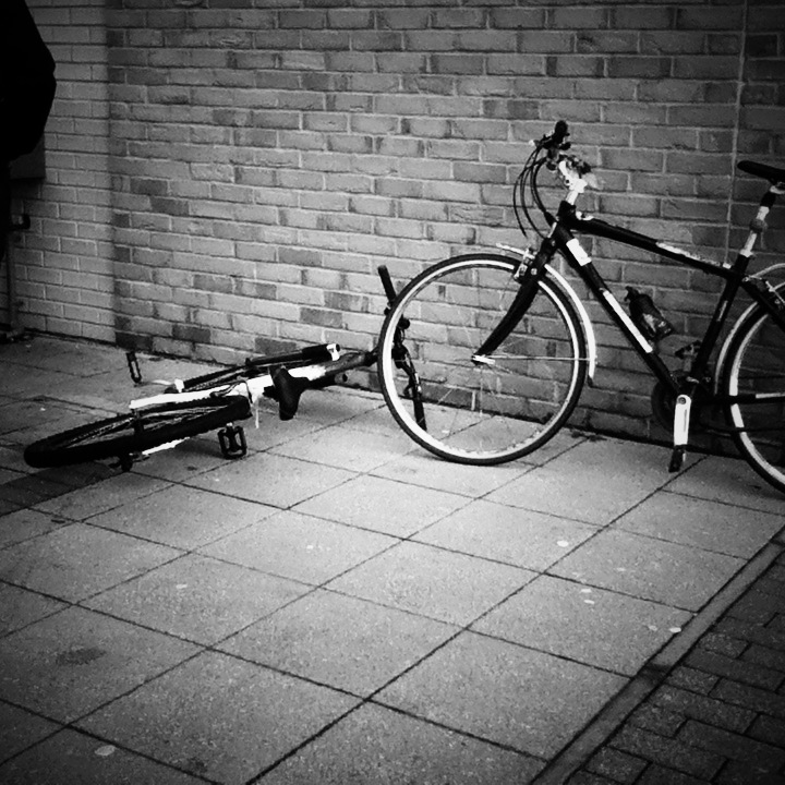
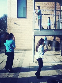
This was my least favourite image, mainly because of the fact that the figure is not in line with the parellel staircase. This would be fine if I was aiming for a busy, more chaotic image however I was not in this case. Another factor that contributes to the failure of this image is the depth of field. I wanted a vast depth of field so that the viewer could look right into the image however the exposure is too high which results in a white effect. I think that possibly if I cropped the image so that you could just see the figure and the doors this image would be more successful as it is mainly the unbalanced composition thats makes this image unsuccessful. Also there is a vast amount of negative space which in this case makes the image quite boring. Also in the top left hand corner the image is very busy however not in line with the banister on the right which distracts the viewer from the reflection and contrast in the top left.
|
CroppingCropping is a way for street photographers to capture odd details in image. Cropping also draws you in more to an image as cropped images reveal features of the image you may not have noticed if the image hadn't been cropped. Street photographers main goal generally is to capture the reality of a place and to make it surreal, cropping contributes to this goal as it is a step closer to reality
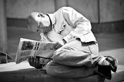
This is one of my favourite examples by a photographer called Benjamin Green. I find this image quite surreal as the position of the man reading the newspaper is quite awkward which is the overall feel of the whole image. Although the angle is very close up the composition of the whole image is in line and reflects how discreet the photographer was being as the man looks peaceful and content. By cropping the image we look closer into what the man is doing however if it was taken at a wider angle we would dismiss the man in the image and view the photograph in a totally different way.
|
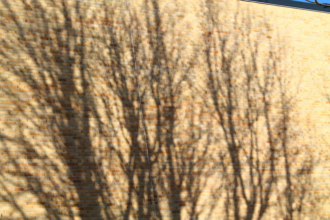
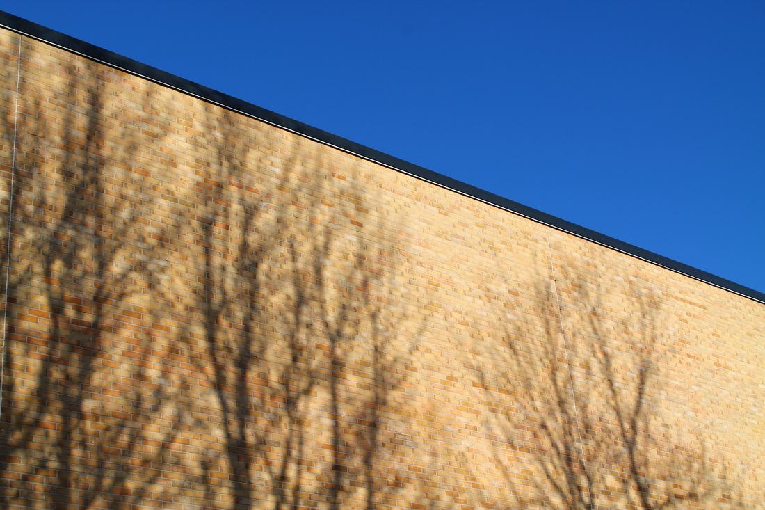
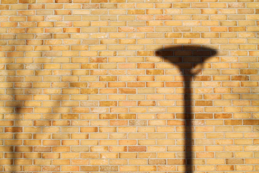
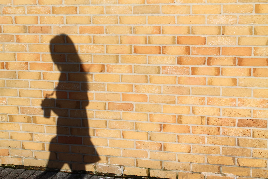
ShadowsStreet photographers tend to capture some sort of shadow in their images as it usually gives the image more depth and tone. It gives the image depth due to the reflection that bounces of the glass or object. Shadows are also quite surreal as its just a reflection of something rather than something real, meaning you can take an image of a shadow and not quite know what it is. In terms of tone, shadows come in different tones in terms of the lighting, the most gripping images of shadows include strong contrasts of the shadow against the background. Shadows also indicate a time of day.
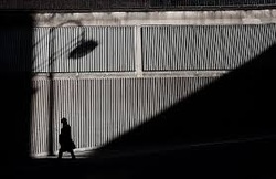
This is another good example of shadows used in street photography. This image, by Steve Jensen shows how surreal shadows can be in an image. When I look at this photo I am quick to question it because its not realistic in many ways. Instead of an actual man walking past and an actual lampost standing there, there is a shadow of it. The beauty of shadows are that they don't reveal all of the object or person, instead they give a faint outline which makes the image a whole lot more mysterious.
|
Photo Challenge: Cropping
|
|
I then took 10 images on school site using an iPod, focussing on the idea of cropping. I looked into cropping and thought it was very interesting how certain photographers like to capture moments within the moment because already you are capturing a secondth of a moment but to look even deeper into something the image becomes more specific.
Overall I'm not pleased with the outcome of my images. Although I'm pleased with a couple of individual images I think as a collection they do not represent cropping. Instead I have taken images based on shadows as I got distracted by the reflection on the window. Also, the composition of most of the images do not work well with the elements in the image. Next time a take another collection of images I'm going to focus more on composition as it is one of the most important elements in an image and in this collection the composition has not worked. |
Photo Challenge: Reflections and shadows
|
|
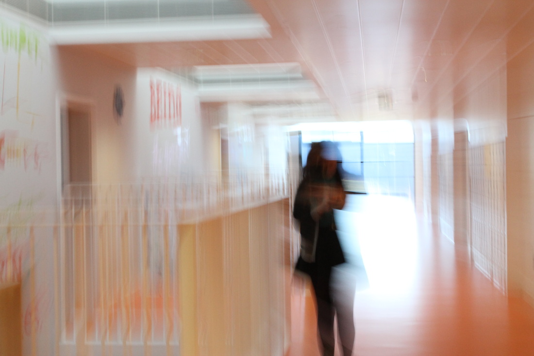
Our task was to take 10 images with the theme of shadow and reflection. Although I had touched on this theme in my last collection of images this time I really thought about what I was going to take and spent longer on the composition and angle. I concentrated most on capturing what I saw through windows as they gave off quite a surreal reflection that gave the image depth. I also made sure I took most of the images on a monochrome effect as they come out higher in contrast with makes the outline of the shadow more prominent. However I do like the fact that one of my images stands out as it is in a different colour to the others, this makes the images more interesting to view as a collection rather than as an individual image. Although there wasn't much time to think about composition as I wanted the images to be 'taken in the moment' I still made sure the images were roughly in line however the tones in the image and slightly off angles are common in street photography.
|
Second Set Of Street Photography Images
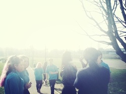
For our next task we were allowed to explore more around the school and into some classrooms to really capture some good street photography looking images-ones that are taken in the moment and not thought about too hard. which I learnt from watching part of the 'Everybody Street' film. This I thought was quite challenging as I was thinking to much about if my images were original or not, this made me hesitate at good photo opportunities. I kept wondering to myself if the photo I had taken/taking is not interesting enough-which was a constant worry, or has been done before. This all resulted in some decent photo's however I strongly believe I would have done a better job if I wasn't over-thinking everything. In able to get over this I am going to just take more photographs so I can get used to not thinking about it.
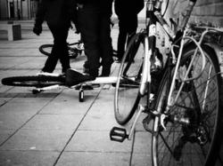
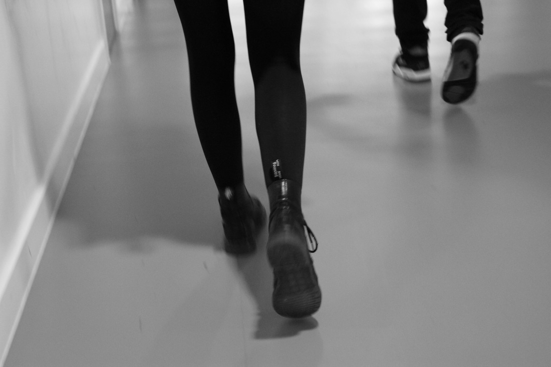
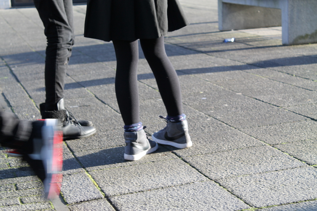
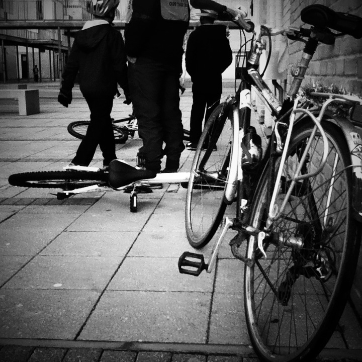
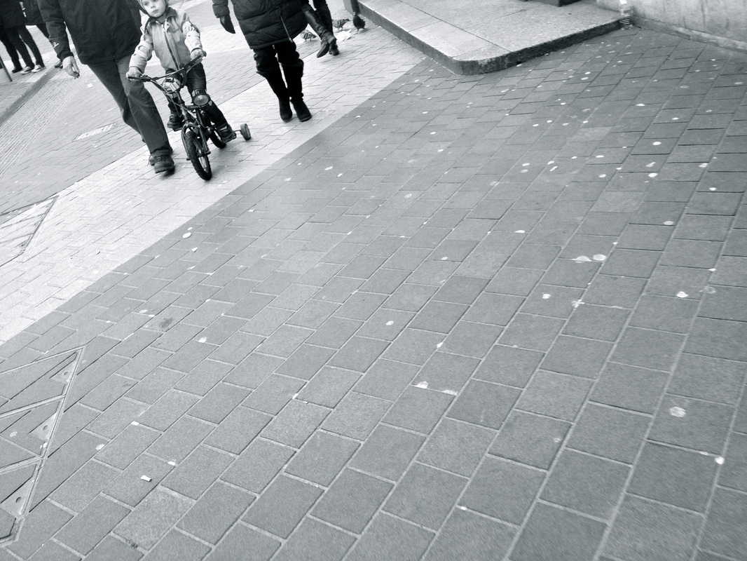
This is my favourite image I took for a couple of reasons. First being the composition, The image is in line with the concrete flooring with brings the viewer in further to look at the lines and onto the main subjects with are the people standing. We see an outline of the figures almost like a silhouette due to the high amount of contrast, not only does this contrast make the figures stand out but it adds to the varied tone in the image as the bike and other elements have more grey tones. There is also a very wide depth of field as we have a bike in the foreground which sort of dominates the image, then the figures, then in the background with its almost infinite depth of field which furthermore gives the image more mystery as the right the image fades out into just white fog which gives the image yet more contrast. I also like the fact that there are some subjects in focus and others not for example the bike against the brick wall and the figures against the white background. I also like the fact that we can't totally see the figures faces, all we know is that they could have been using the bikes are now on a break or resting from there journey, however they are not still and we see some movement of the legs which overall lifts the image as it gives it life.
My Third Set Of Photos
I then took another set of images however not on school grounds, instead we had the freedom to be independent and take some wherever we wanted. Although this was a positive thing-because we could capture moments in more busier and different environments other than the school, it was still quite hard to have the courage to go right into peoples faces however once I took a couple of images I gradually got used to do this, and the result were some quite successful images. I started to really enjoy taking images especially ones that captured human behavior which hopefully comes across in the images below.

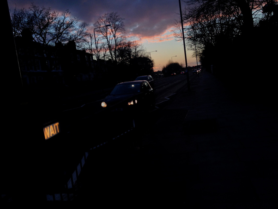
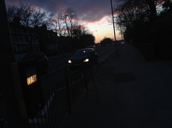
This was one of my favourite images as it it conveys mixed emotions because its quite surreal. I took this photo at a time when the sun was beginning to set and I though the colours were really beautiful, I was going to take an image just of the sky however I quickly questioned myself if that would be a dull image, I stepped back further and realised the fluorescent word 'wait' was so exposed to I adjusted my angle so that the image was darker so that the colours in the sky and the 'wait' sign would be predominant in the image. The composition of this image is also successful as it has been taken at a slight tilted angle which creates a diagonal line where the car and the fluorescent writing is, it also makes it more realistic and adds to the life in the photograph. I think the meaning behind this image is quite interesting as the car that looks moving is behind the 'wait' so there is a contrast. Although there is a lot of black present in the image I think it works because of the harmonious colours in the sky at the top which really lifts the image altogether also there is a contrast between the organic trees and the electronically powered 'wait' sign. I like this image to be shown as a collection with the other one as they show a darker more mysterious side to a street crossing, also I like the fact how the image is suteley quite busier as there are obviously many cars on the roads that have been blacked out.
Triangles
|
Triangles is a compositional technique used in street photography, mainly for the purposes of adding balance and movement to your image. Although when capturing an image the photographer does not always strictly use triangles to outline composition, the photographer does usually end up creating an image with these three points to create a triangle because its a type of layout that drawers people in, making it a successful image.
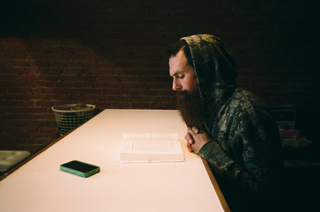
This image, taken by street photographer Eric Kim has an outline of a triangle; the bin, the man's head and the mobile phone/book. This compositional technique brings this image to life as the elements in the image are clearly laid out which makes this image simplistic but not boring which draws the viewer in closer because of the triangle. Furthermore when looking closer into the image we recognise more than one triangle which again adds to the arrangement and therefore success of this image.
Triangles in my images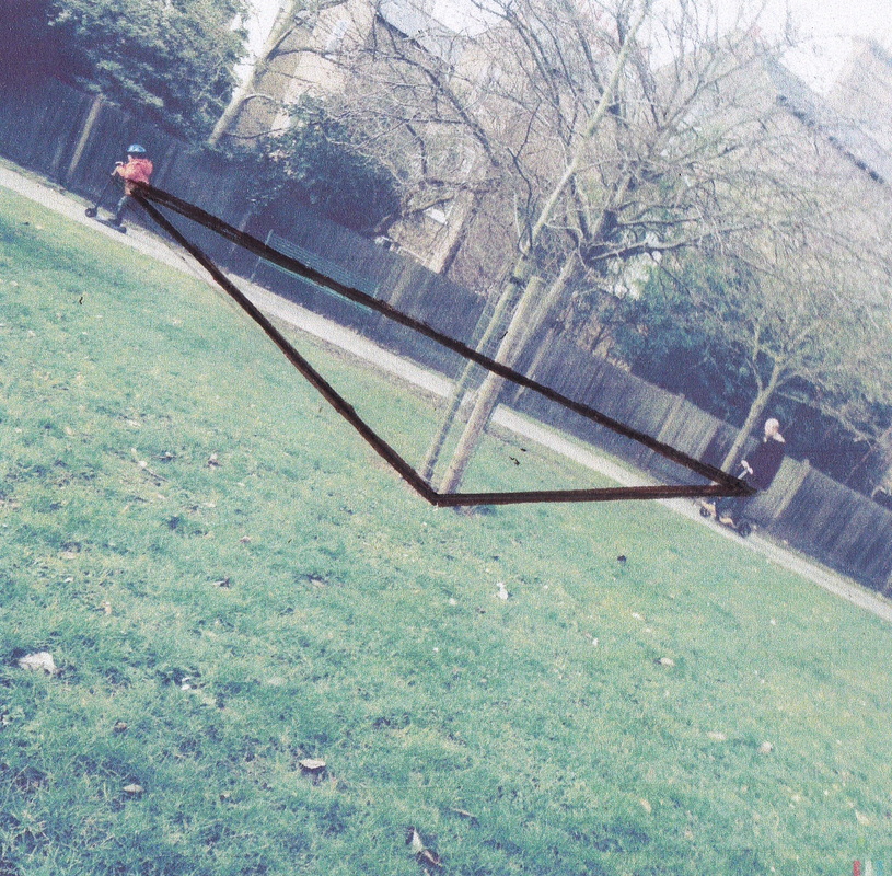
Here is my image clearly marked out showing the triangle
|
Here are some example that clearly demonstrate this compositional technique.
Triangles in my images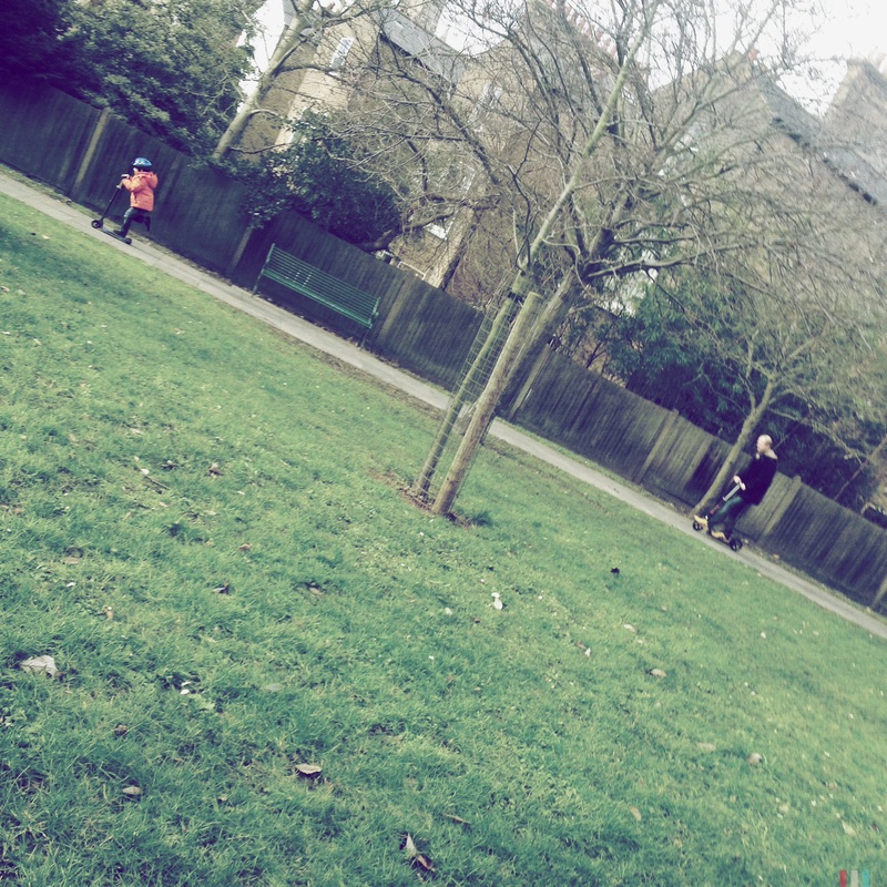
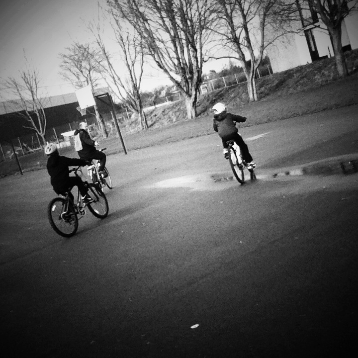
This is one of my own images that clearly illustrates this composition technique, triangles. The young figure scooting away forms a triangle with the other figure and the tree that sits in the centre of the image. Without this triangle arrangement and elements being where they are, the composition would not be balanced which would make this image less interesting as the success of this image is all due to the central composition.
|
DIAGONALS
|
Diagonals are another compositional technique which helps to streamline an image. It can can make the image more linear and overall help balance out the image to make it more spaced out and evenly composed.
Diagonals in my own images 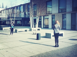
This is an image I have taken in school grounds which clearly represents the technique of diagonals. There is a strong diagonal line from the closer figure in the foreground, to the other figure further in the back of the image. The shadows are also diagonals which adds to the sense of surrealism in this image and also the reflections in the windows add to this too.
|
Here are some examples which clearly mark out the compositional technique of diagonals.
My Own Images |
Walk On By
|
|
Walk on by is a good way to capture a wider frame of somebody walking. These sorts of images usually show movement as the figure is sometimes blurred. After looking at some 'Walk on by' images I decided to take some of my own. I did some where the figures would be blur and the background would be clear to create a contrast against the two.
|
Surfaces
RULE OF THIRDS
Rule of thirds is another compositional technique which helps for an image to have a good sense of line and direction. The basic principle behind this rule would be to image cutting an image into thirds both horizontally and vertically so that there are 9 parts. When taking an image with this in mind you consider placing elements in your images in a more thought out way so that parts of your image can stand out, and others do not have too. The overall purpose of this technique is for your images to become more balanced and therefore more interesting for the viewer.
|
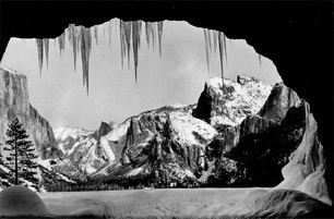
This is an image by Ansel Adams which is a good example that shows the rule of thirds. In the foreground we have what looks like a smooth but bumpy rock which fills the bottom part of the image. As we move up the image, and more into the centre there is a large amount of rock and mountain which fills the centre of the image and second half. The top of the image, which contrasts with the rest of the image fills the top with a dark black colour. These are the three parts of the image that makes up the Rule Of Thirds.
|
|
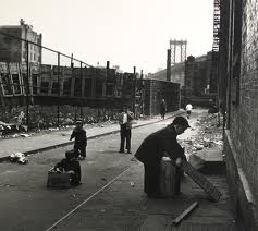
This is in image photographed by Rebecca Lepkoff, a street photographer who featured in the 'Everybody Street' documentary. This image clearly marks out three thirds as there are three figures, all in different sizes. This composition creates this image to be more balanced and less overcrowded. If the figures were to be standing closer together we would not be able to see there actions and gestures however because they have been separated, using the rule of thirds, we get a more in depth understanding of what they are doing, how they are doing it and we can start to question why are they doing it?
|
|
Photo Challenge: Rule Of Thirds
This was my least successful image as although I used the Rule of Thirds to help outline the composition I feel like its quite busy however not in the right way as the light is overexposed which therefore fades out the whole image. If I were to use the rule of thirds more intentitively I would crop some of the image out so that it would create a balanced and clear image. I would also darken the image totally so that the subjects would remain clear.
|
This is my most successful image. In order to produce this image I used the Rule of thirds outline in my head to create this even but busy composition. I love the way there are layers of people walking, some on the top of the image, and others on the bottom. There is also a contrast of more linear lines, from the metal poles and also the lines that outline the figures. This overall makes the image more textural as the different figures create different layers which therefore create more depth.
|
Fourth Set Of Images
|
|
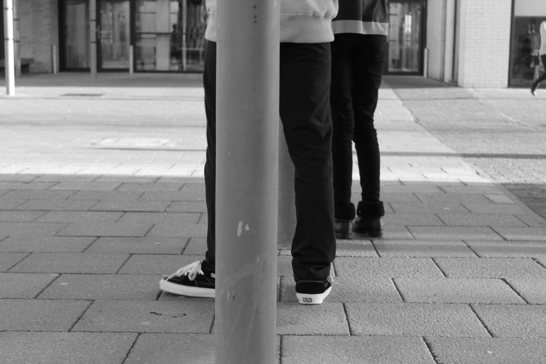
After taking my own images, using this compositional technique it made me think more about how I layout my images and how the composition really holds the image together. I focussed on a good sense of line, especially horizontal lines. Many of the images I have taken feature people in them so it was important to either have their heads in line vertically or horizontally with the rest of the image so that it creates a balanced display. I especially liked using the vertical metal poles in my image as a guide for the rest of the photograph. The lines guide the viewer up or down onto the main subject which overall gives the image a good depth of field,
|
After taking my own images, using this compositional technique it made me think more about how I layout my images and how the composition really holds the image together. I focussed on a good sense of line, especially horizontal lines. Many of the images I have taken feature people in them so it was important to either have their heads in line vertically or horizontally with the rest of the image so that it creates a balanced display. I especially liked using the vertical metal poles in my image as a guide for the rest of the photograph. The lines guide the viewer up or down onto the main subject which overall gives the image a good depth of field.
Compare and contrast
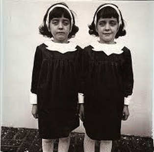
Diana Arbus, Identical Twins, Roselle, New Jersey, 1967.
|
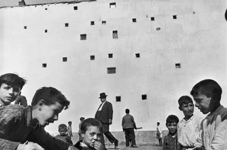
Henry Cartier Bresson. |
Similarities
Both of these images are in black and white and feature more than one person. They both include people, some of which are facing the camera and pulling expressions that could convey mixed emotions, which contrasts with the rest of the surrounding image which is either spacious or blank. The main focus on these images are human behavior. They both include children which in some respects makes the image more playful and free but also disciplined. Although there is a variety of tone in both of these images are is also a strong contrast between the foreground and background colours for example the figures in the images are mostly darker than the background and more pale wall behind them. This makes the image quite flat as it has little depth of field. If we look even deeper into the image I notice that in both images there is a small strip of ground or pavement. Because of this small strip we get the impression that the photographers focal point was the people and whats going on above them, rather than the photographer taking a more wide angled shot which would capture everything going on. This overall makes the image more precise and realistic.
Differences
Despite the fact both of these images feature children, they capture two very different sides of childhood. Whilst Diana Arbus focusses more on the disciplined and more rigid side of childhood Henry Cartier Bresson captures something which is more free and in some ways more realistic. In terms of tone, although both images are in black and white and feature some similar tone the image of the two twins is darker and therefore more mysterious whereas Henry Cartier Bresson;s image is more paler which could reflect his intention of the image being less mysterious and more open as it is in a vast space. Furthermore the image of the two twins seems more intense as the photographer has looked closely into two peoples emotions and feelings rather than a whole bunch of people which makes the image more personal.
Photo Challenge: Rule Of Thirds 2
|
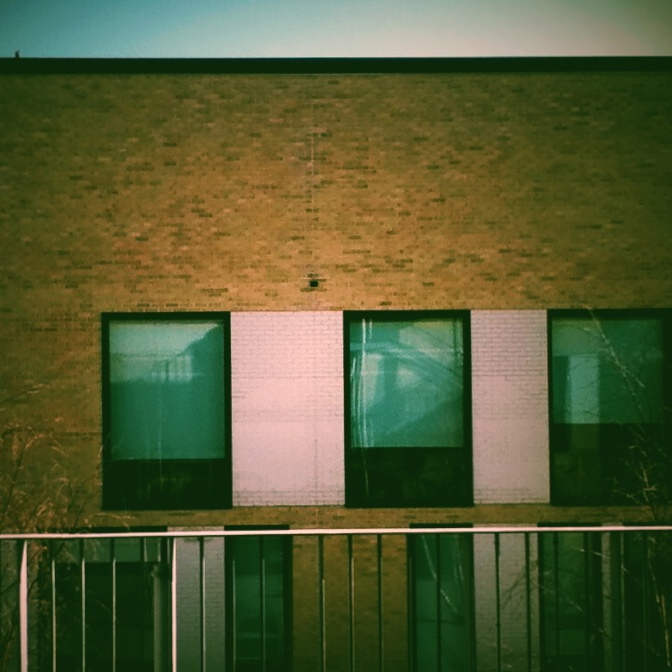
This image also doesn't show the rule of thirds as all the windows are placed in a significant way so they are all the same.
|
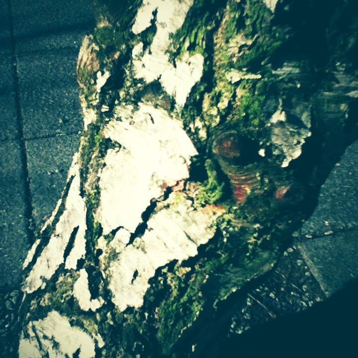
I decided to take an image of this bark of a tree close up so that I didn't get much negative space which would divide the image into parts. However this image did not work out too well as the quality of the camera lens wasn't too good which meant I could not zoom in close enough
|
|
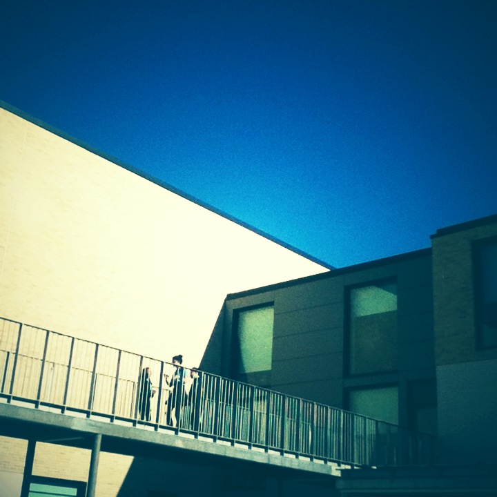
There is no rule of thirds in this image as there is no definite line which would distinguish the three sections. This is mostly due to the angle that the photo has been taken
|
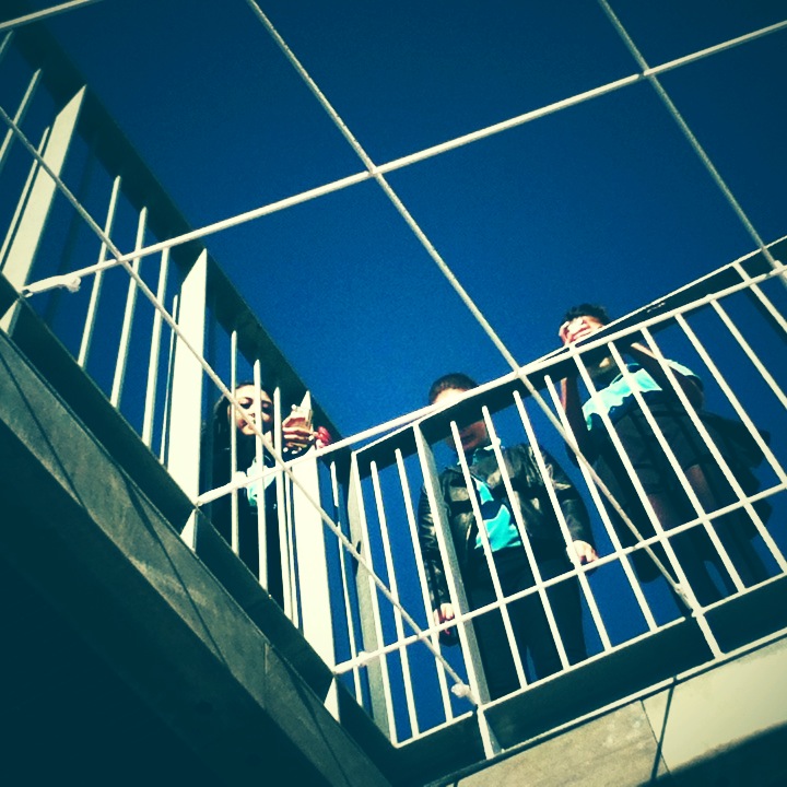
Similar to the image taken on the links, this image is also confusing to the viewer as there are many lines overlapping the three figures placed roughly in this image. This adds to the mystery of the image as the peoples facial expressions aren't quite being revealed which could suggest this image is mysterious. Also because the figures are placed roughly in the image we can not split it into two parts because of the arrangement of them on top of the diagonal lines flowing in the image.
|
|
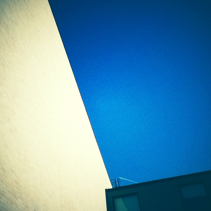
This image also doesn't show the rule of thirds as there are many lines going on in this image, all flowing in different directions. There is also a lot of open blue space which can not be divided into thirds as there is nothing to divide it by. I like this image however even though I have used an obscure compositional technique as it is quite minimalistic.
|
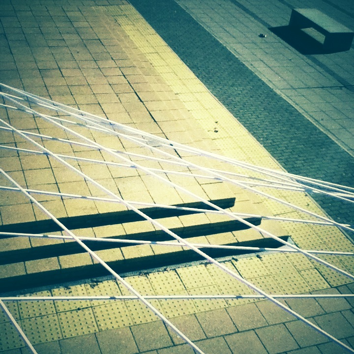
This image also doesn't show the compositional technique of the rule of thirds as the white string installation is overlapped on to of the concrete stairs. This further distorts the image as the elements in the image are not balanced.
|
My Final 4 Images

|
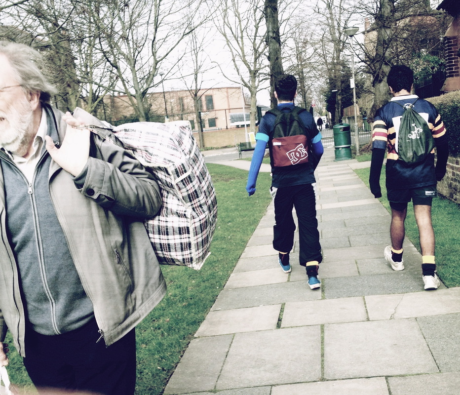
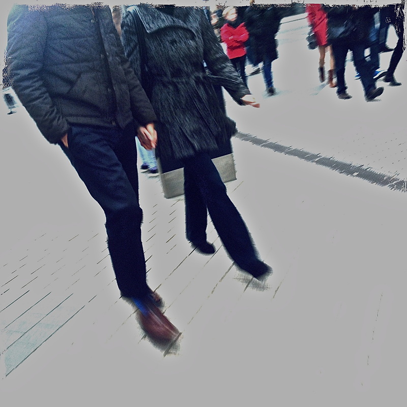
The three figures in this image are walking into different directions. The older figure in the foreground, is walking near the camera whilst the two, what looks like school boys are striding in a different direction. Whilst this image reflects movement in the streets it also shows a difference in ethnicity and age. The older man carrying a basket of what looks like laundry contrasts with the two younger school boys. Although the two 'groups' of people are obviously living different sorts of lives, they are still coming together, perhaps not to talk but they will at least walk past eachother on the streets. I wanted this image to have a mysterious feel to it so I made sure that none of the faces would be captured, therefore the image will be less obvious. The composition in this image makes the figures stand out even though they are amongst different layers and textures such as the pavement lines and trees.
|
|
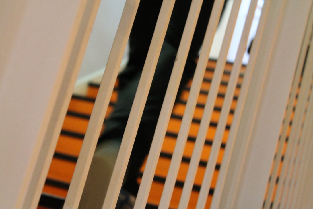
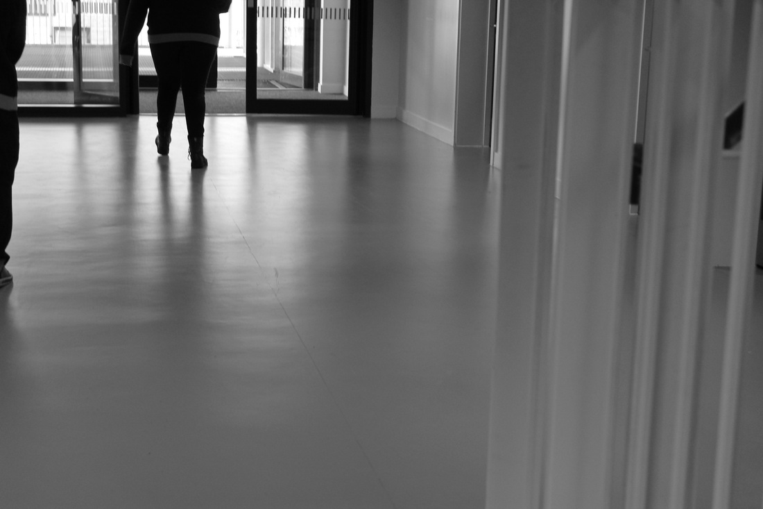
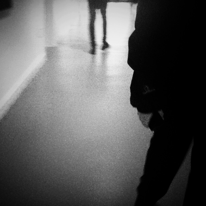
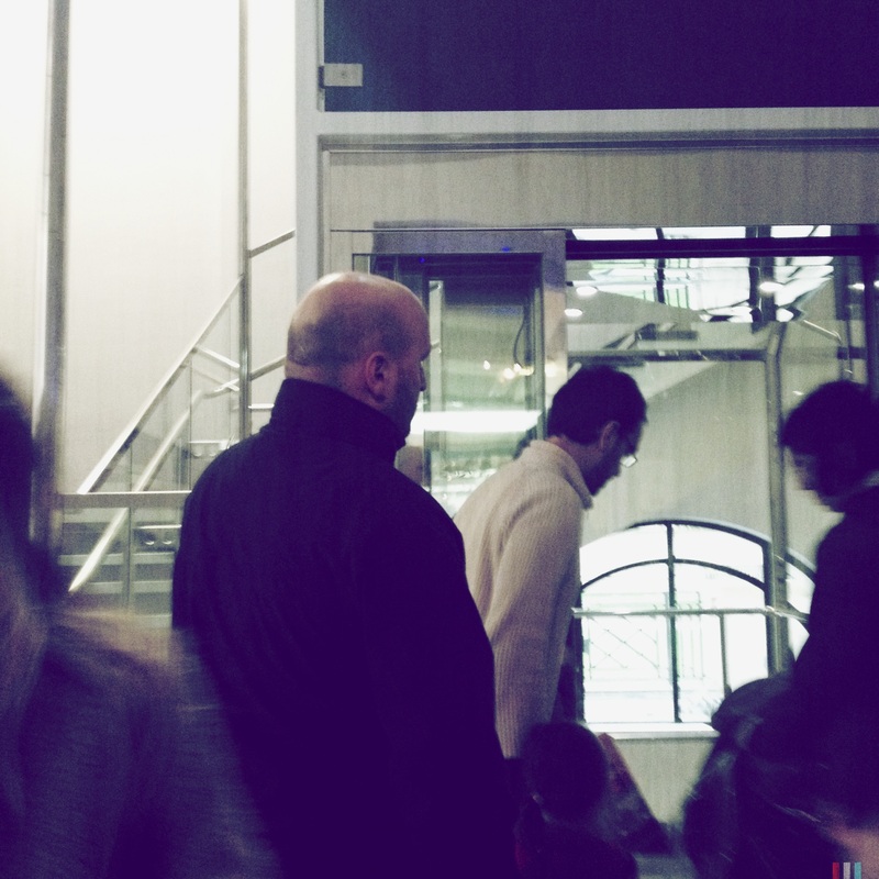
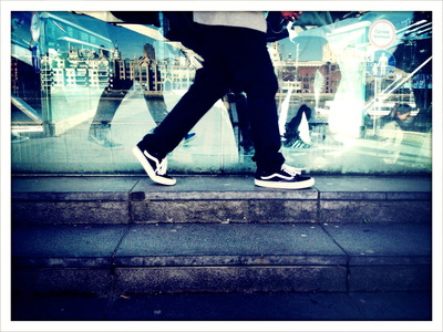
This image is themed around reflections. It also reflects how the chaotic streets through the mirrored reflection from the glass. The reflection not only gives the image depth but it gives an infinite feel as there are layers and layers of image such as the buildings against the walking legs. The composition of the image is quite structured as the walking legs are central to the image against the reflection and steps.
|
|
|
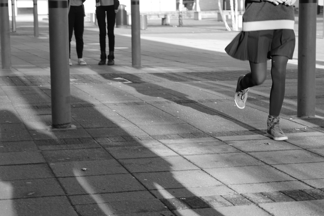
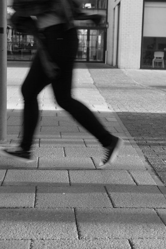
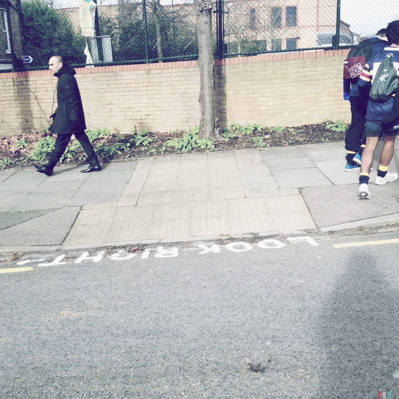
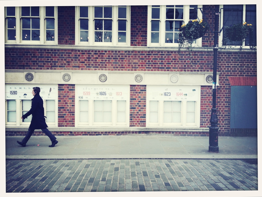
Using the 'walk on by' theme I was inspired to take some images that had people walking past a specific area. In this case I set the image up to be quite formal therefore the composition had to be in line with the figure and rest of elements in the image such as the lampost. This image stands out for me as it shows the calmer and more formal side of life on the streets aside from the chaotic and busier sides of cities and streets most street photographers tend to capture.
|
|
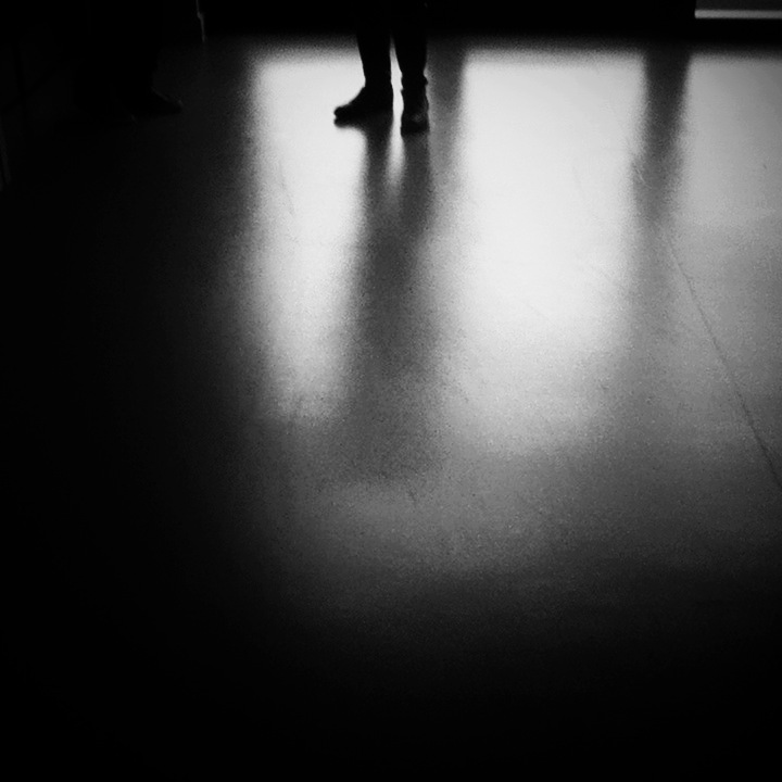
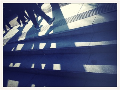
This image was inspired by the 'shadow' theme. It is one of my favourite images as the shadow in a way takes over the entire photograph which makes it quite abstract. The image is also quite linear as the shadows are pointing in different directions which makes them overlap. I like the way you can see the outline of the legs but not totally as it gives the image a mysterious feel about it.
|
|
