ABSURD
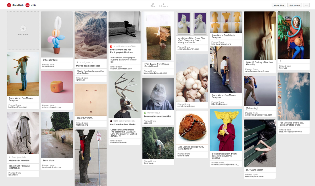
Pinterest board
|
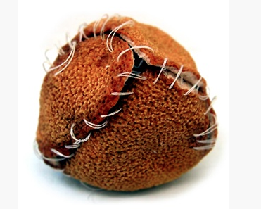
I found this 'absurd' image on pinterest after looking at many photographs with the theme of 'absurd'. The orange peel has been sewn up in an attempt to put the pieces back together however the white string, contrasting against the burnt orange colour makes this image very unique. Similar to cake mixture, when someone has peeled an orange ready to eat it the peel is usually discarded however in this image the photographer has tried to reverse this process, putting it back together again like when you first found it. As well as the idea behind the image the actual texture of orange peel stands out with its rough texture. The burnt orange texture contrasts with the white string making the image seem more abstract. I really like the idea and aesthetic of the image. It has inspired me to experiment with pieces of textured fruits and to sew them together like this one.
|
|
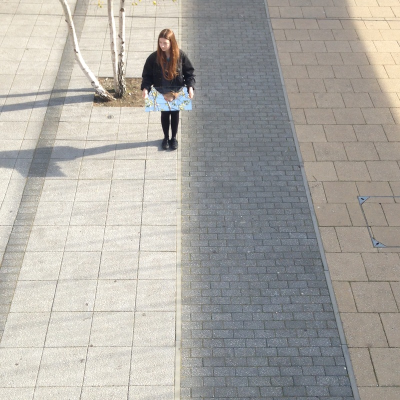
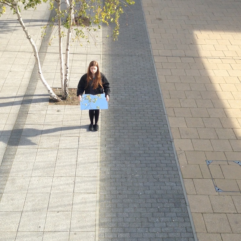
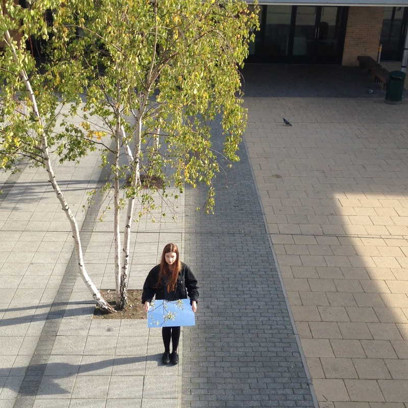
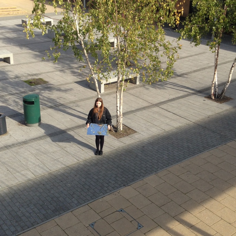
Photoshoots #1 |
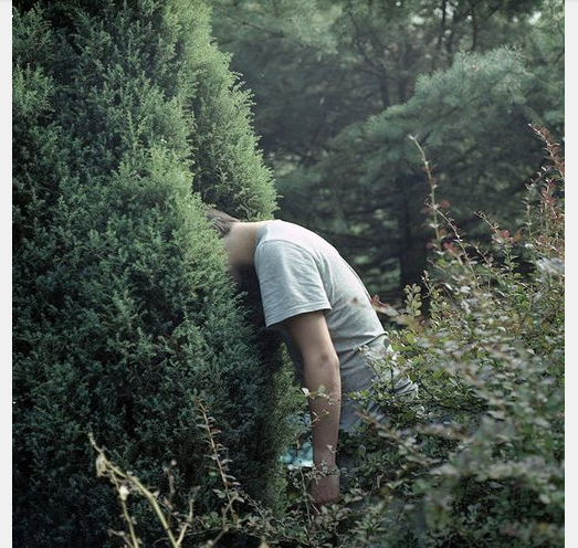
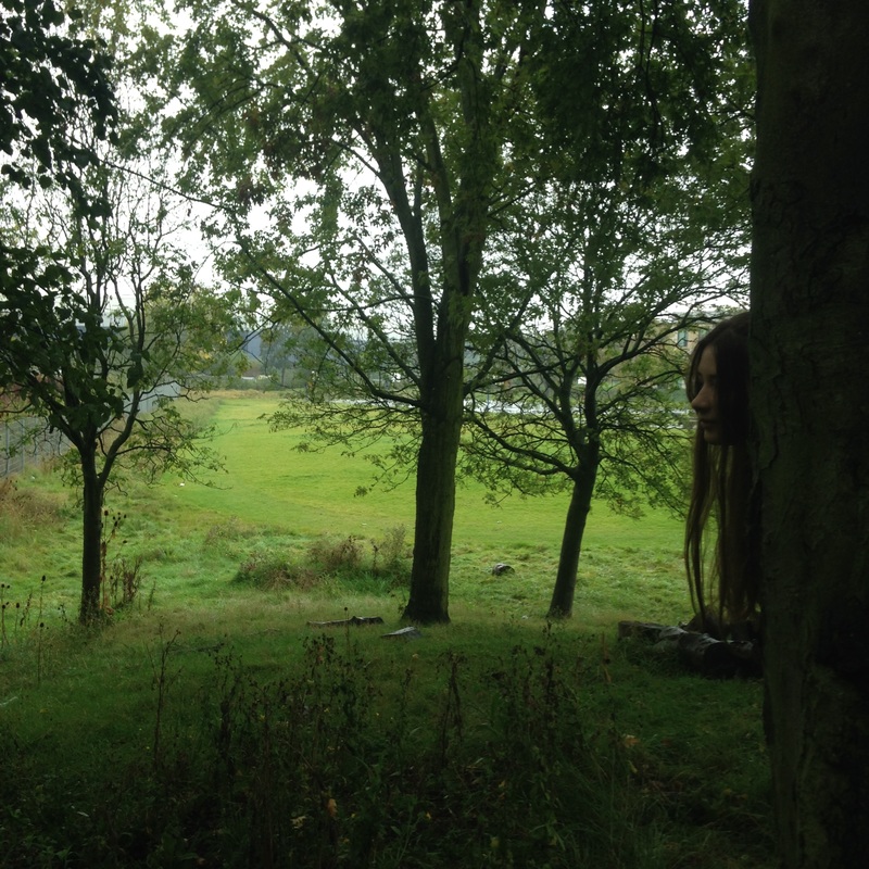
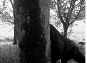
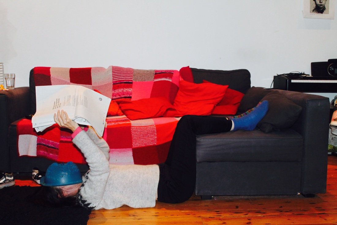
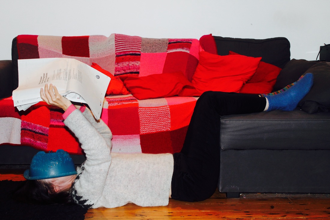
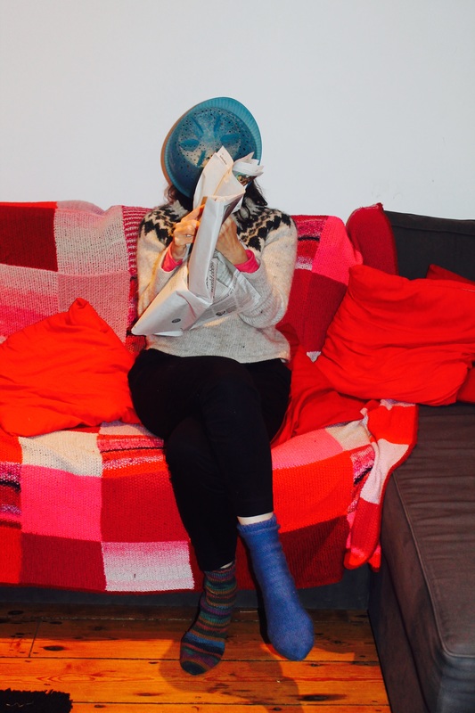
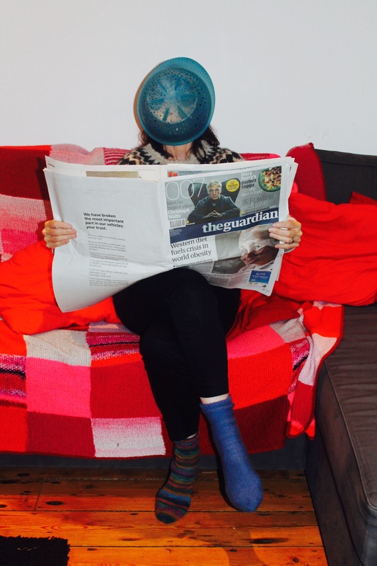
This photograph shares the same theme to the one above however it is very different. Instead of an object being used the photographer has decided to use a figure in the photograph standing with their face in to the trees. Normally, the figure would be looking at the tree, admiring the nature but this wouldn't be absurd. There is quite a deep depth of field in this image as the photograph is made up of three layers. The first layer - the foreground- is made up of branches and twigs, the second layer is the figure itself in the tree and the third layer - the background- is not in focus but we can see the dark lines of the tree branches. Each layer has a different texture which makes the image more three dimensional. Also, the photographer has decided to take the image at a certain angle whereby the trees create a path that we as the viewer can look through. The fact that the photographer took this image in this way means the viewer is guided to the centre of interest which is the figure. The rest of the image is a build up to the figure facing into the tree.
|
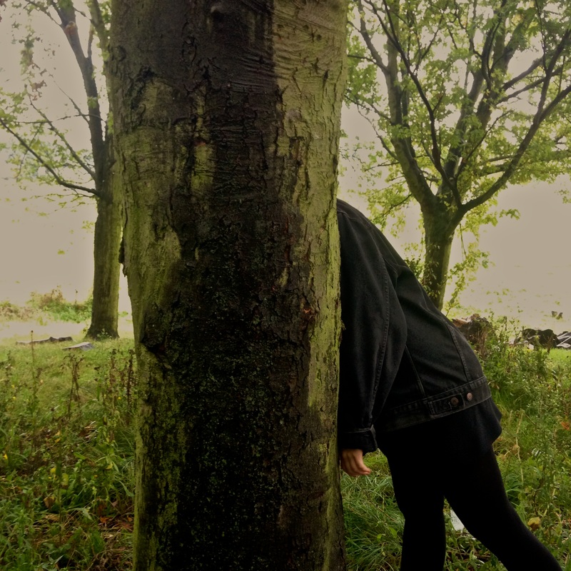
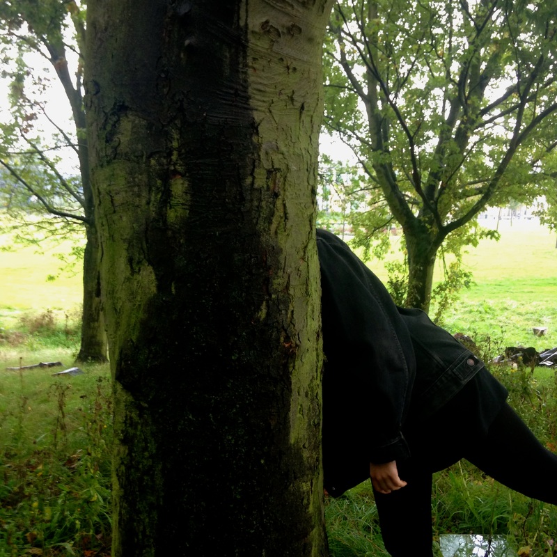
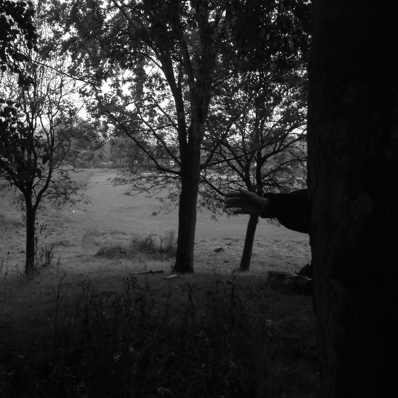
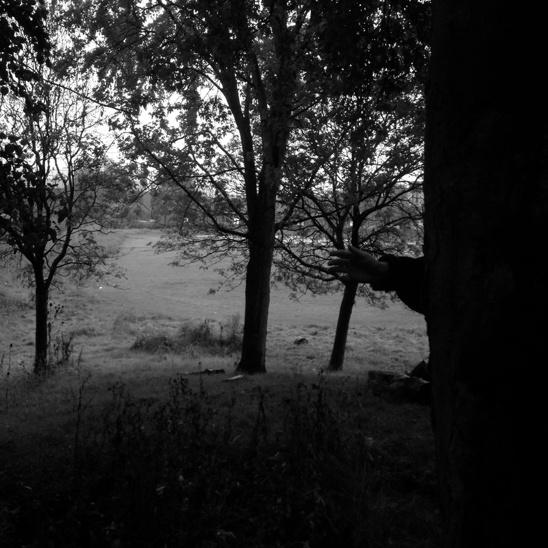
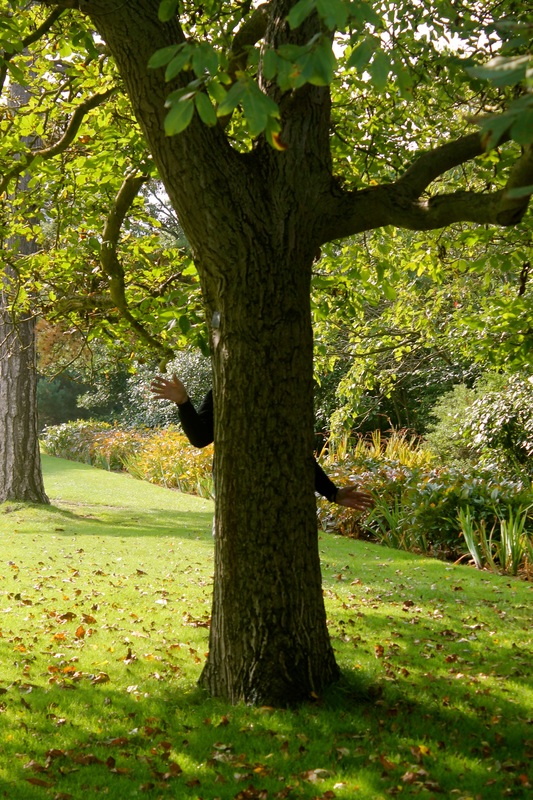
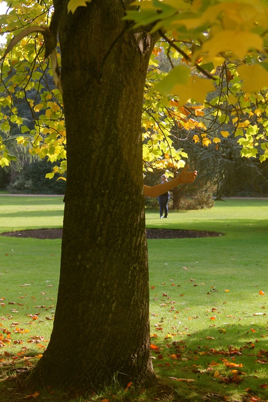
These were my first images which I thought were unsuccessful however they were a starting point for a new idea which I would like to develop. The image of the hand coming out of the tree I thought was quite successful as the idea of a hand coming out of a tree seems quite absurd, replicating a branch like it is part of the tree. Although I like this idea I feel like this is not clear through the images I have taken due to the light facing the opposite way I would like it to be. For example in one of the images the background is highlighted by the light however the hand has not making it blend into the tree. Next time I would like to make the hand the main element of the photograph so that it stands out. To ensure the subject is clear I need to make sure the light is hitting the the tree with the hand, I can do this by experimenting with angles and finding out where the light is coming from.
|
MOST SUCCESSFUL IMAGE
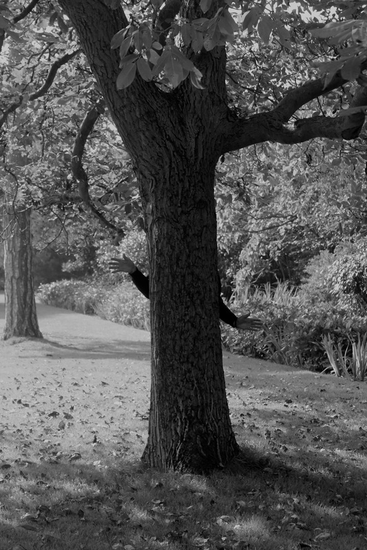
This is my most successful image in terms of the content of the image as I found a way of combining the human form with an organic form (the tree) to create something that looks absurd. I quite like the vibrance of the green against the brown and black however these colours are mainly like this because of the light hitting the wrong direction which is something I would like to change in my next few experiments. |
|
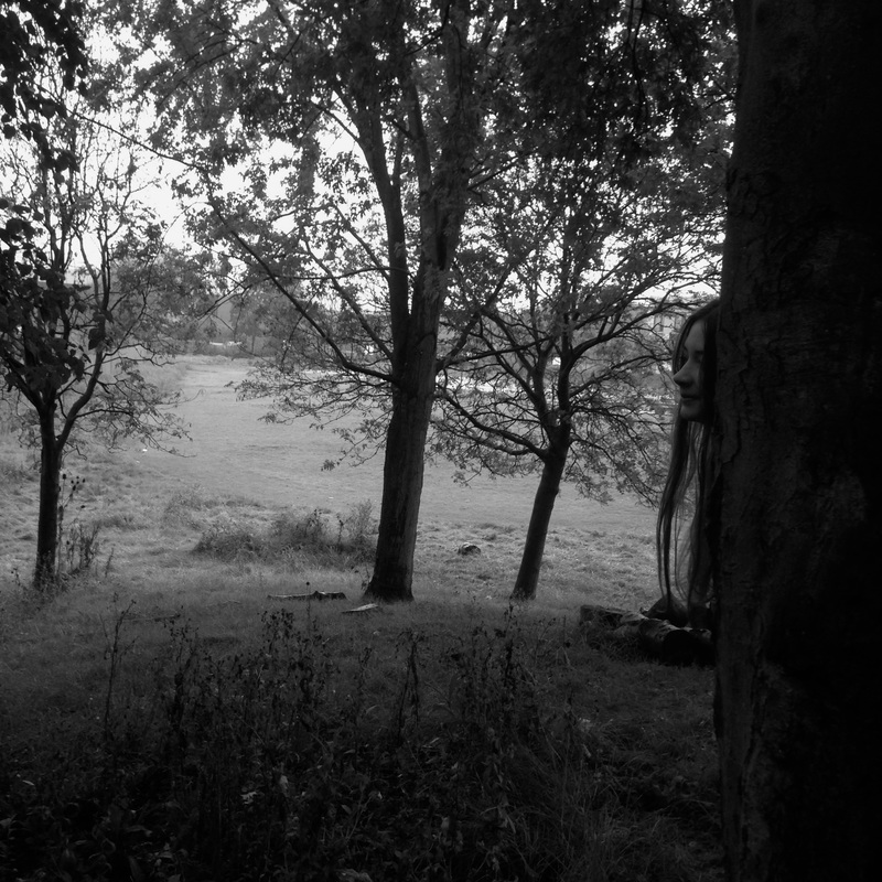
LEAST SUCCESSFUL IMAGE
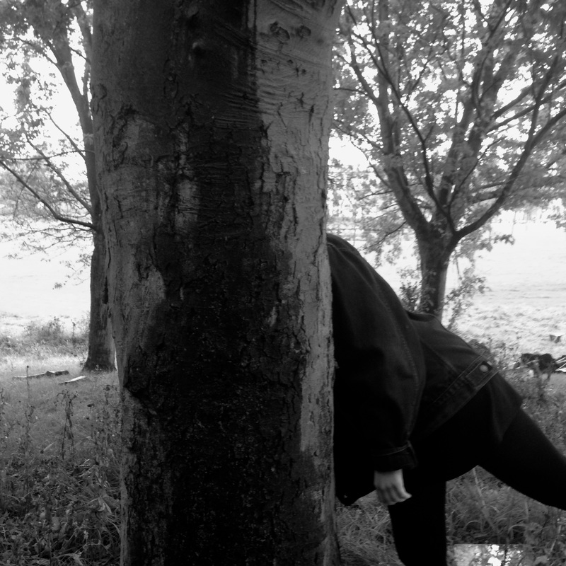
This image was unsuccessful for a number of reasons such as the lighting. The figure in the image merges into the background with the rest of the image which makes it weak. The grey tones of the images and overexposed making it look quite bleak. To extend on this, although the composition is quite good, the black filter I have used over the image to experiment makes the image quite confusing to understand for example I want it to be somewhat obvious to the view that the figure is there rather than the figure standing in an awkward position not really revealing itself. |
|
Photoshoot #2
Evaluation
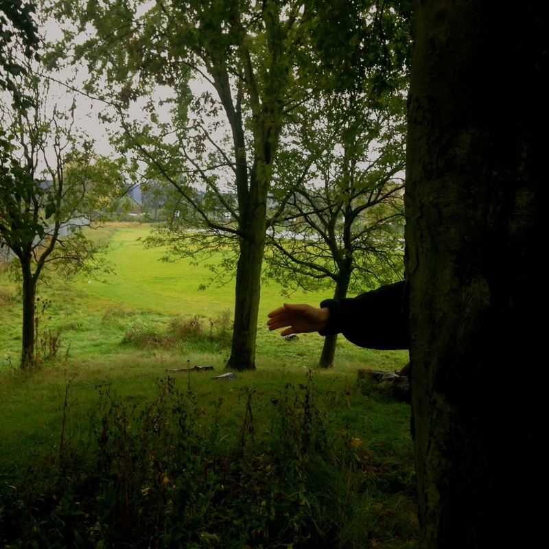
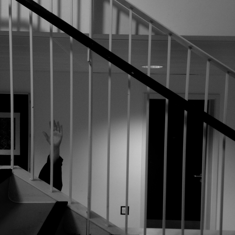
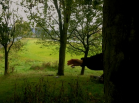
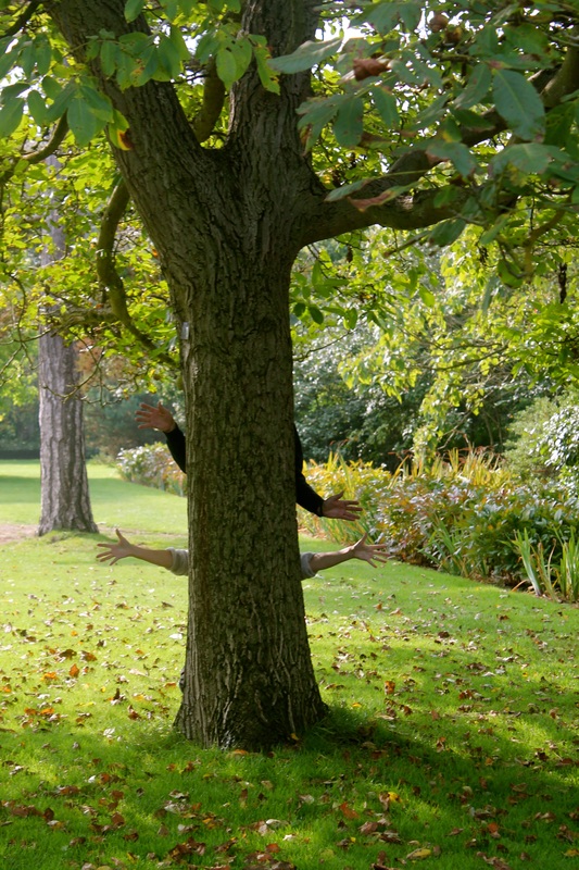
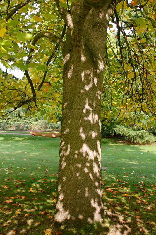
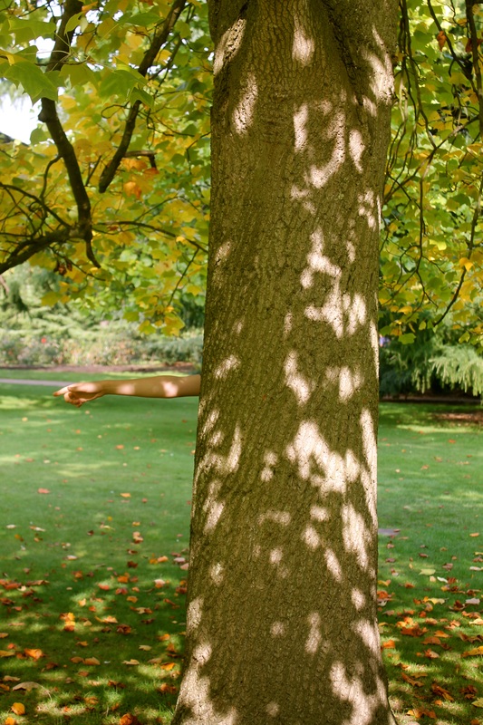
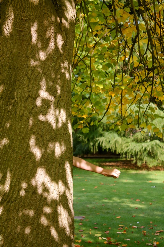
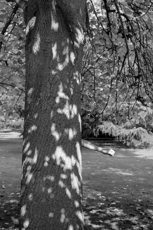
After evaluating my other set of images I realised I would have to think carefully about the lighting in my photographs which was harder because I was using natural light. Despite this, I eventually captured the light in the right way with the light hitting the hand. The shadow casted over the tree and hand looks like they are merged together, like the arm is part of the tree which I like. The idea of an arm and hand replacing a tree branch is absurd and relates to the theme of the human form combining with an organic form which is something I would like to experiment.
I have an idea of making a video, inspired by these images as I feel that would help enhance the subject matter for example I could film the hand moving like a tree branch. I also like the colours in theses images as they are quite vibrant and saturated, this is also something I would like to include in my film when I make one. I could even situate the hands in different places.
Photoshoot #3
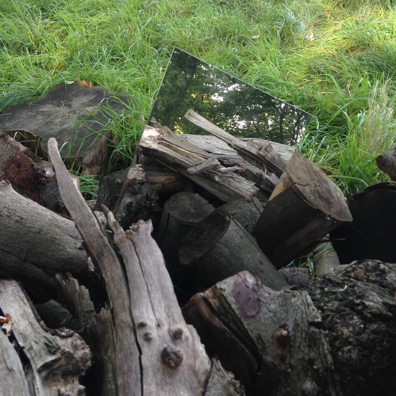
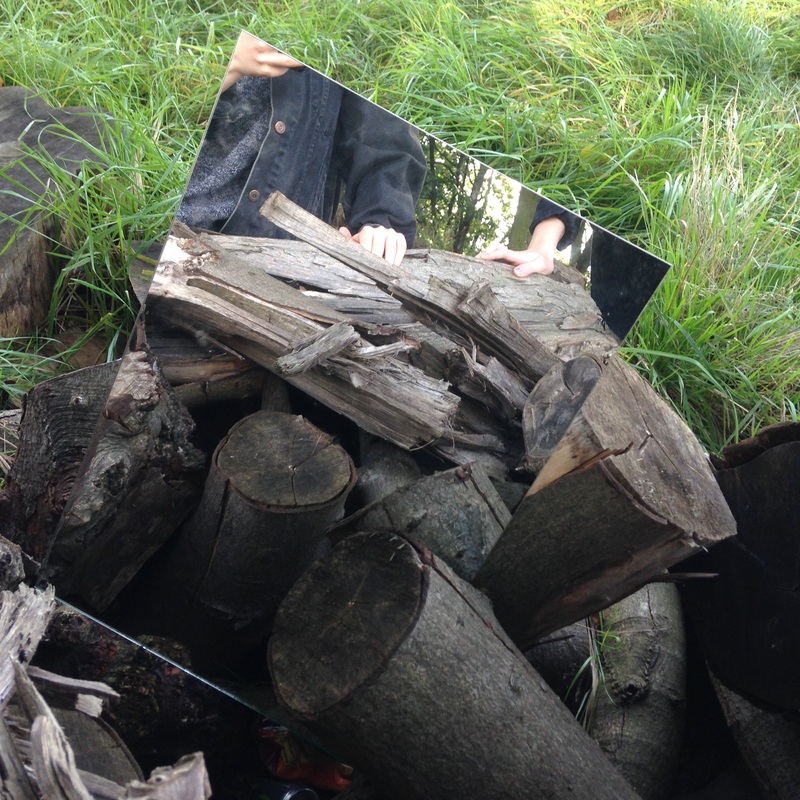
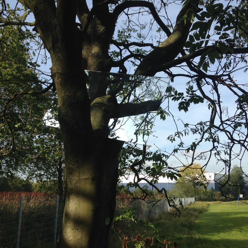
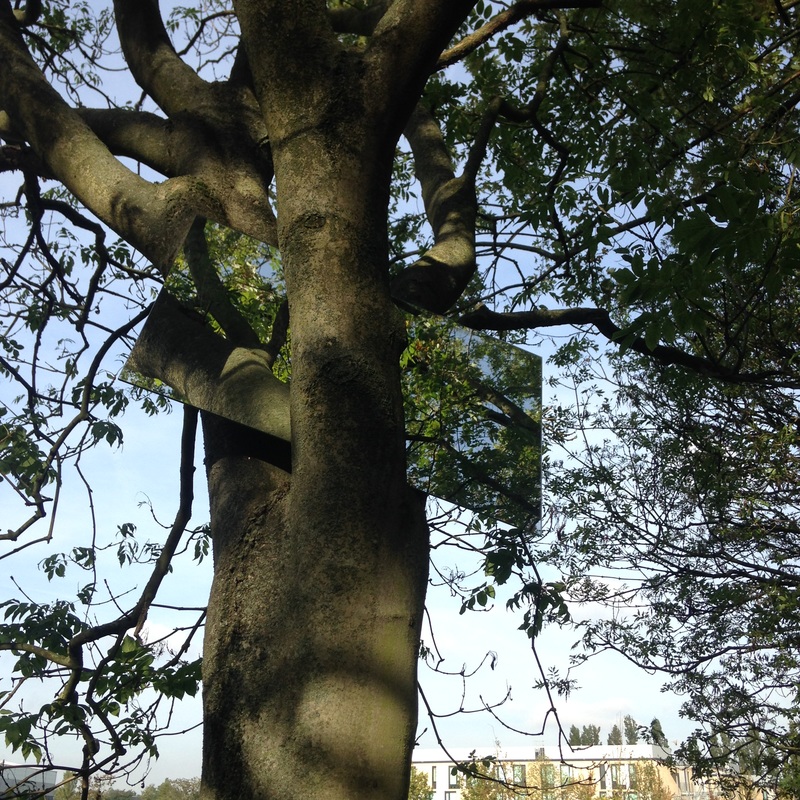
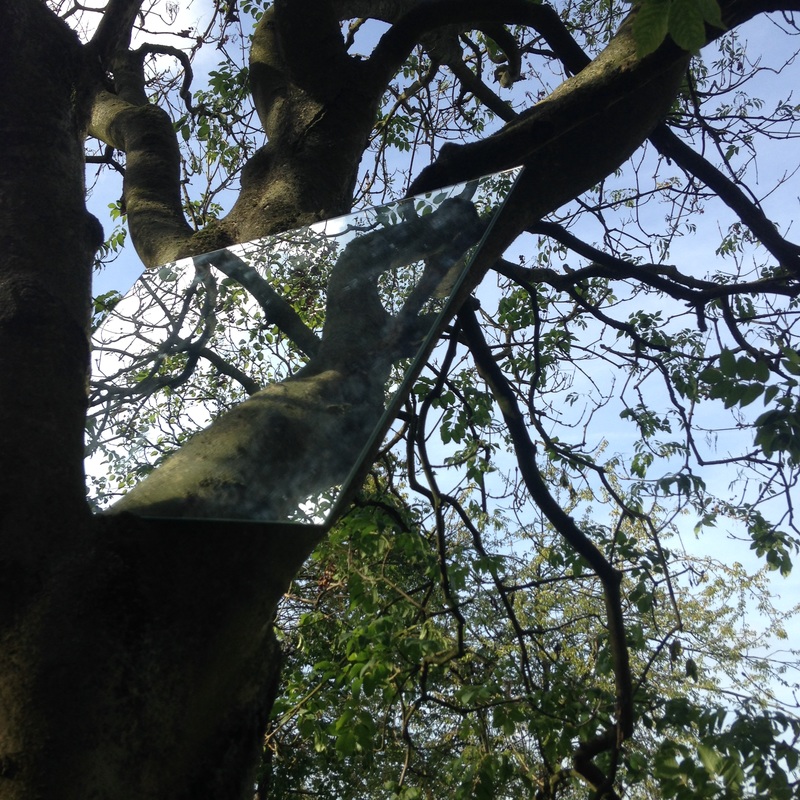
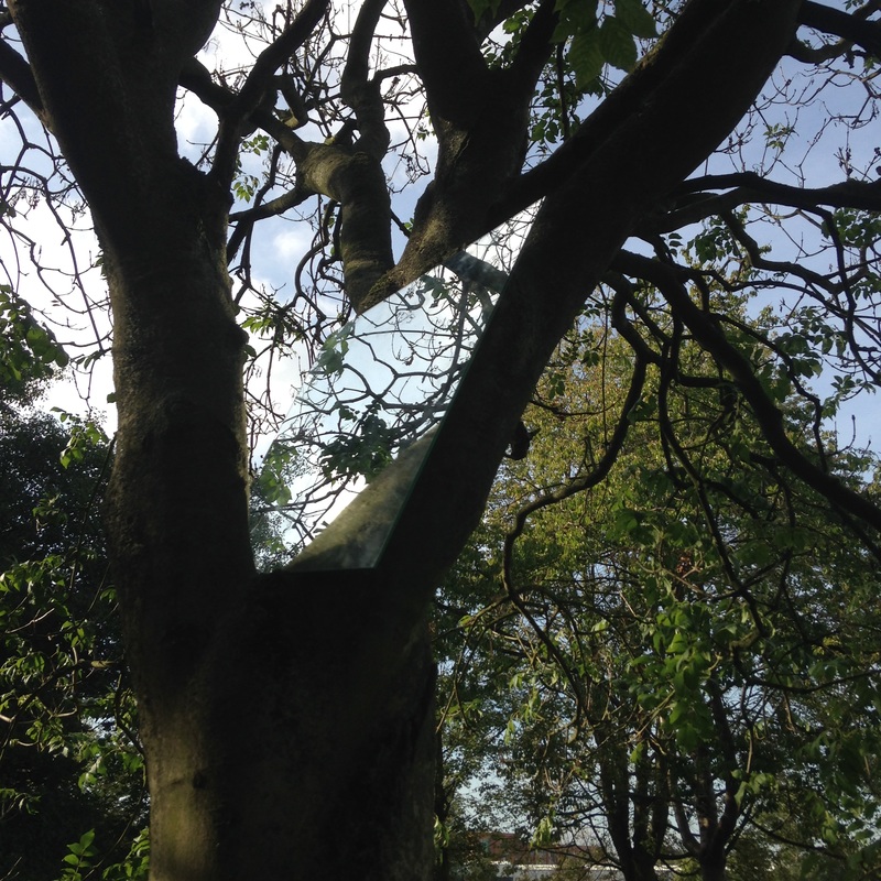
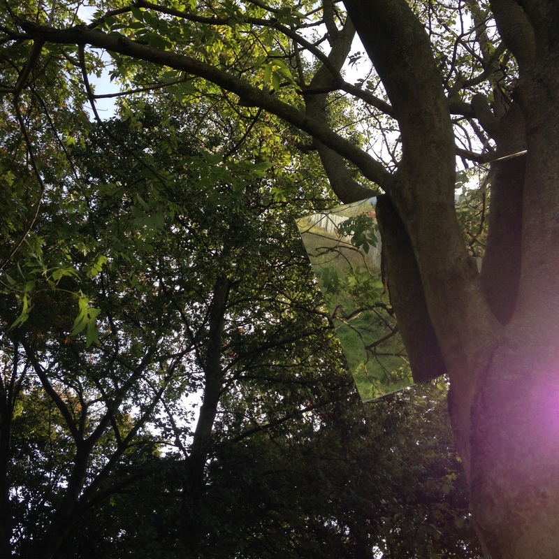
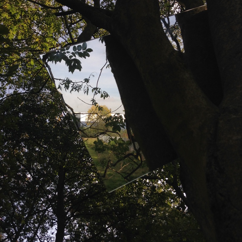
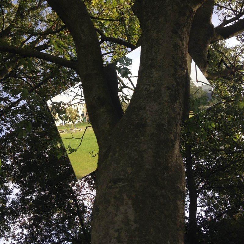
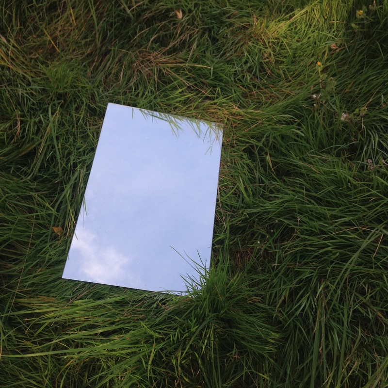
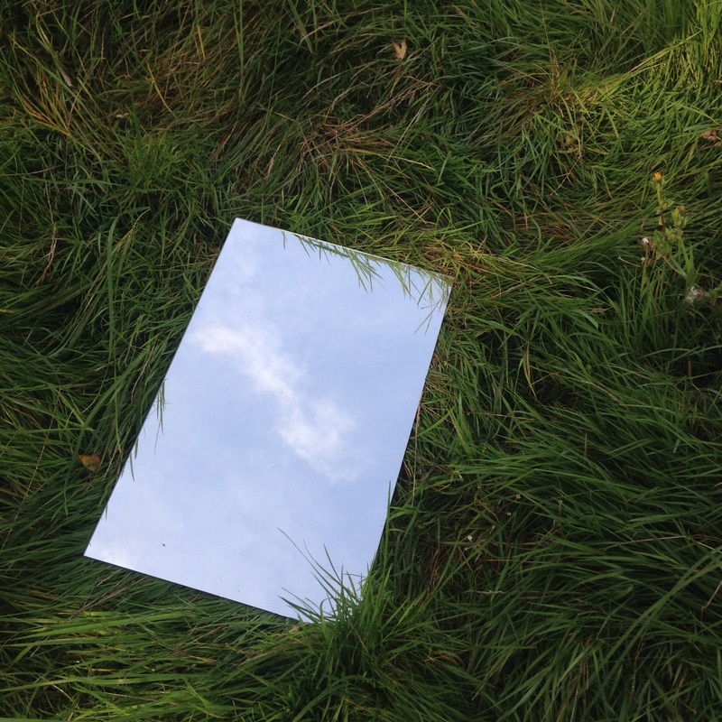
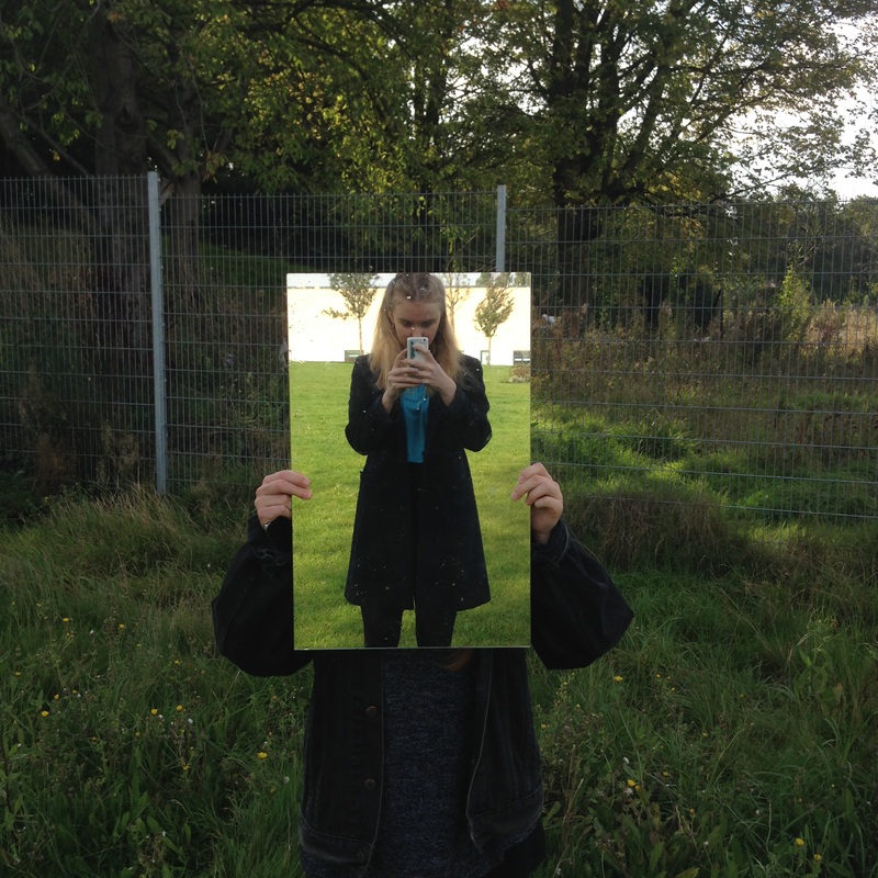
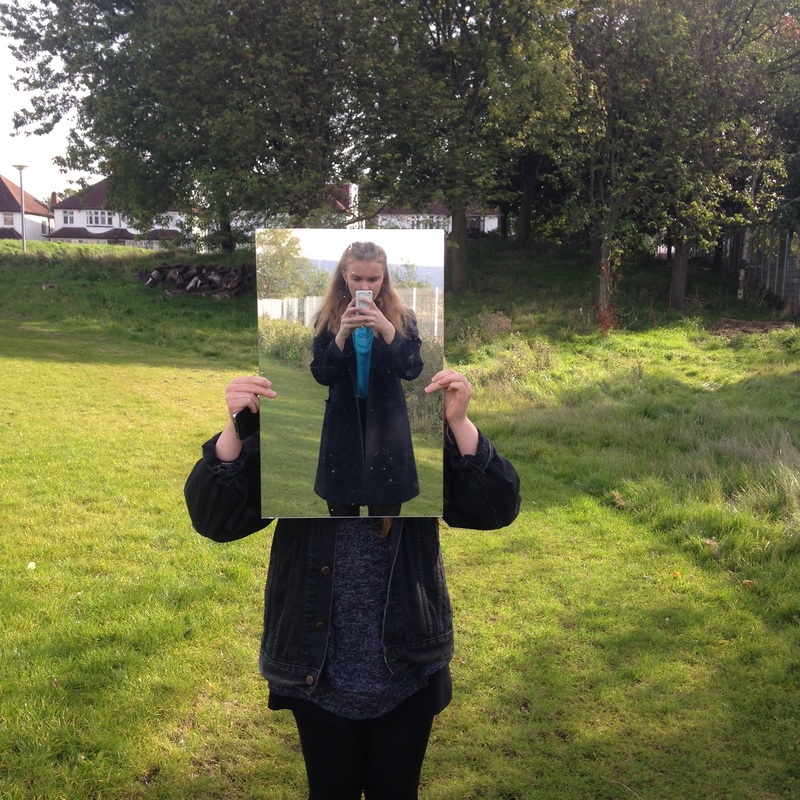
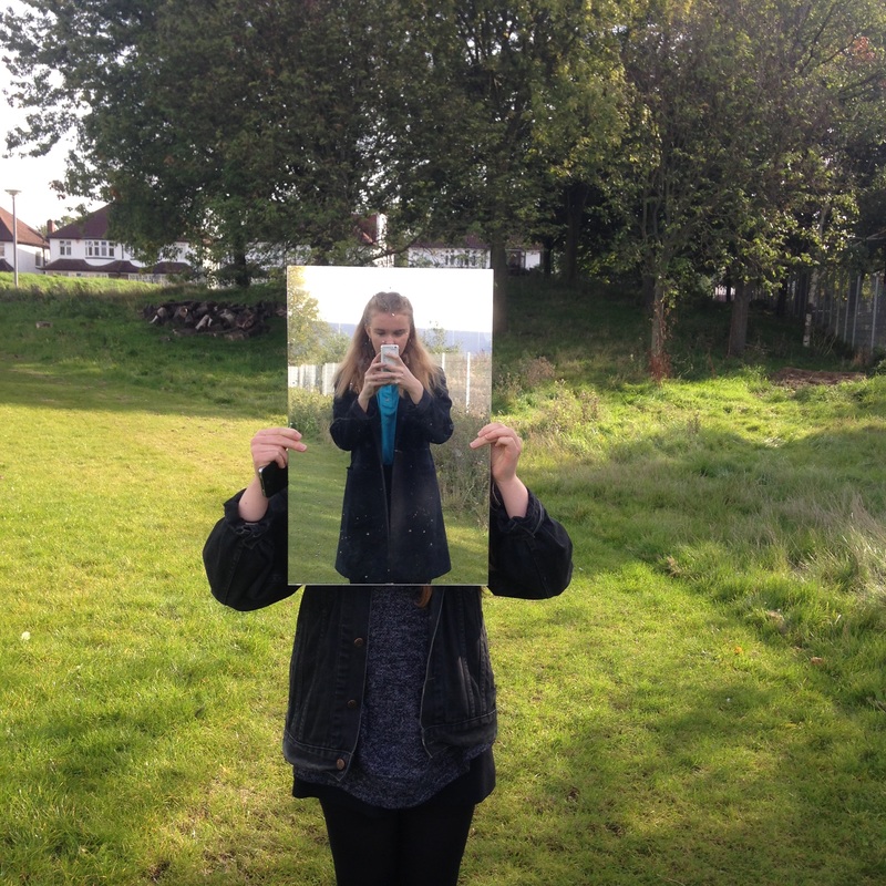
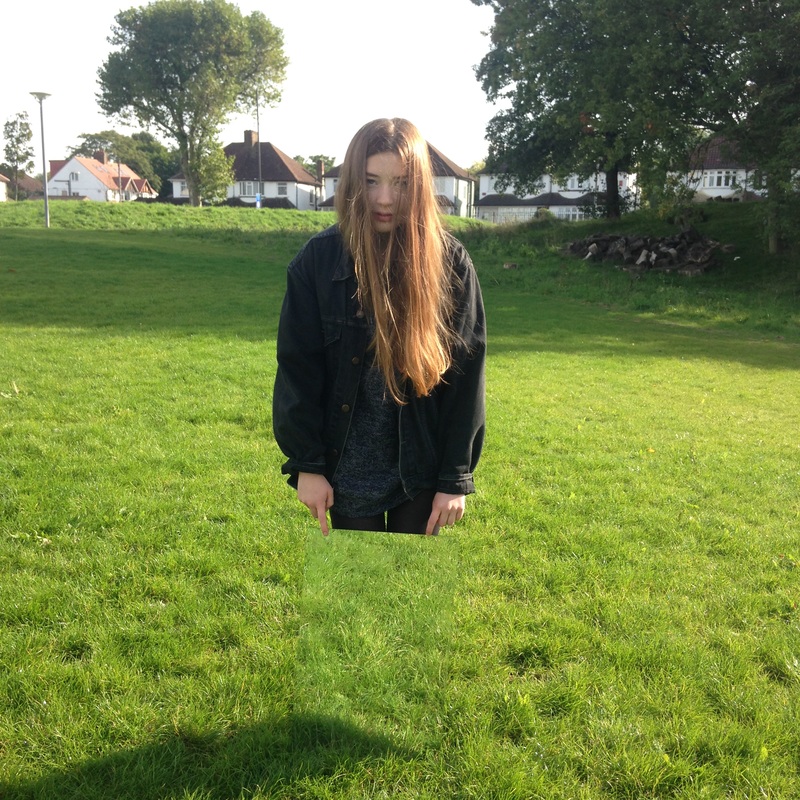
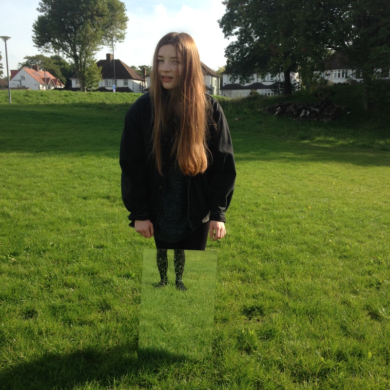
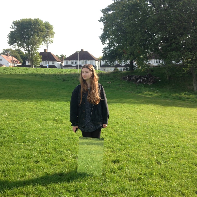
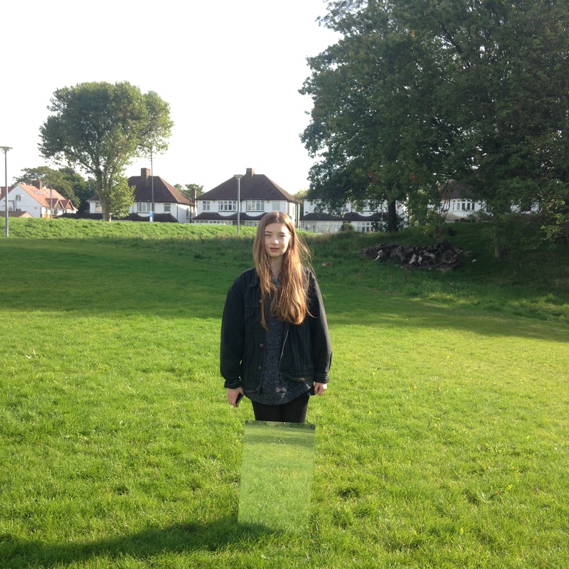
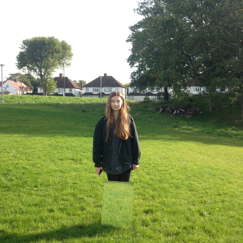
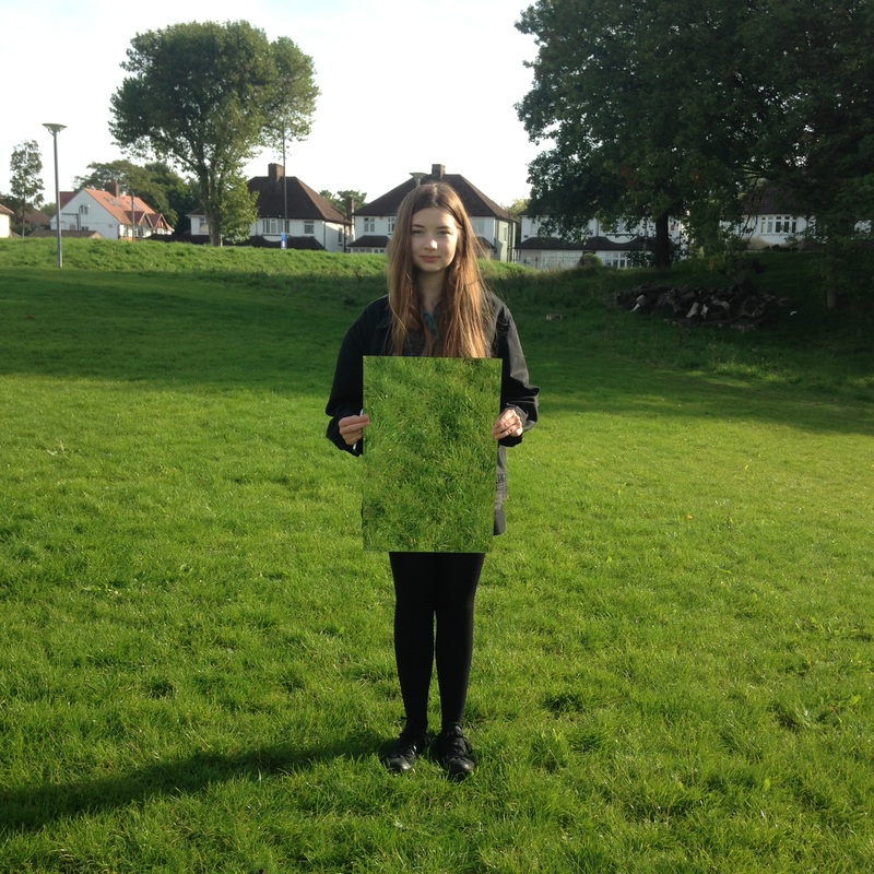
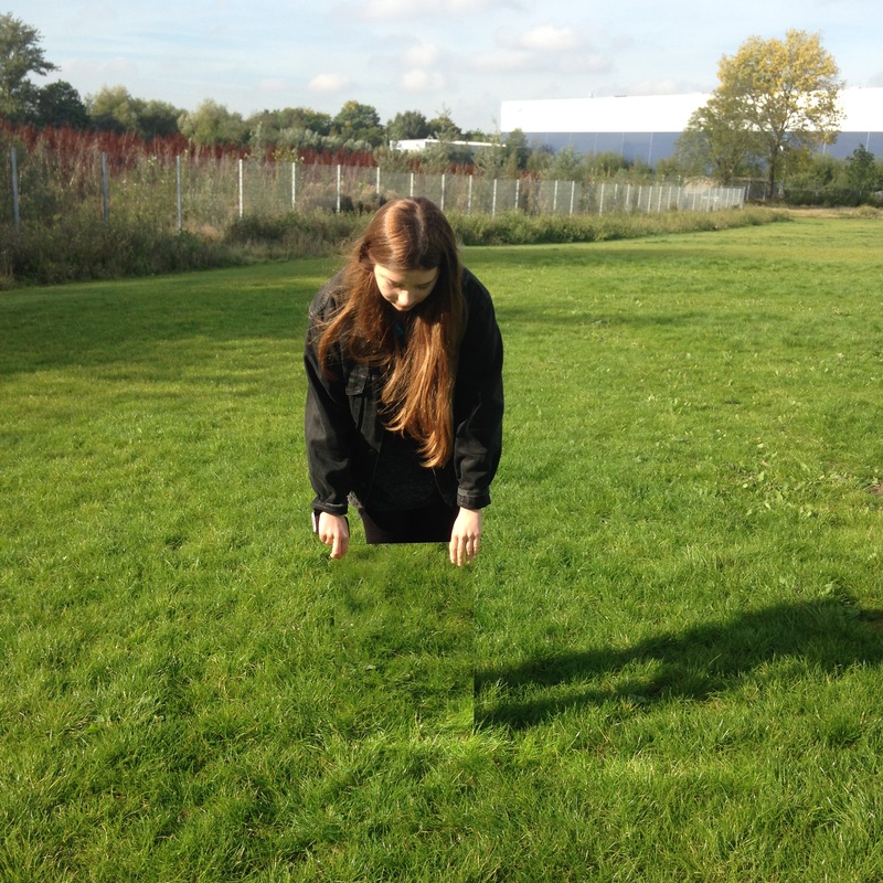
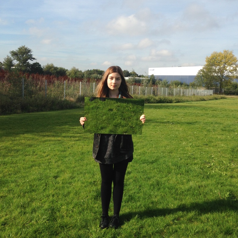
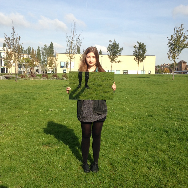
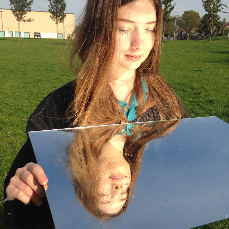
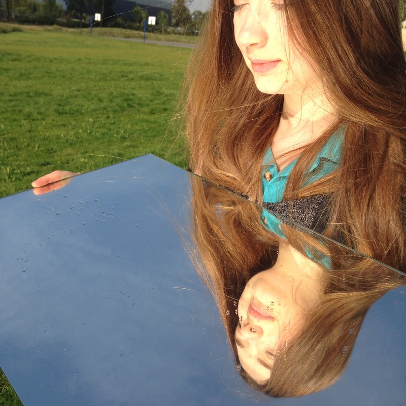
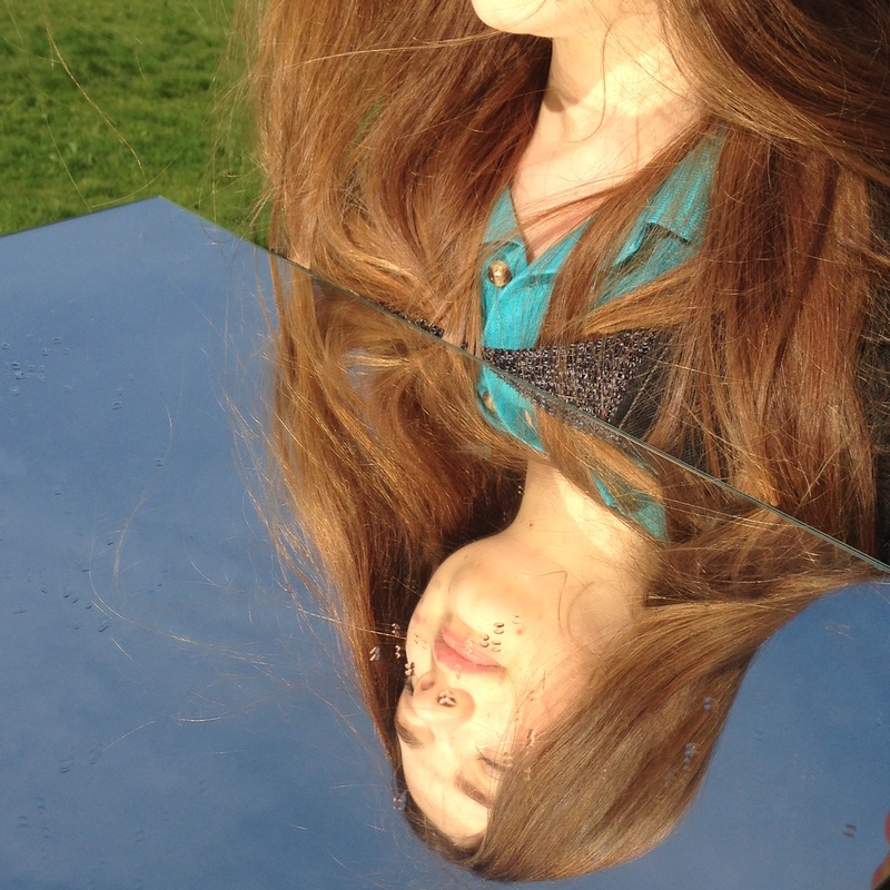
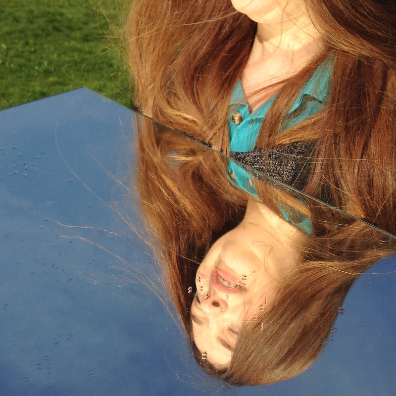
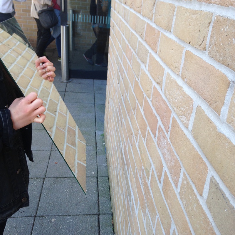
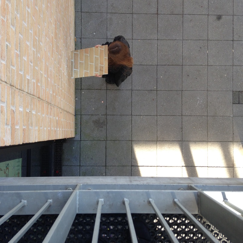
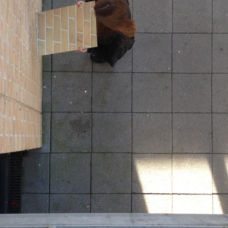
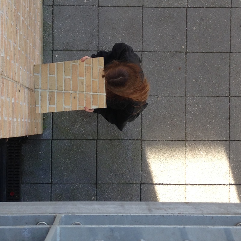
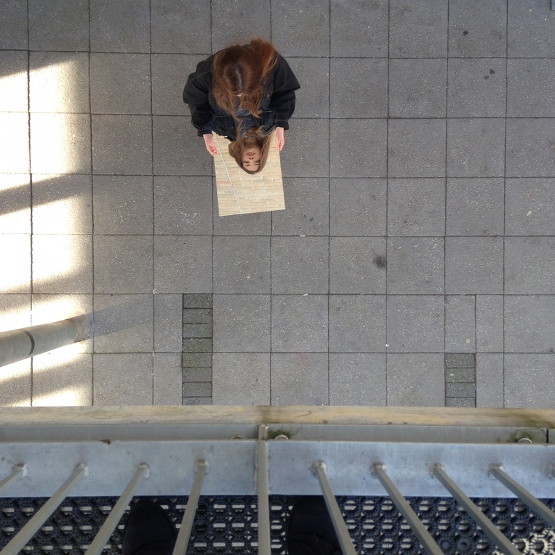
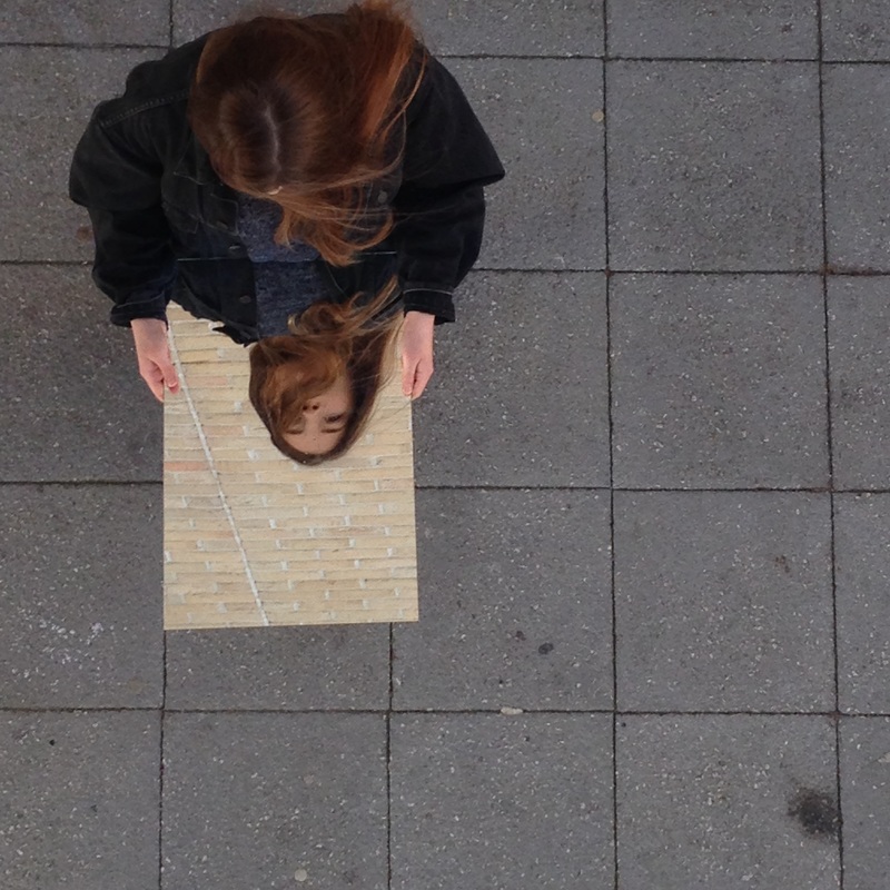
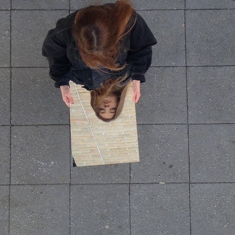
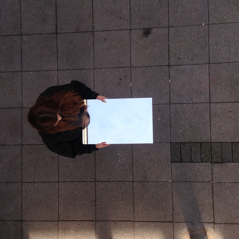
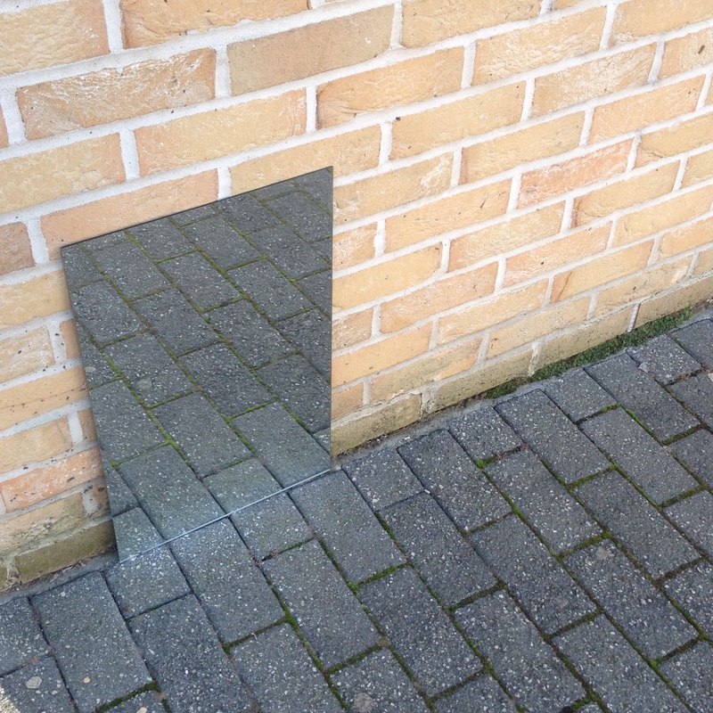
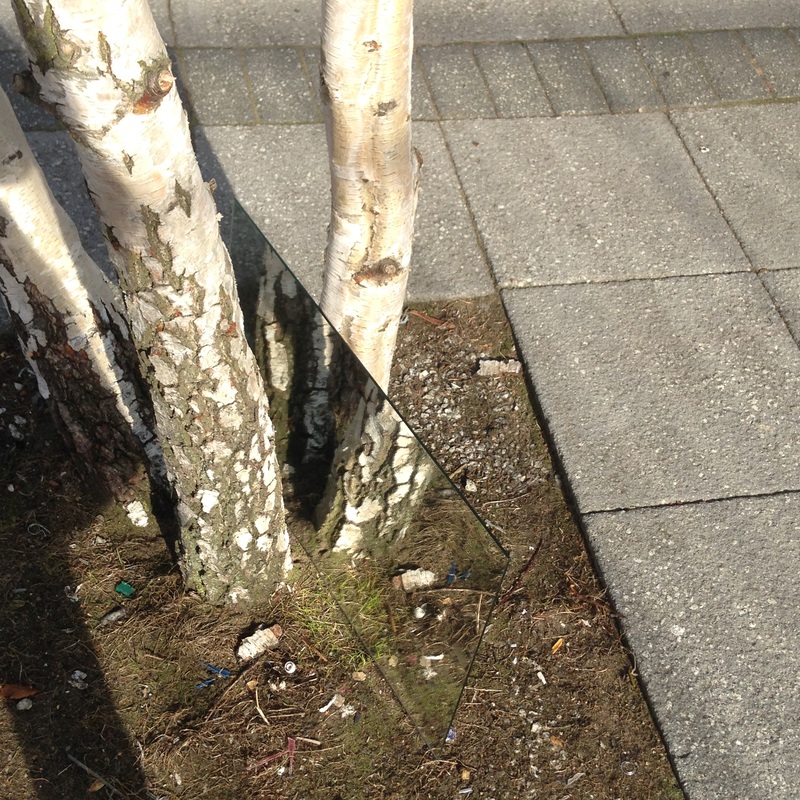
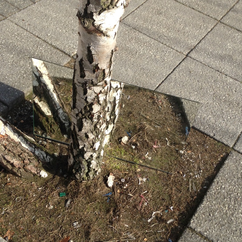
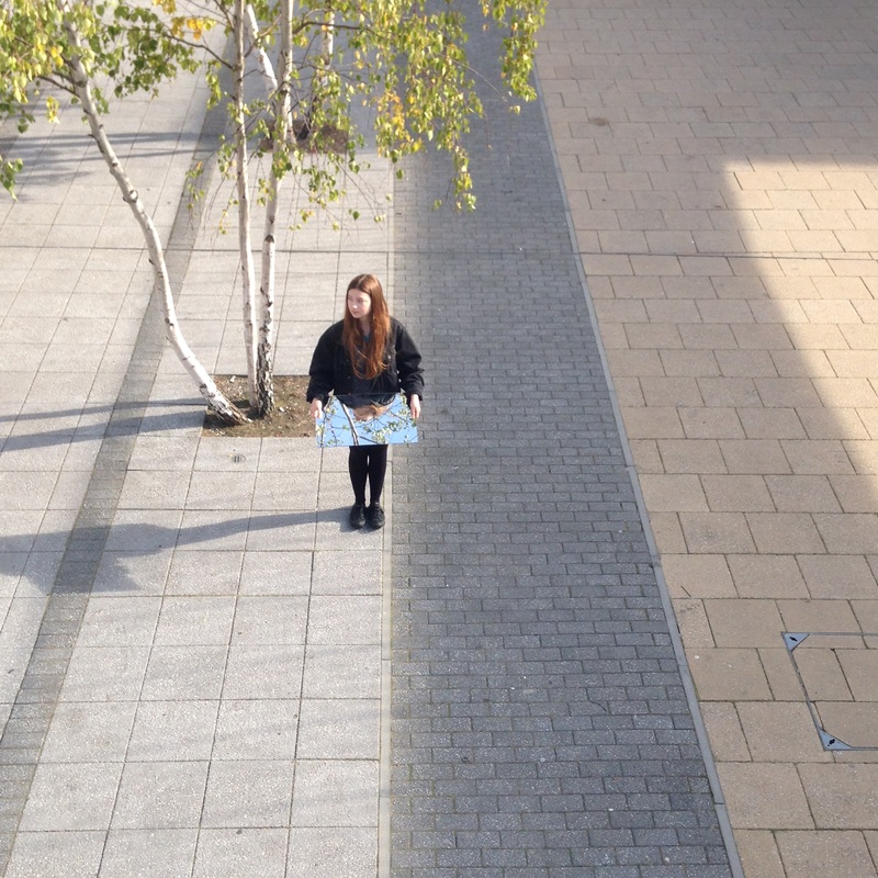
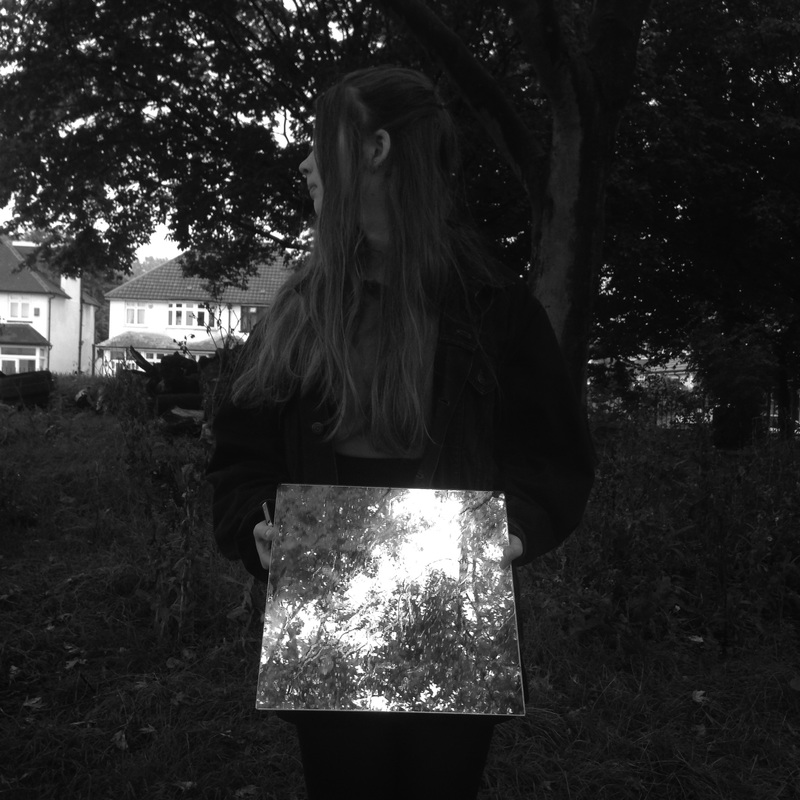
I am quite pleased with my first set of images. Using a mirror in my images was a way for me to experiment with the theme of absurdity, placing it in different spaces in the photographs. I started off trying place the mirror next to some trees so that you could see the reflection of the log however this did not change the image and it still looked somewhat normal. I think this was because the trees take up most of the image which means the reflection in the mirror does not stand out as it simply blends into the background. Also, they were quite over exposed which weakened the image therefore I decided to use a figure in my images to make it more interesting. Using a mirror in these images
Short film I have created combining all my experiments + ideas so far.
absurd from Clara Bach on Vimeo.
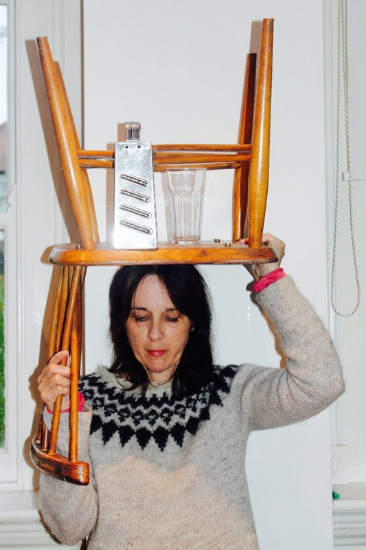
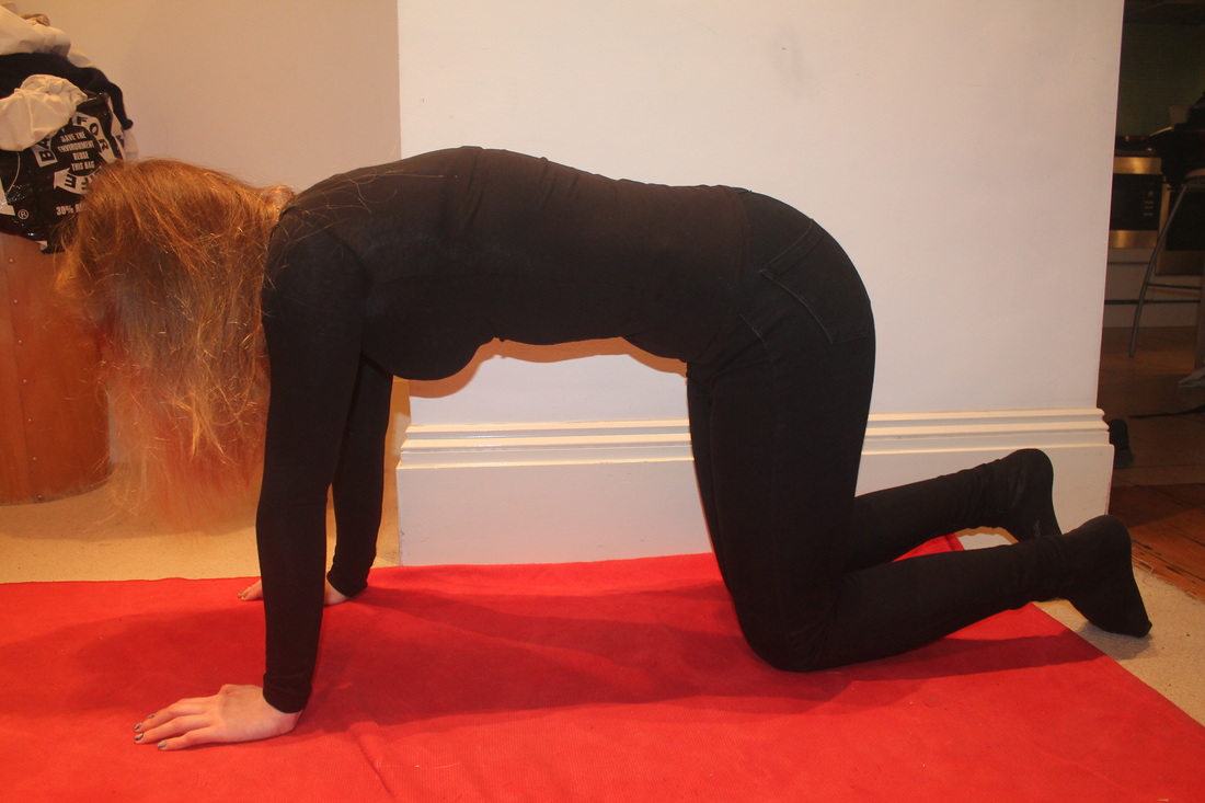
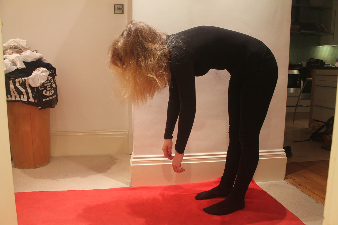
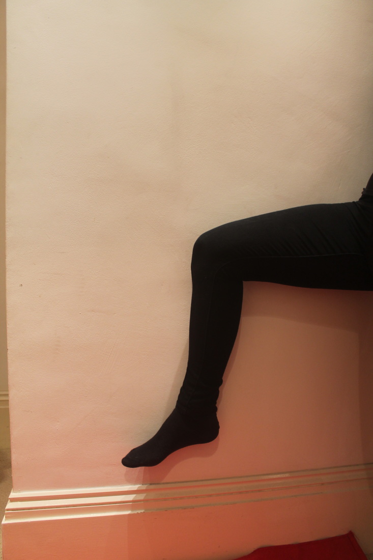
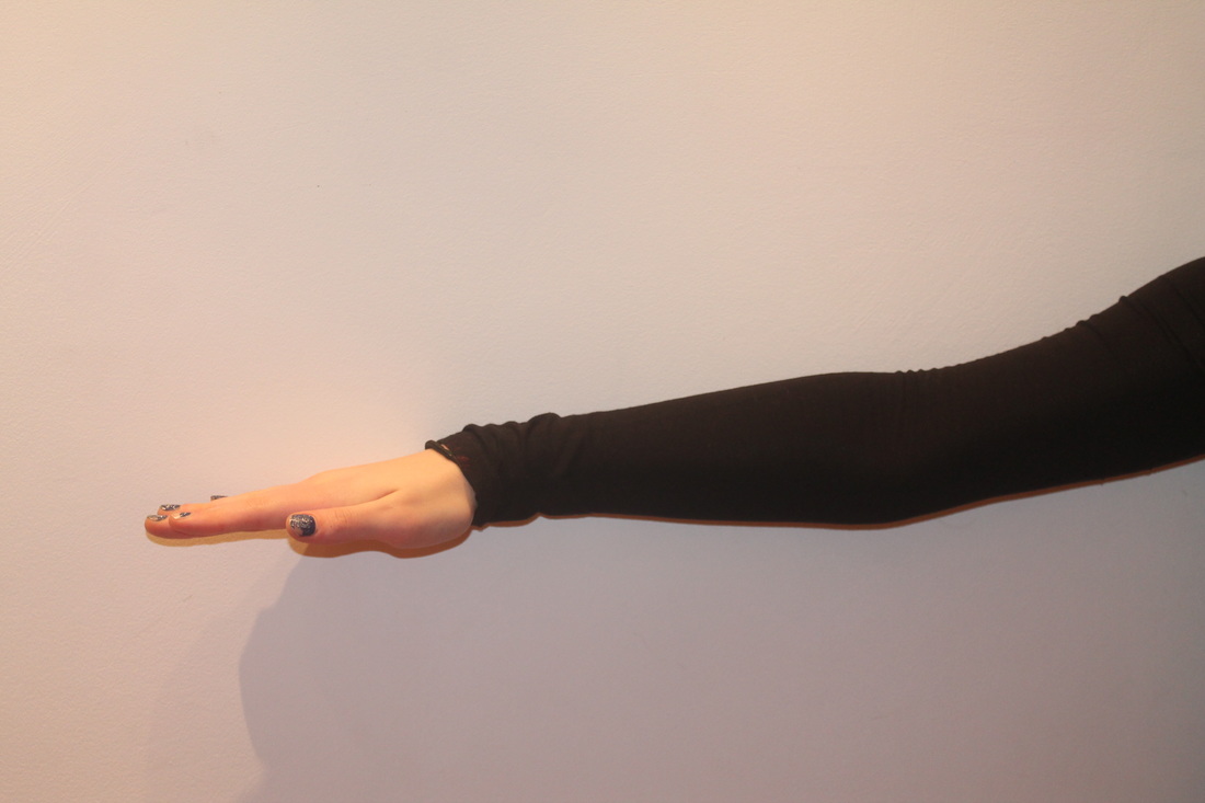
Photoshoots #4
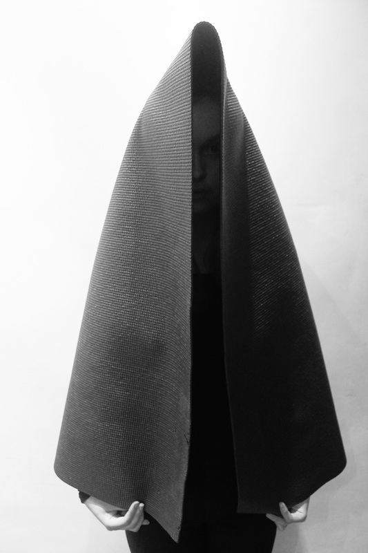
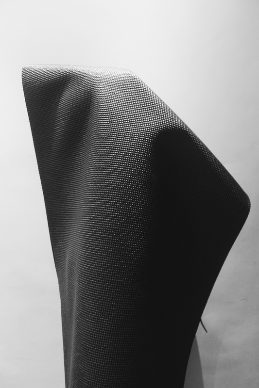
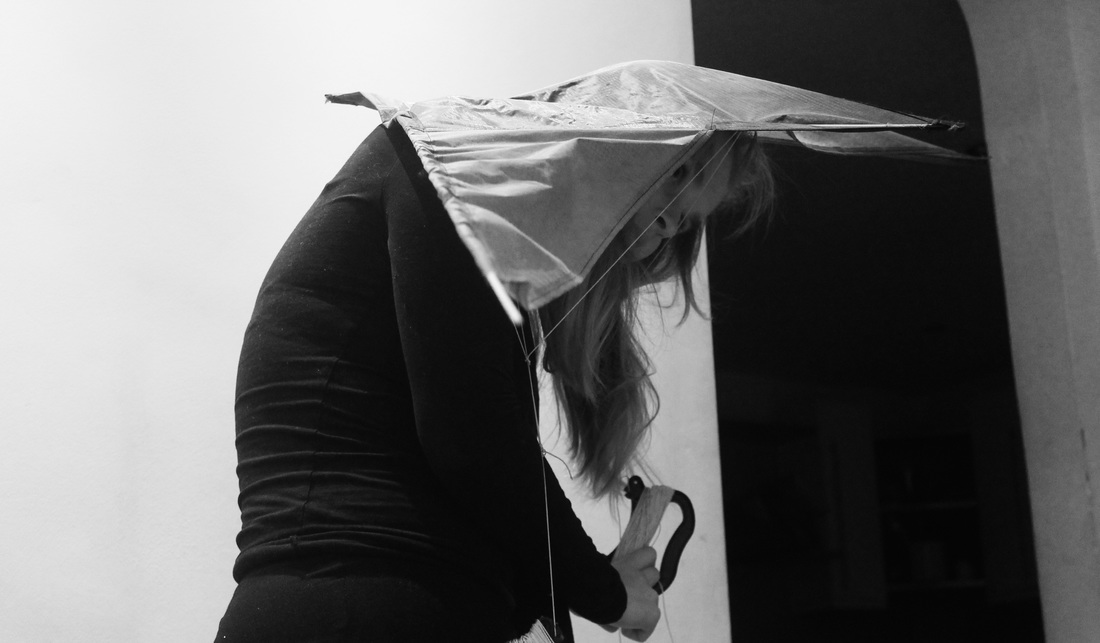
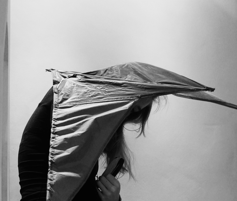
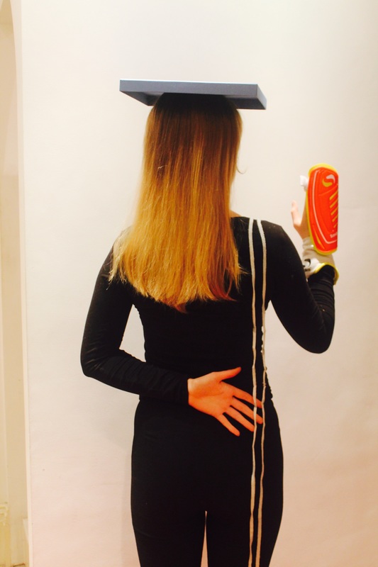
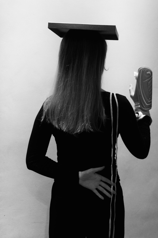
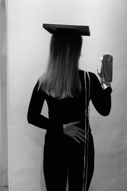
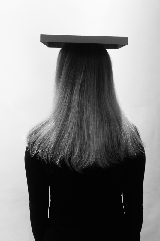
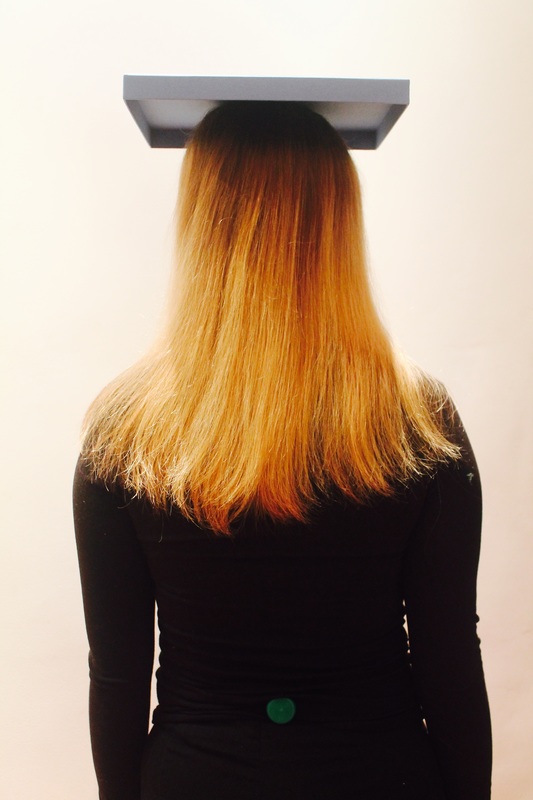
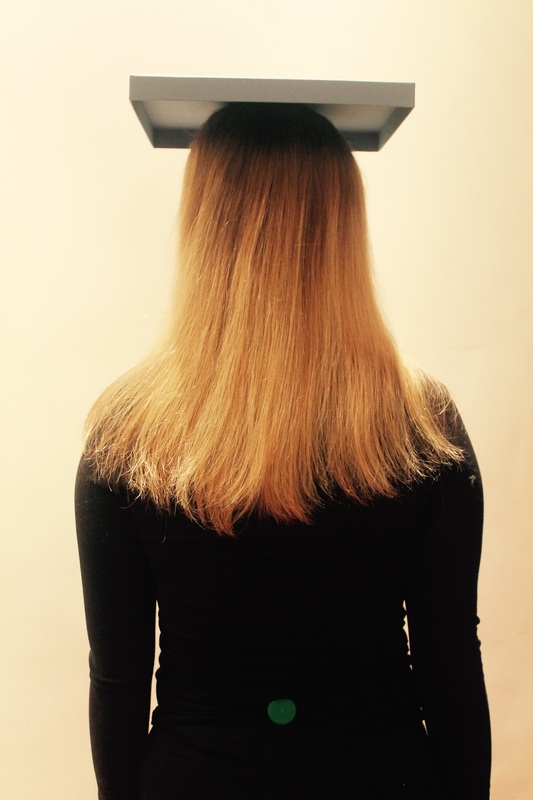
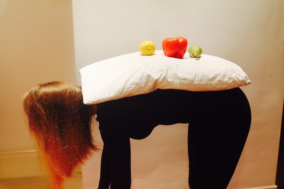
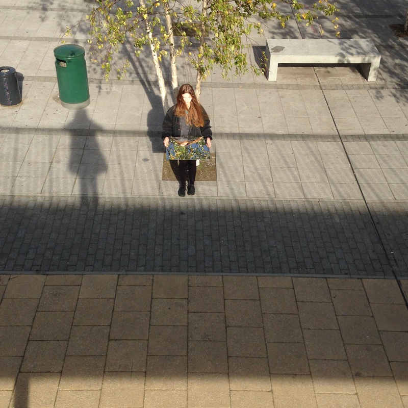
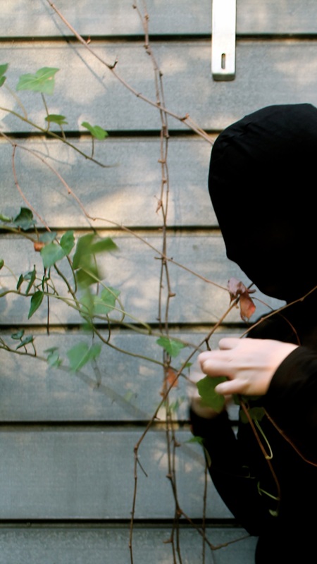
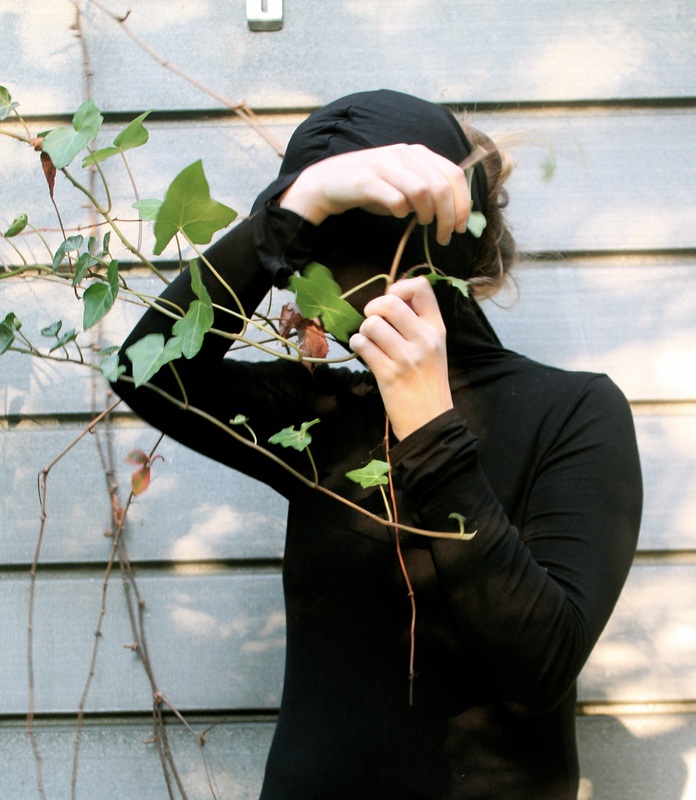
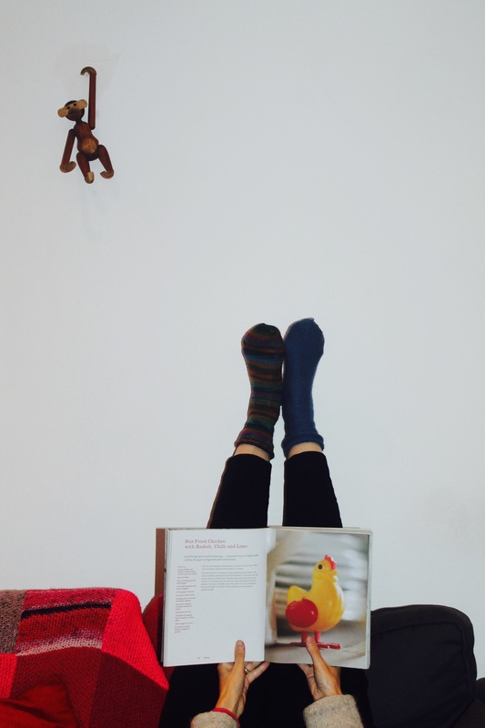
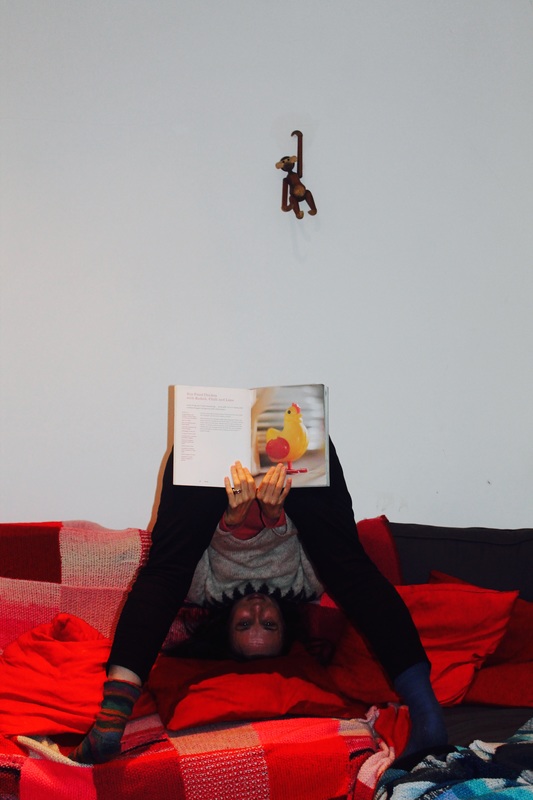
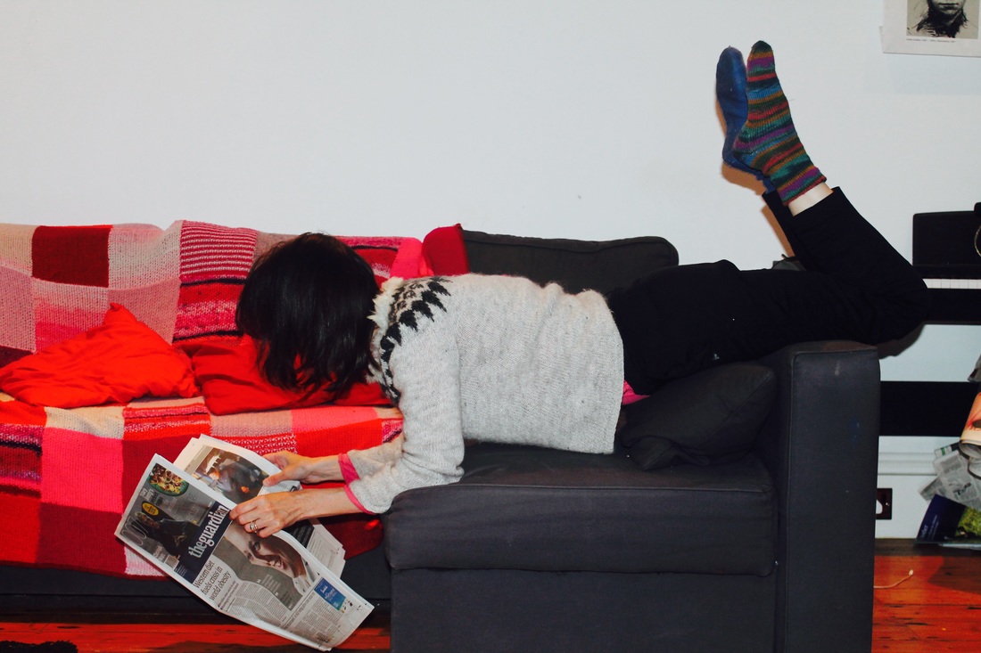
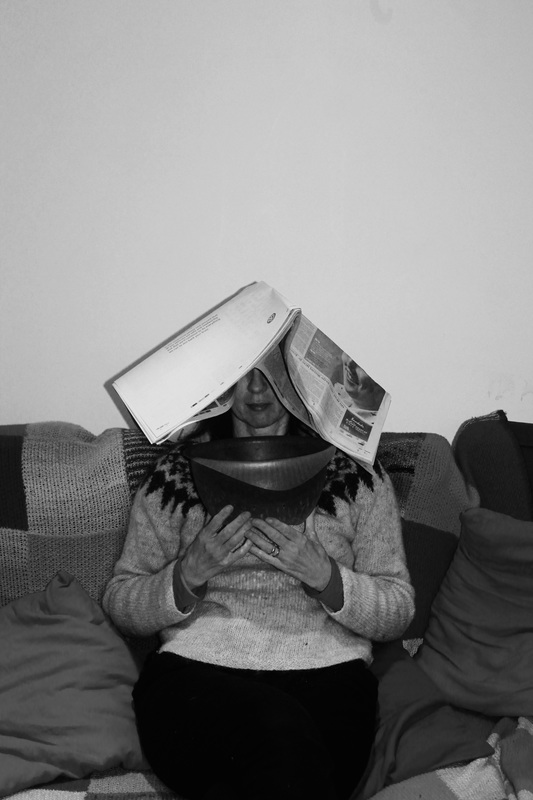
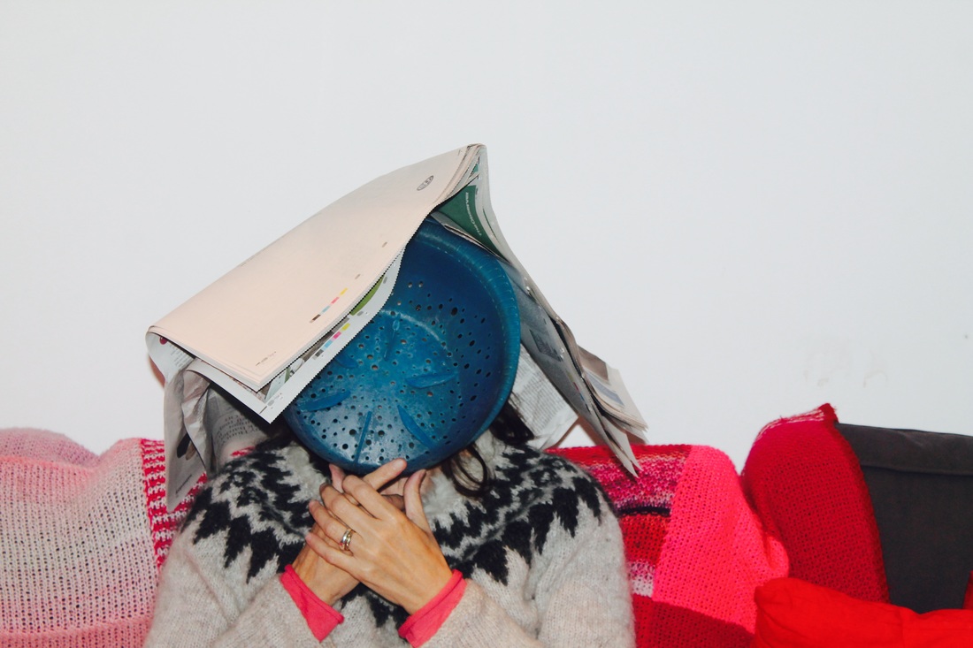
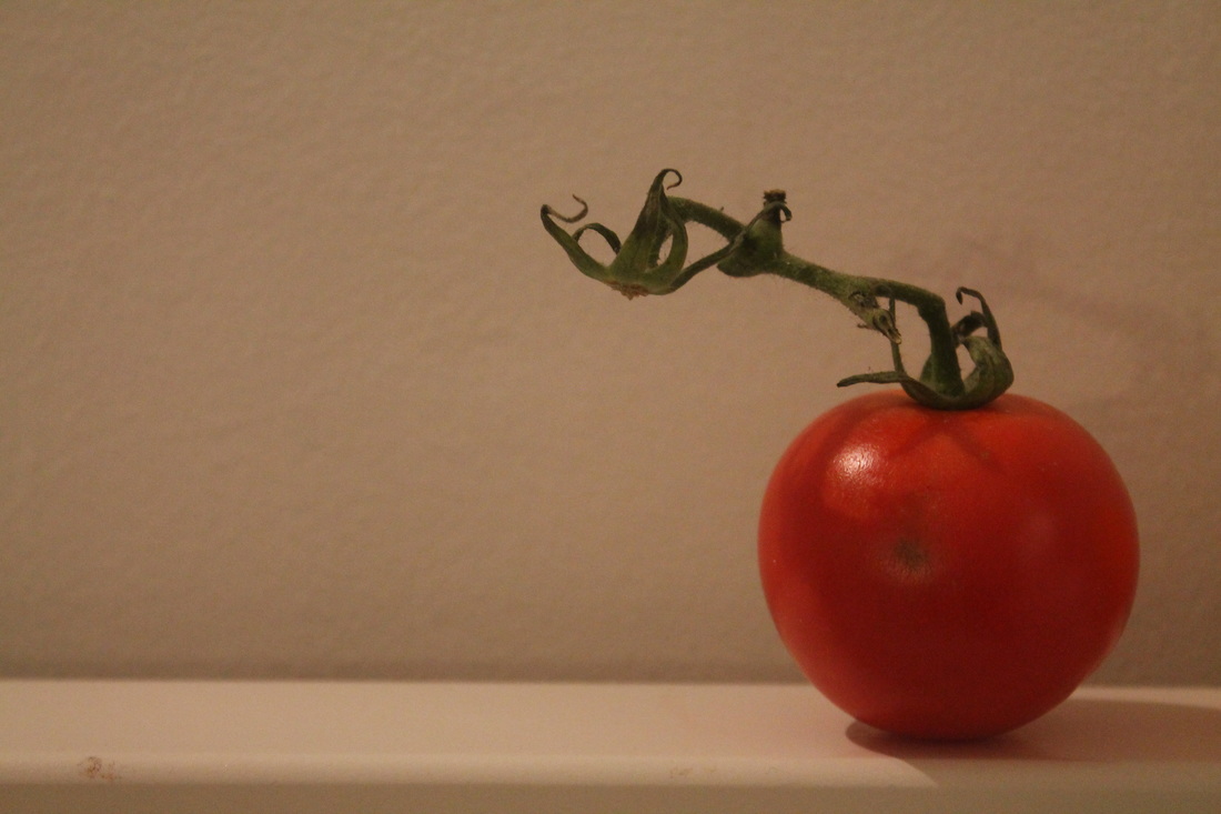
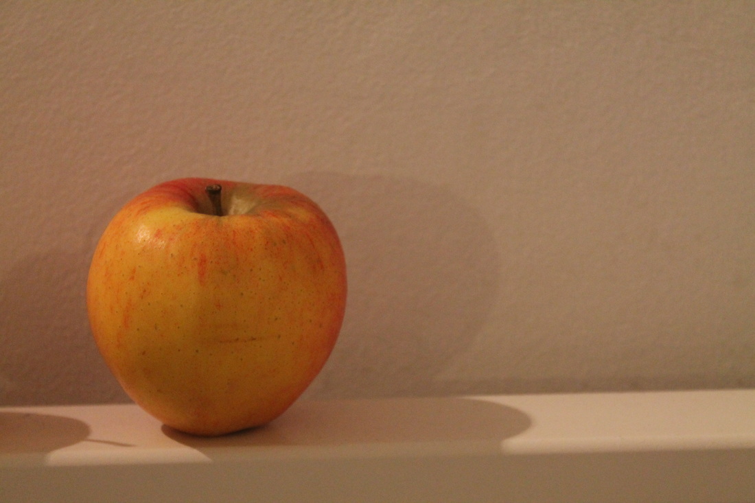
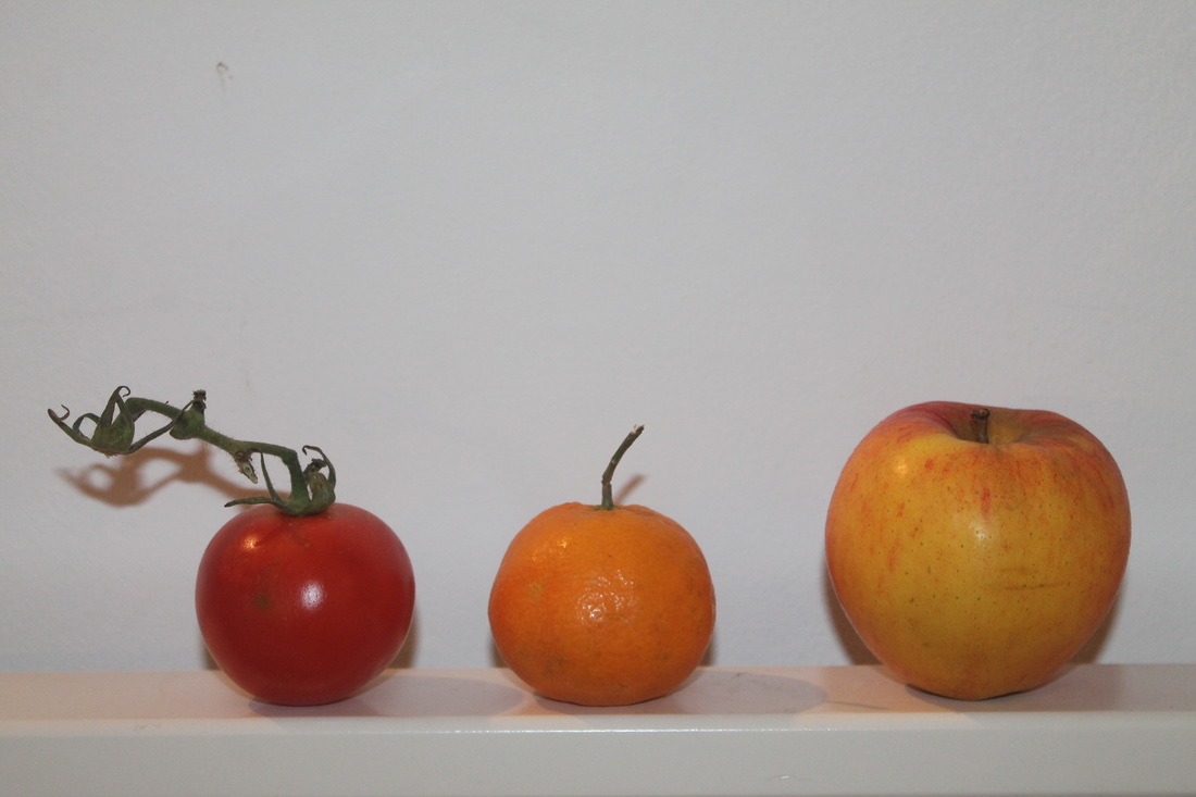
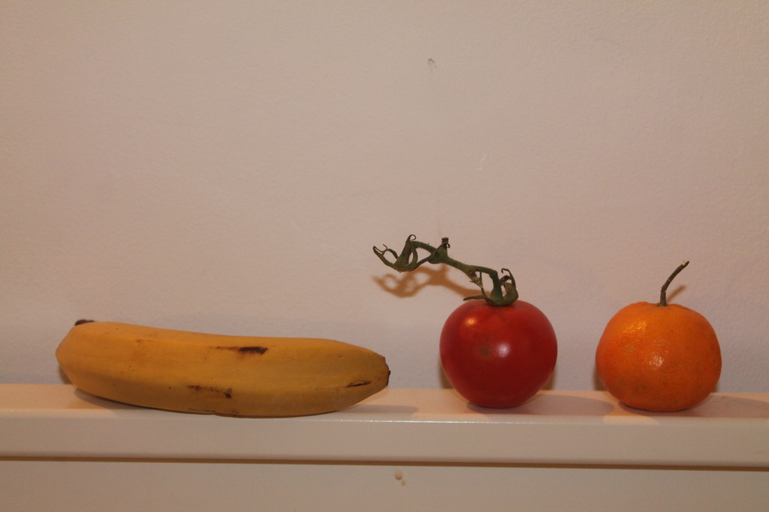
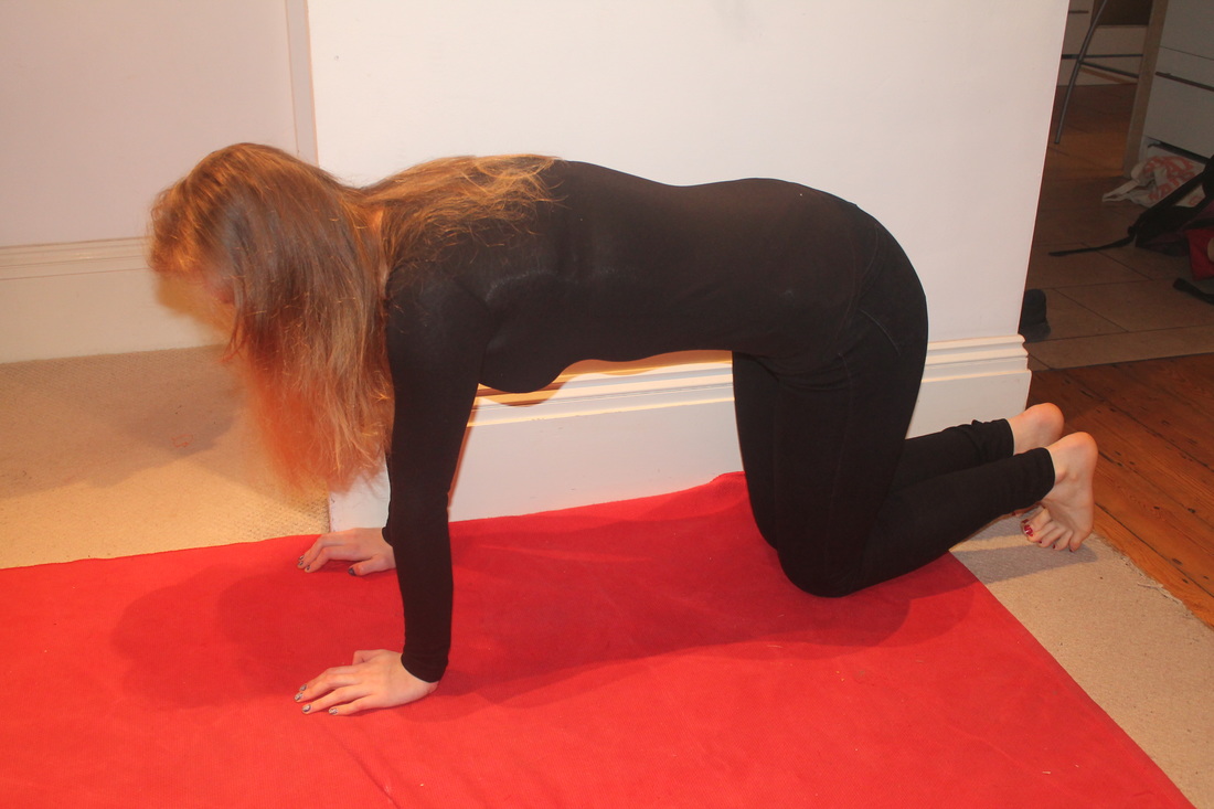
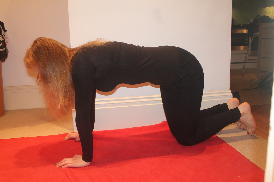
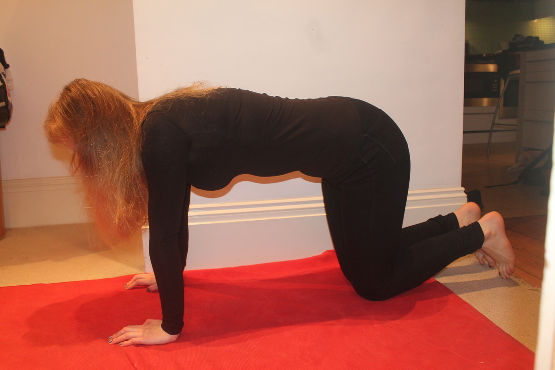
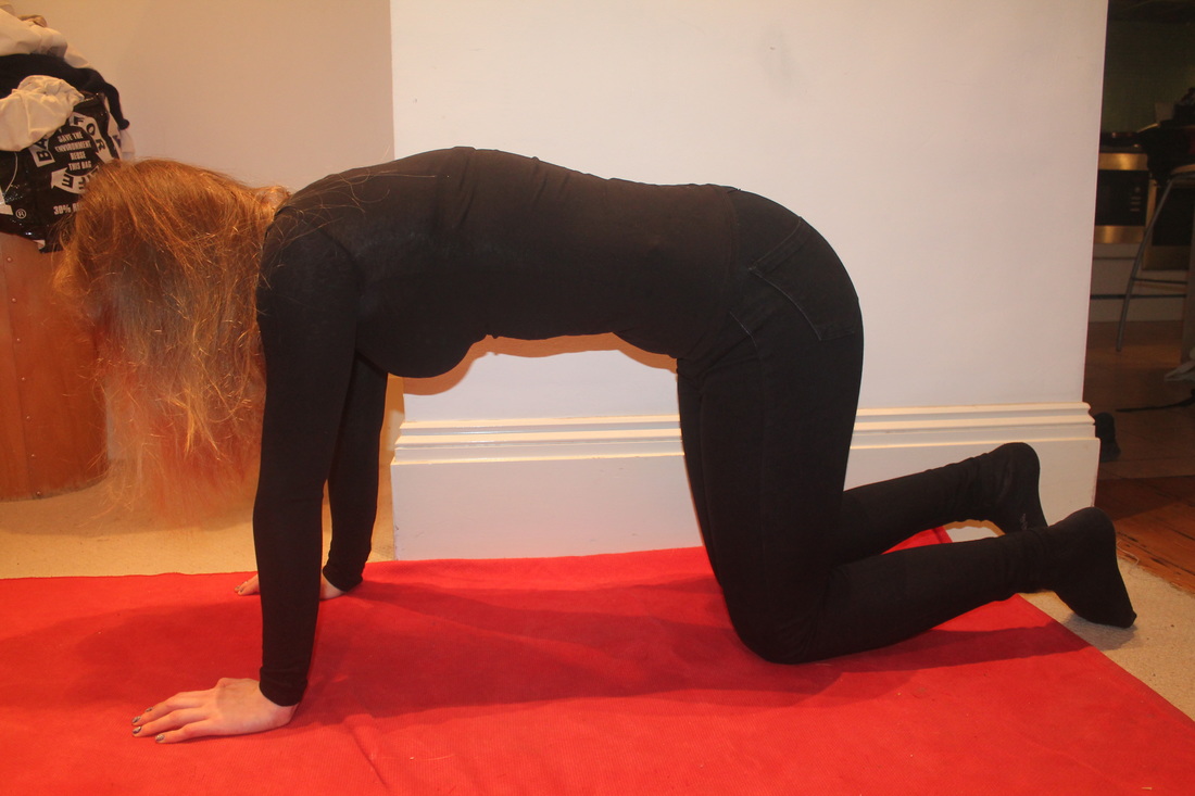
In my second set of images I wanted to again use an objects to create abstract images. I thought that some of my first images I took with the person holding the mirror - with the reflection of grass or trees- were quite successful therefore I wanted to use objects again. I started thinking about objects and there difference uses and how we as humans use them in our everyday lives. For example in my first couple of images I rolled up a carpet around myself as if I was being suffocated by a useful object. I also used a kite which is something we use to fly however I have used the object in the reverse way, as if the kite is dragging me down an not making me fly. The next few images were of me wearing objects that you wouldn't usually wear in those places for example the laces are things we use on our shoes. Inspired by the photographs of the sewn up orange I wanted to include some fruits in my images therefore I set up a still life not on a table but on my back, creating a place for the objects to sit.
During the process of taking these photographs I thought more about the objects in the images than the figure therefore I wanted to use myself in the images using a self timer in contrast to the other photographs I take whereby I use other people. I did this because I wanted to feel more part of the work rather than simply photographing somebody else's moment.
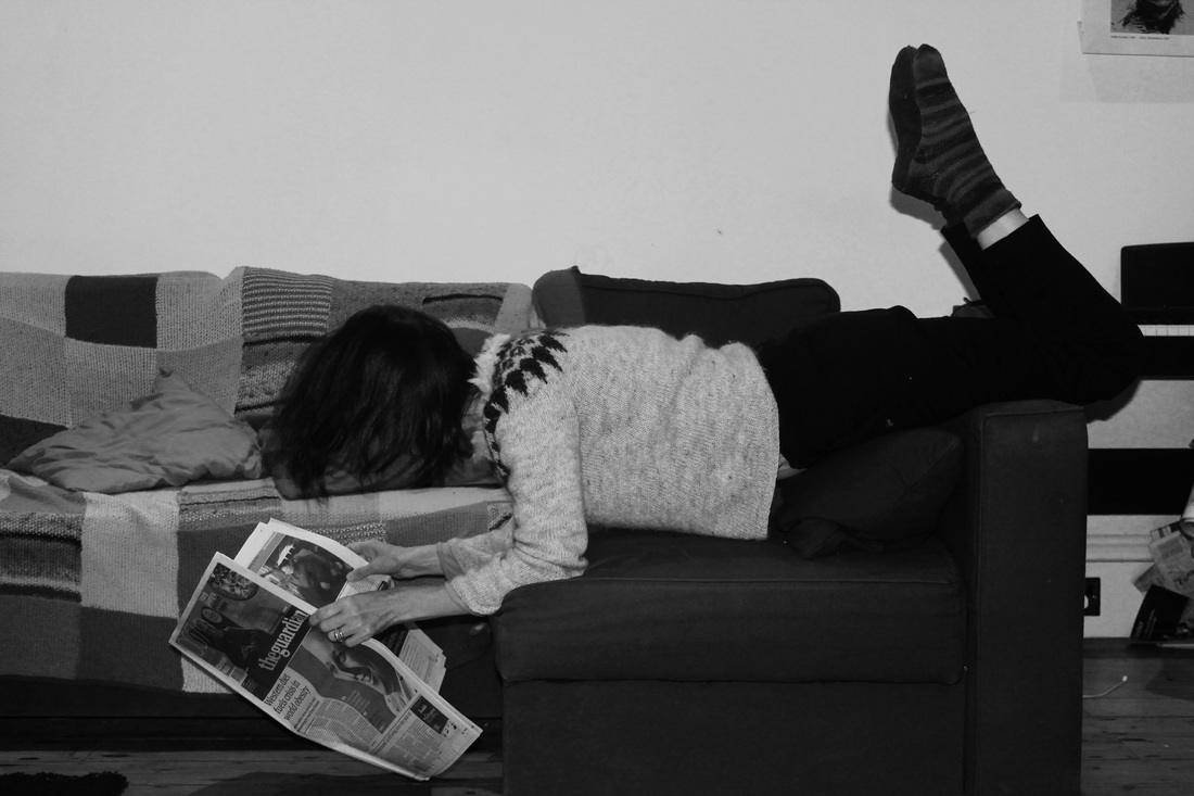
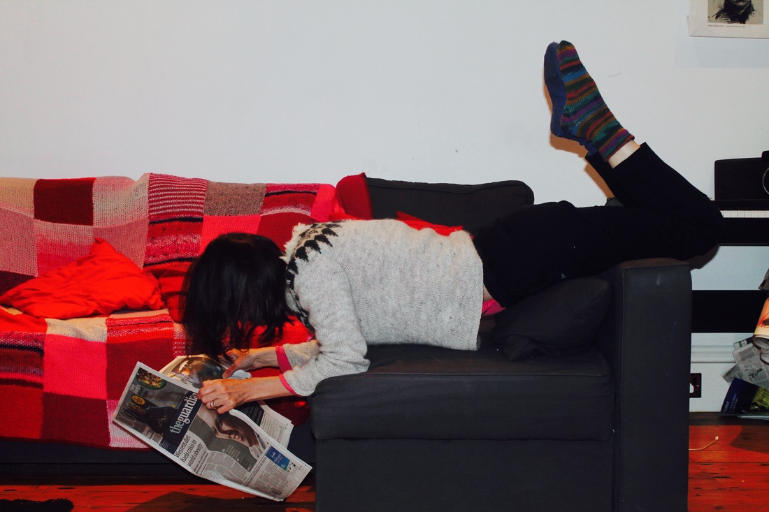
I also decided to edit this photographs, some with very saturated colour and others in black and white. I decided to edit some in different ways so that I could see which ones work better than others. I could then take this knowledge and use it for my next set of images, extended on the ideas I have already created in these photographs.
During the process of taking these photographs I thought more about the objects in the images than the figure therefore I wanted to use myself in the images using a self timer in contrast to the other photographs I take whereby I use other people. I did this because I wanted to feel more part of the work rather than simply photographing somebody else's moment.
I also decided to edit this photographs, some with very saturated colour and others in black and white. I decided to edit some in different ways so that I could see which ones work better than others. I could then take this knowledge and use it for my next set of images, extended on the ideas I have already created in these photographs.
Photoshoot #5
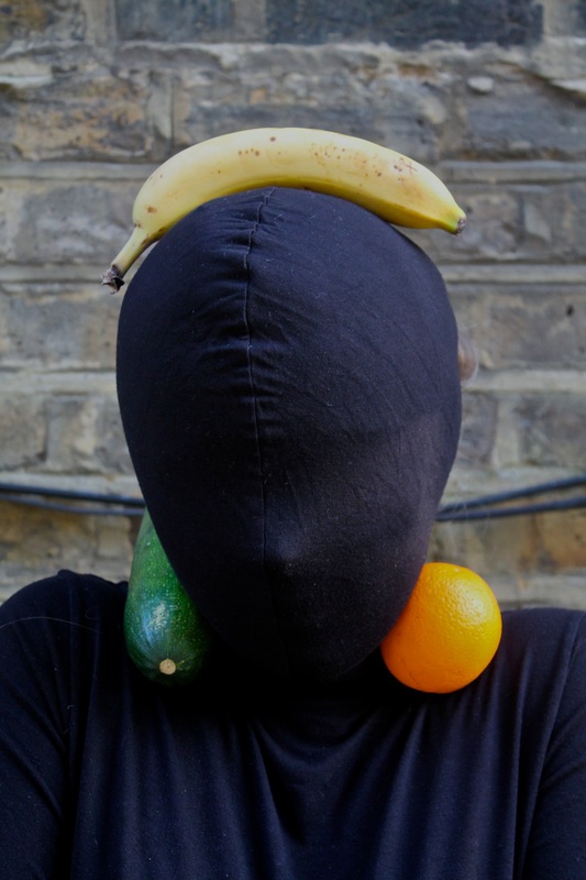
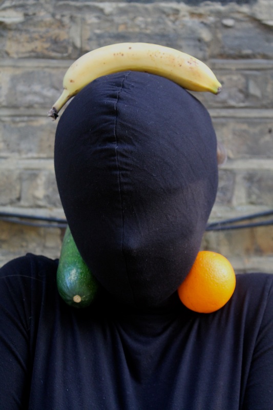
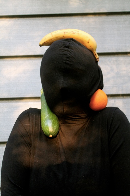
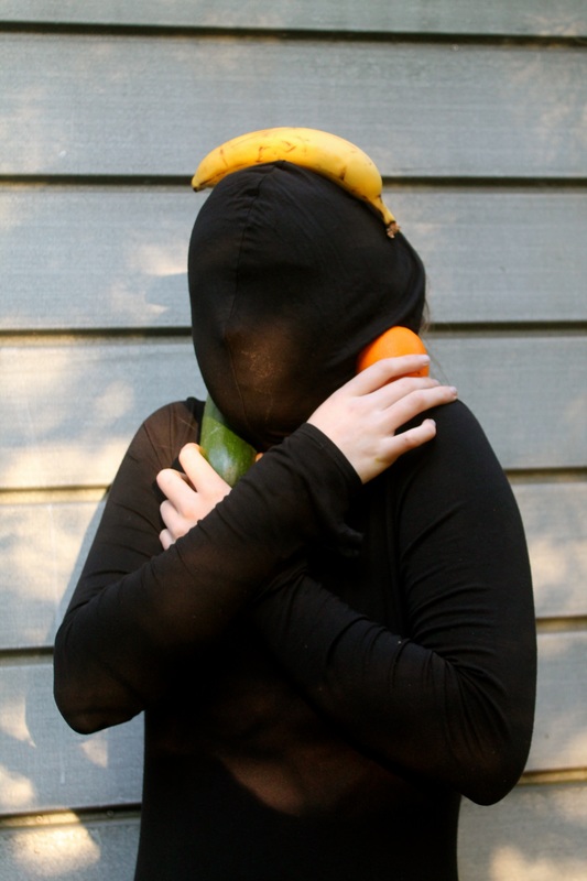
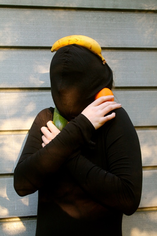
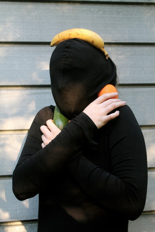
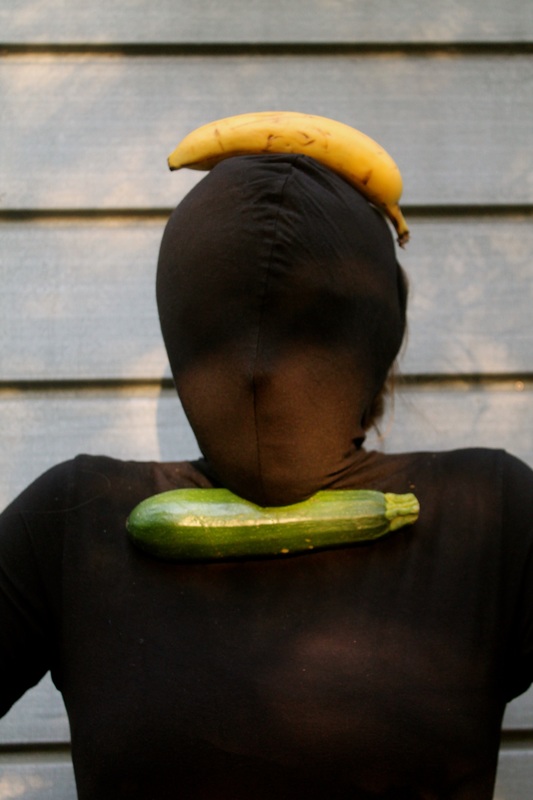
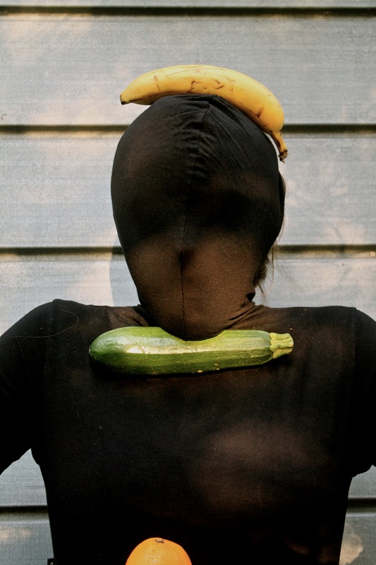
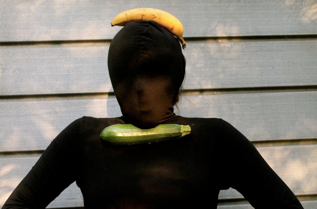
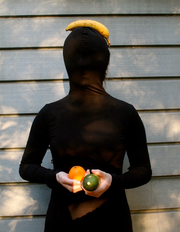
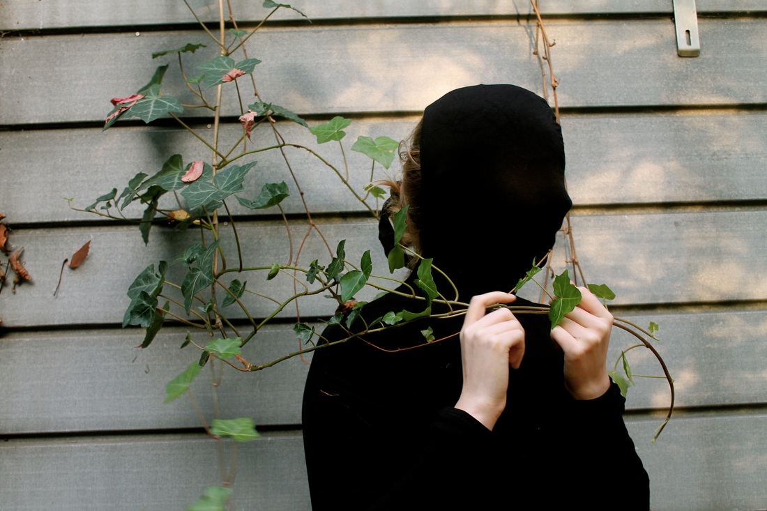
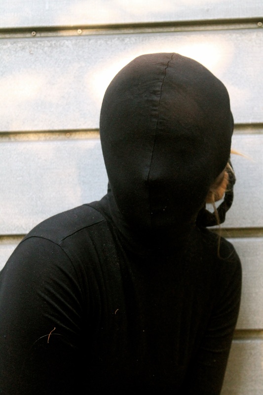
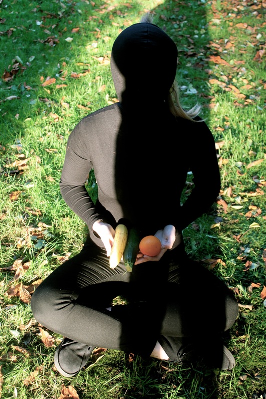
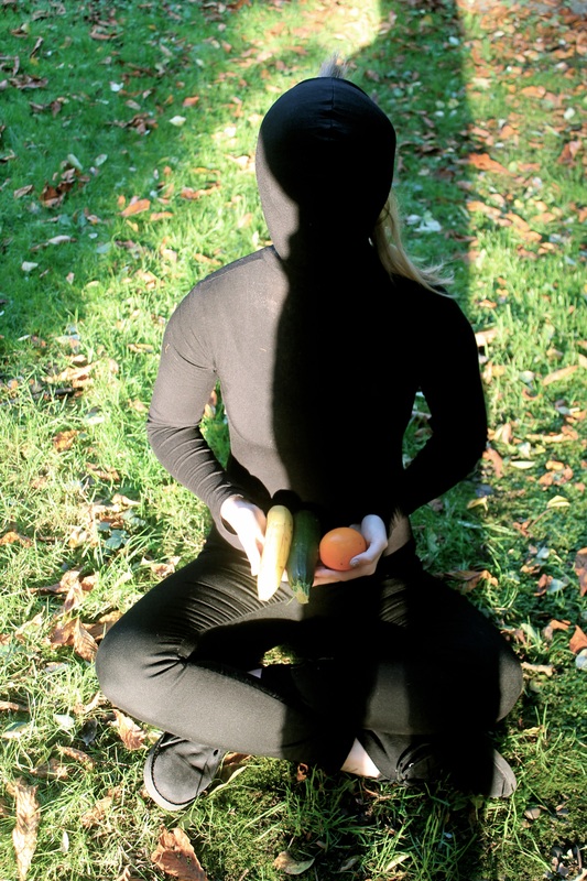
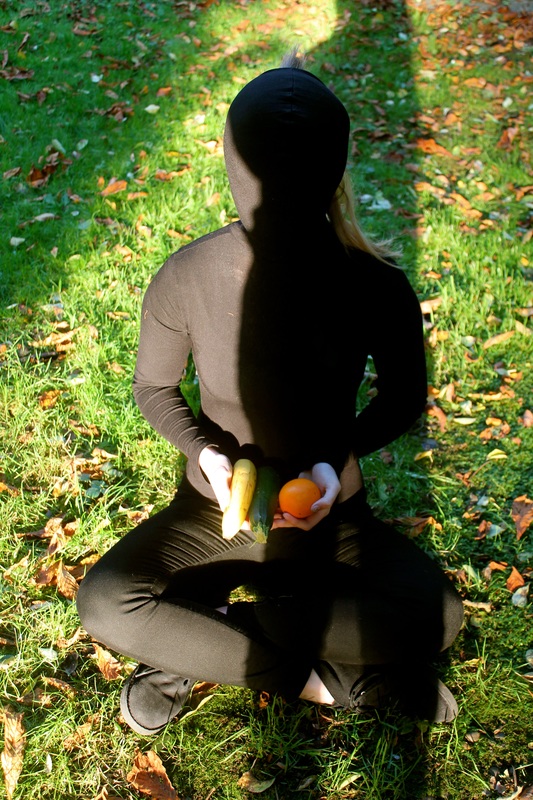
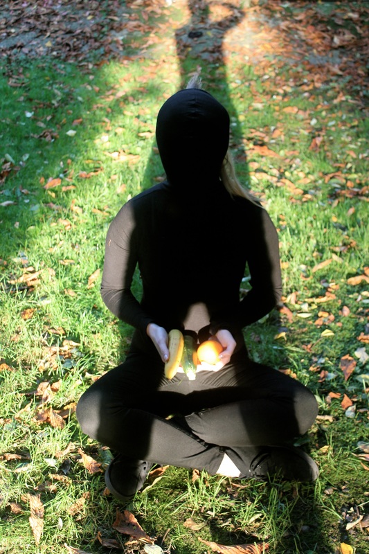
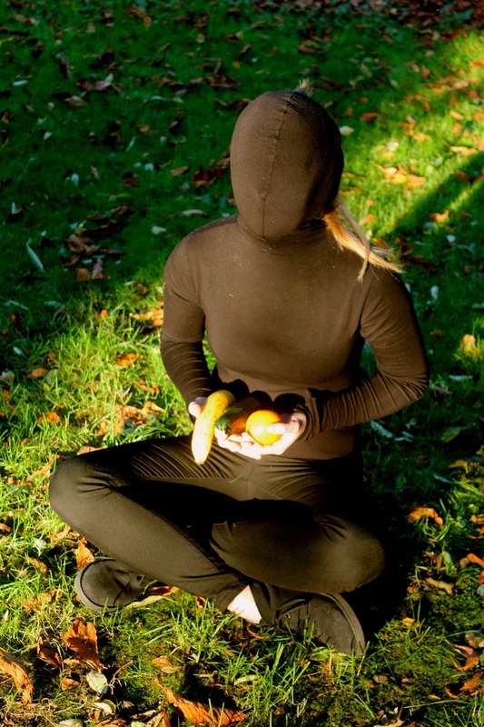
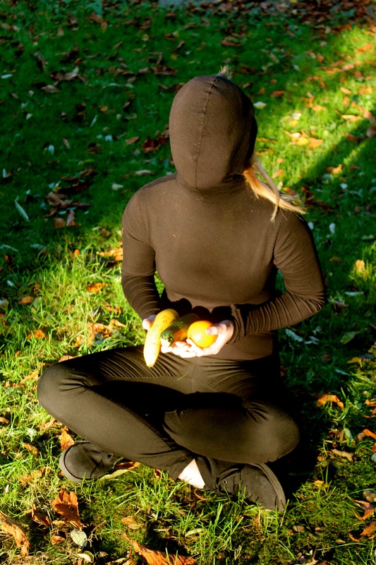
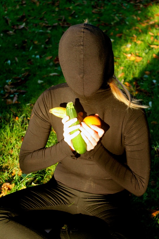
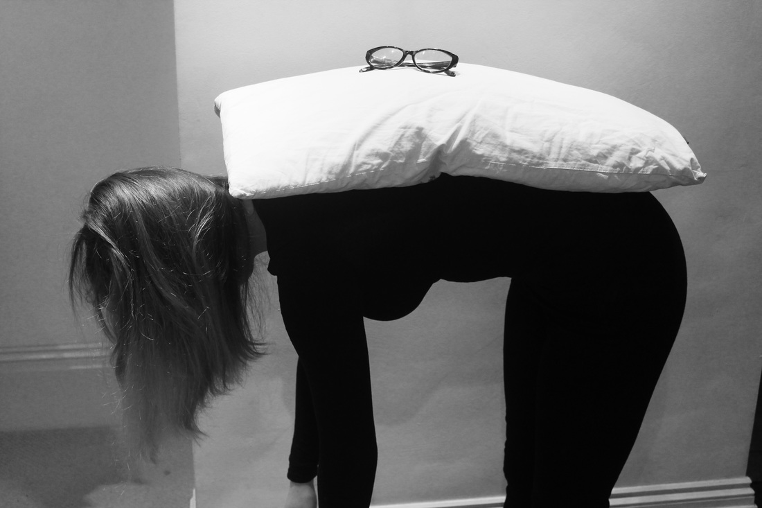
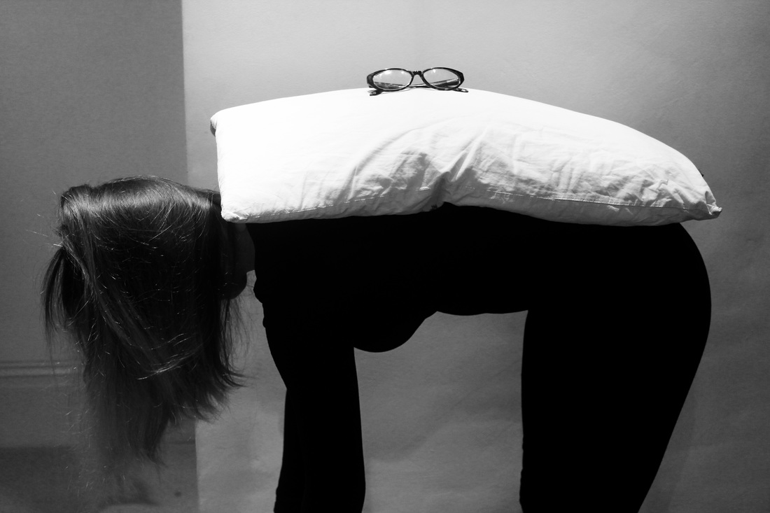
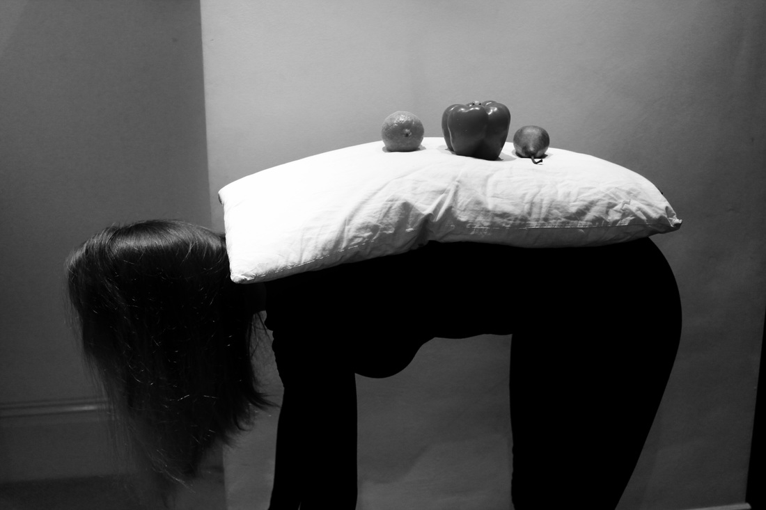
I wanted to look further into the idea of using everyday objects in my work and displaying them in a more unusual way, for example I used the fruit in the other photographs and displayed them on my arched back. Using similar fruit to before I decided to display them on a person however I did not want the persons identity to be revealed therefore I have covered them in a black top concealing their features and face. I quite like the idea of creating a still life on someone elses body rather than simply taking a more traditional photo. This way of working is something I would like to experiment with through some film
Final Piece 1 - a short film using mirrors and nature
absurd from Clara Bach on Vimeo.
David Shrigley
|
David Shrigley, born in 1968 is visual artist working with drawing, painting sculpture animation and photography.
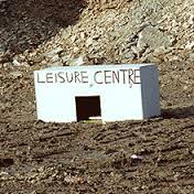
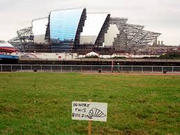
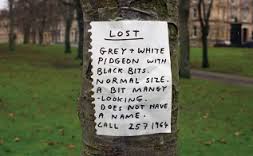
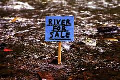
In these photographs David Shrigley has used 'absurd phrases' over quite normal photographs making them seem absurd. At first glance the images seem quite silly and simplistic which arguable are what they are however when looking deeper into the images we begin to understand that the artist in using his work to comment on something. The simple and clear signs are situated in environments that like to the writing or not at all for example in the 'leisure centre' photograph the box is displayed in a what looks like a deserted place however the sign which says 'river for sale' is displayed in a river. I'm not sure if I really like his work however I quite like the way its playful and fun and quite easy to interpret. However, I don't want to do exstensive works and experiments inspired by this artist as I prefer not using text in photographs. 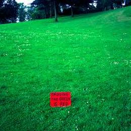
This is one of Shrigley's most famous images. The red sign says 'imagine the green is red'. As the viewer, we notice the grass is quite obviously green which means the artist is making a satirical remark.
Photoshoot #6 |
These six images are a selection of Shrigley's work. I quite like the more simplistic signs for example the sign that says 'river for sale' that is placed in a river.
|

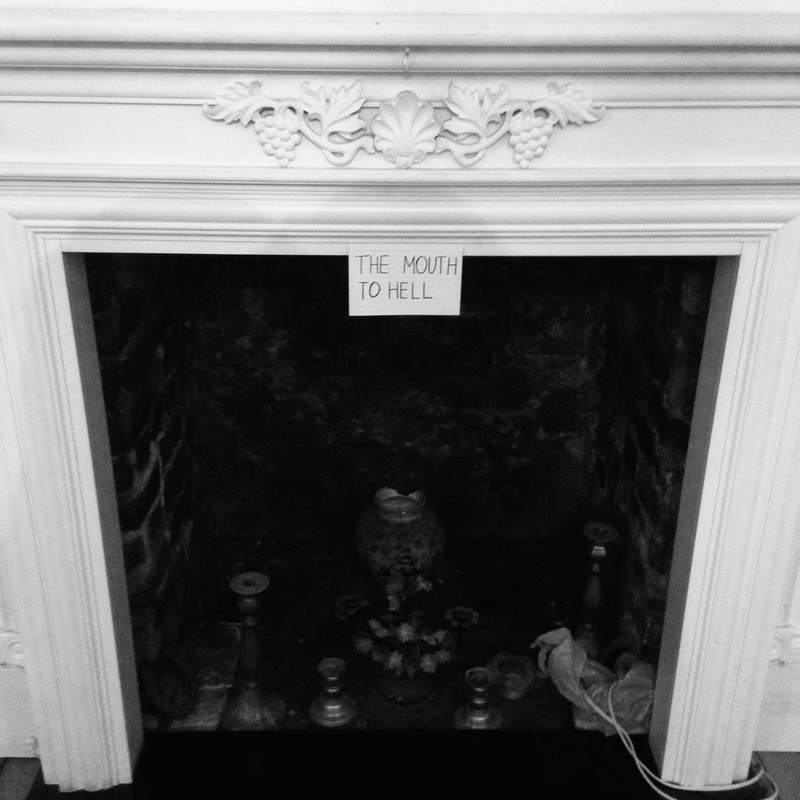
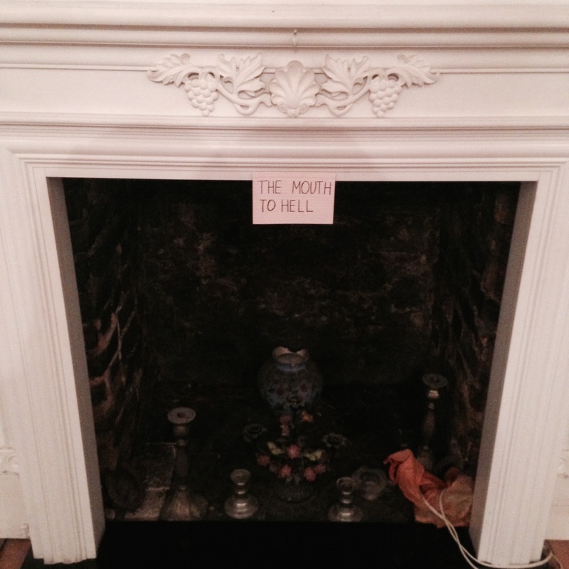
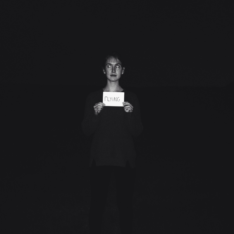
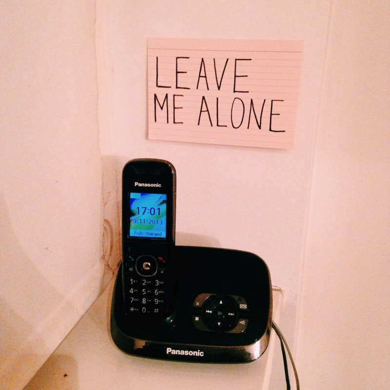
Inspired by the works of Shrigley I decided to make my own signs and display them in different ways. I liked the simplistic qualities of Shrigley's work therefore I wanted to make the signs quite simple. However, I also liked the idea of making the signs intriguing and questioning to look at. I think the key to making these images successful is to ensure the composition is clear and simple so that the sign stands out. Also, I wanted the sign to correspond with the background of the image so that it sort of makes sense.
For example in one of my first images I took with the sign that reads 'mouth to hell' the viewer questions what the mouth to hell is until we look closer into it and realise there is a dark open space behind it that could be the 'mouth'
For example in one of my first images I took with the sign that reads 'mouth to hell' the viewer questions what the mouth to hell is until we look closer into it and realise there is a dark open space behind it that could be the 'mouth'
Why do I not want to use elements of Shrigley's work in my own?
I quite liked the idea of using text within my work however this is not something I want to carry on doing. Instead I want to take from his work the playfulness it of it, something I would like to show in my next set of images.
Photoshoot #7
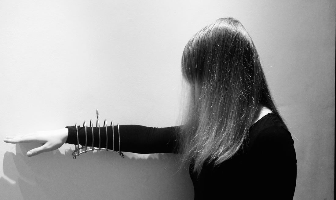
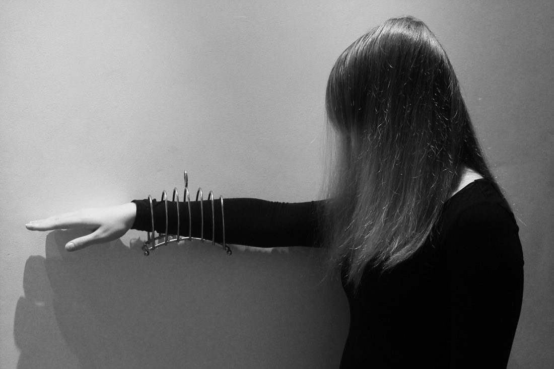
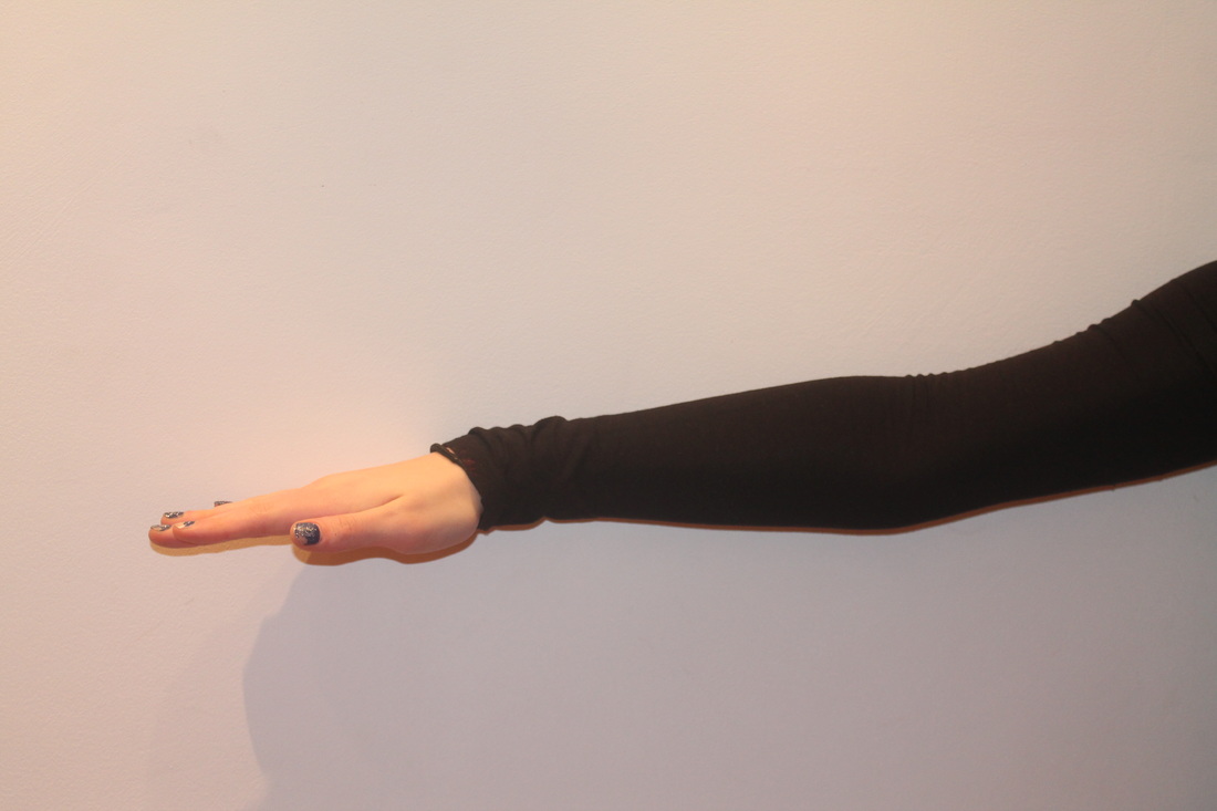
Yet again in this photoshoot I have developed upon the idea of using everyday objects in a more absurd way however instead of using black material to cover the face of the person I have used an everyday kitchen utensil of a cyclinder instead. I quite like this style of image because the object blends into the image better and is more intriguing however it is more obvious in these images that the object are displayed in an absurd way. I really like most of the images I have taken as I have continued to experiment with the same idea of using everyday objects so now I need to find a way of displaying them in an interesting way so that you can see the images clearly inside, alternatively I could use a more abstract display strategie which could change the images however seeing as the images are already absurd I may not need to do this,
Photoshoot #8
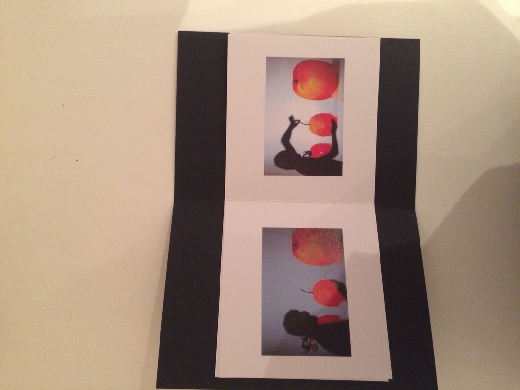
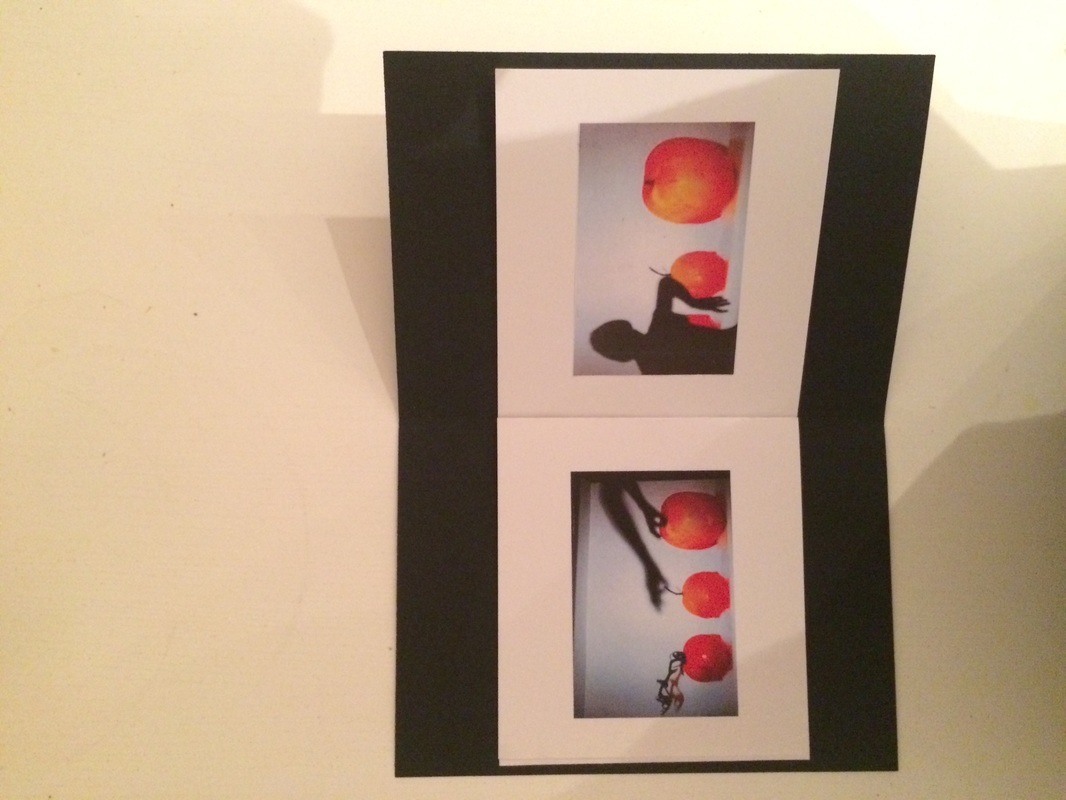
Book Final Piece
Book evaluation
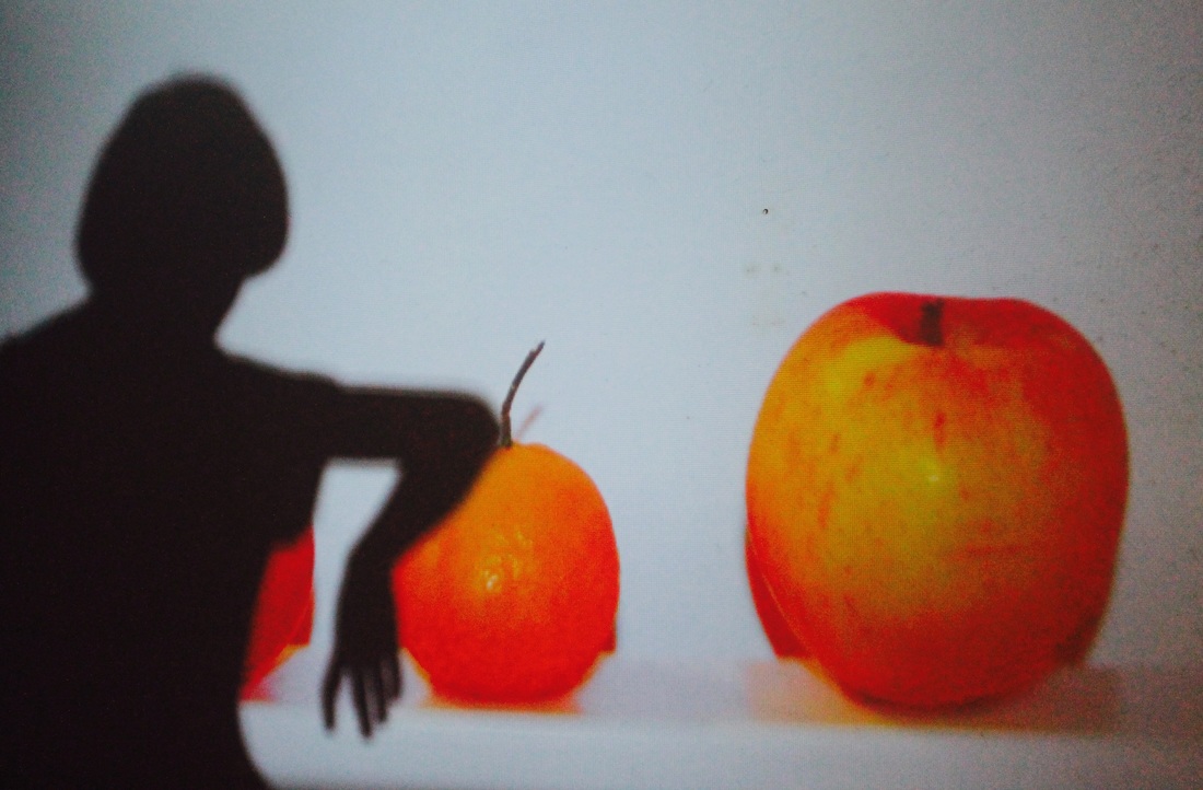
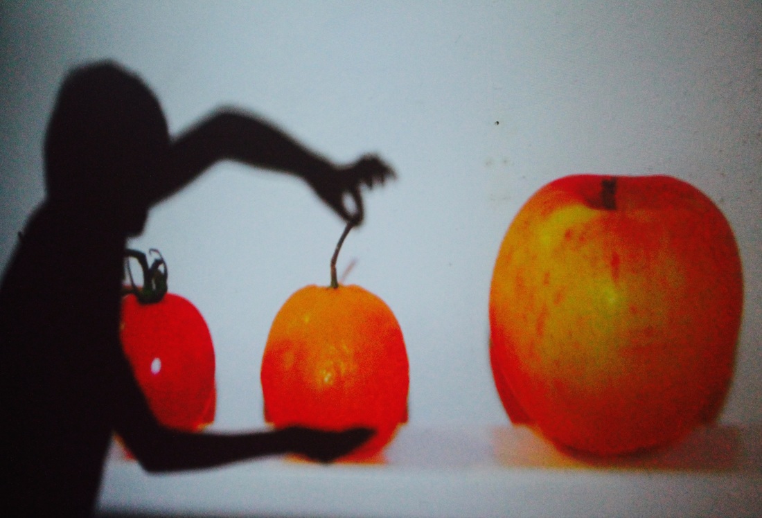
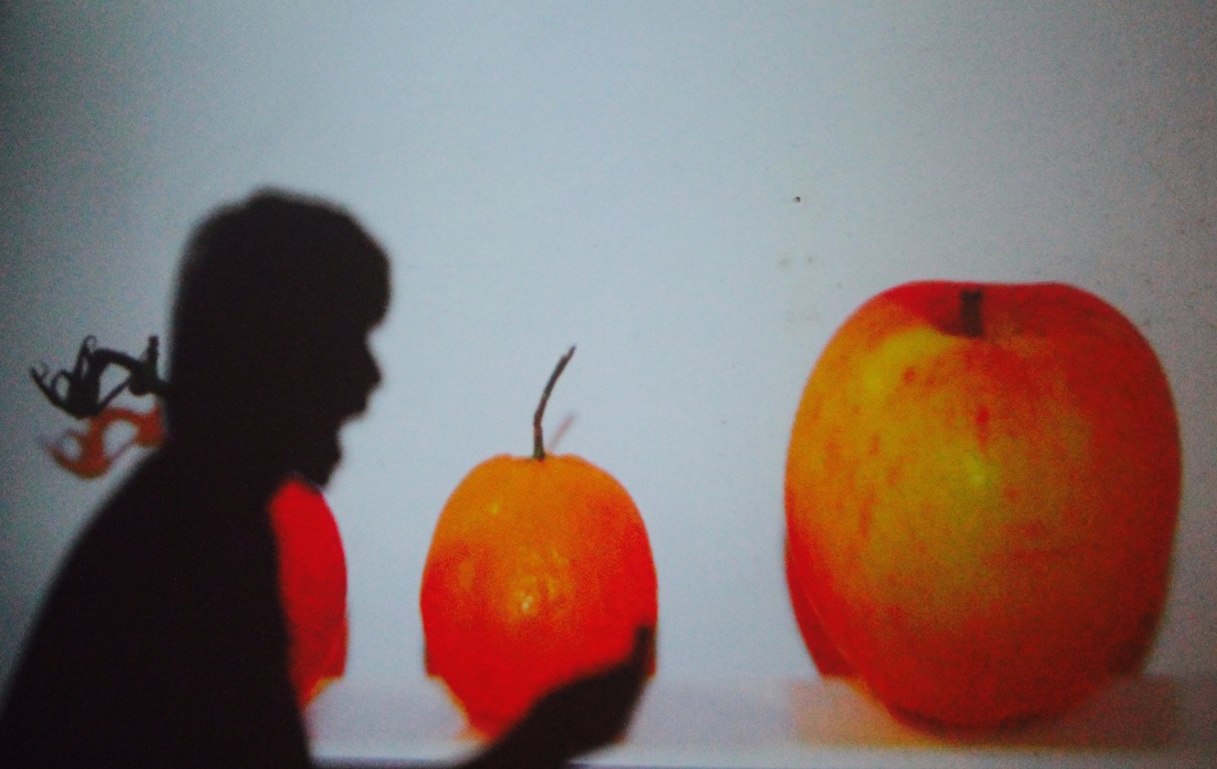
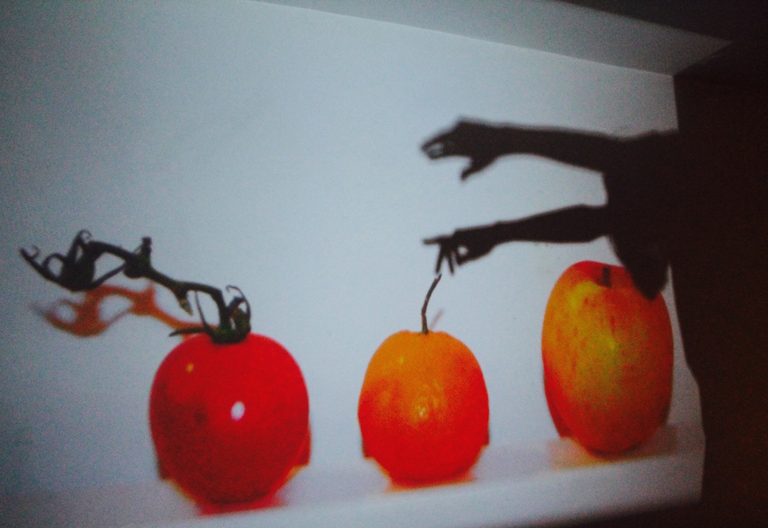
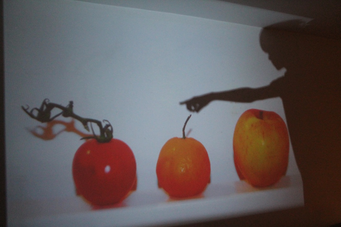
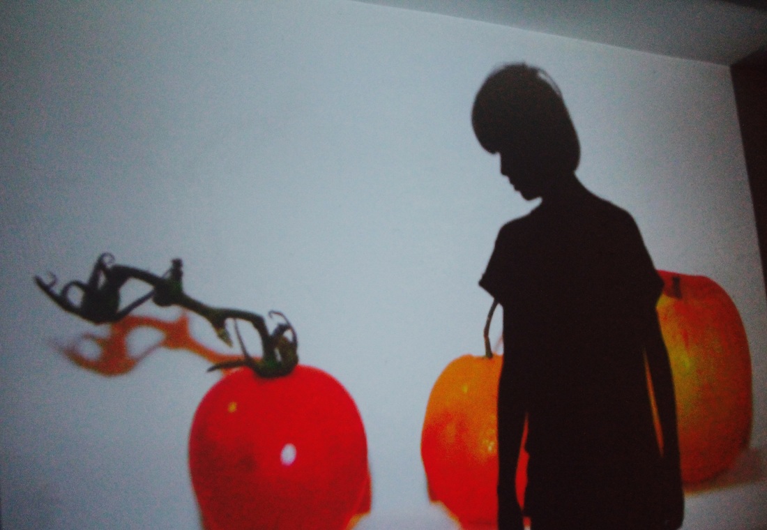
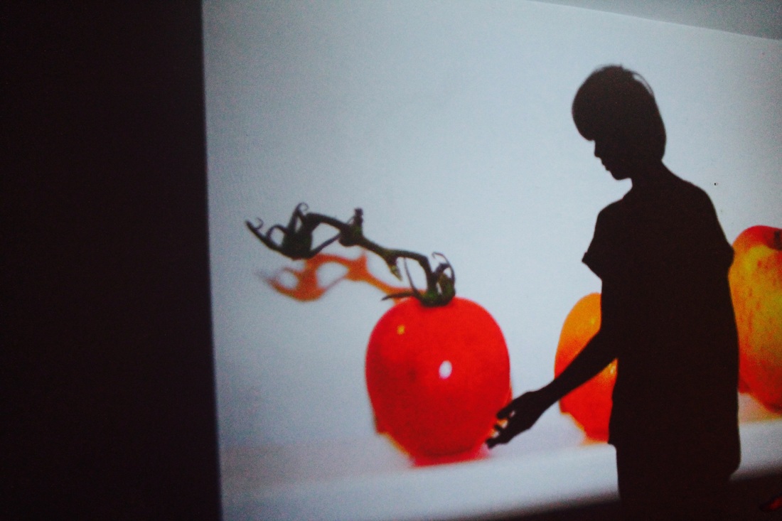
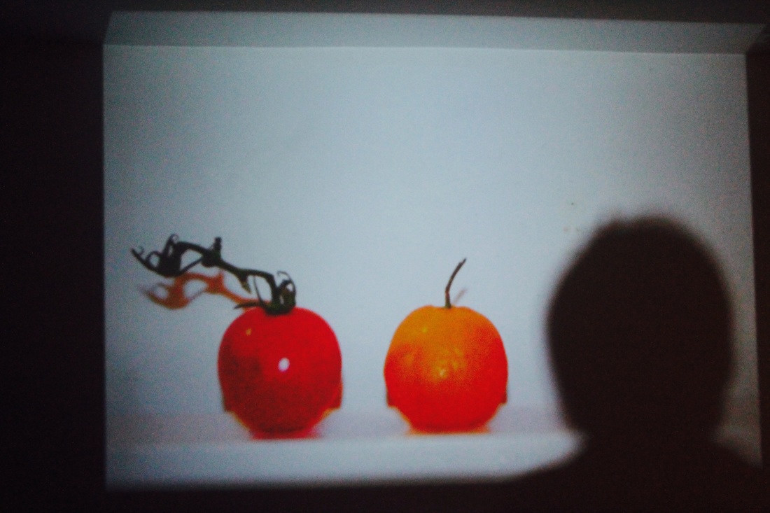
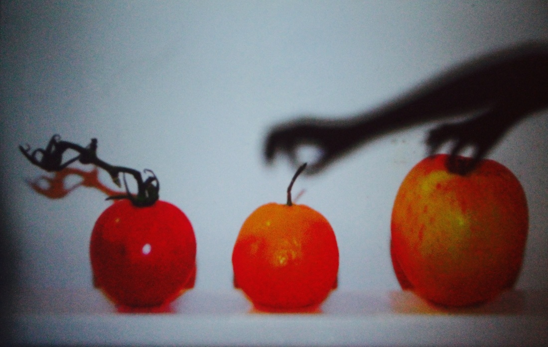
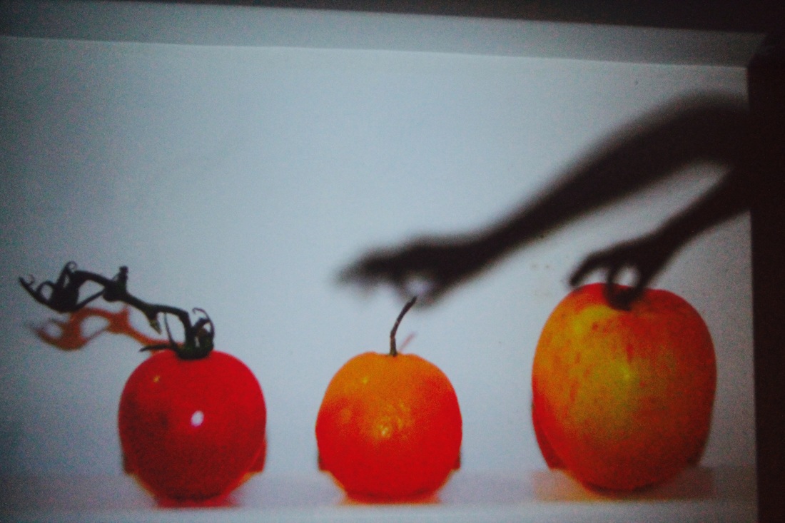
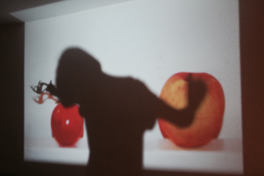
This is my first final piece for the theme absurd and I decided to make a book with the images. I did this because I wanted the final outcome to look like a story or have some kind of narrative behind it therefore by displaying photographs one after each other we can read it like a story book. The images I took took using a projecter was a final development of the images I had taken, exploring the different ways in which I could display everyday objects in more absurd ways.
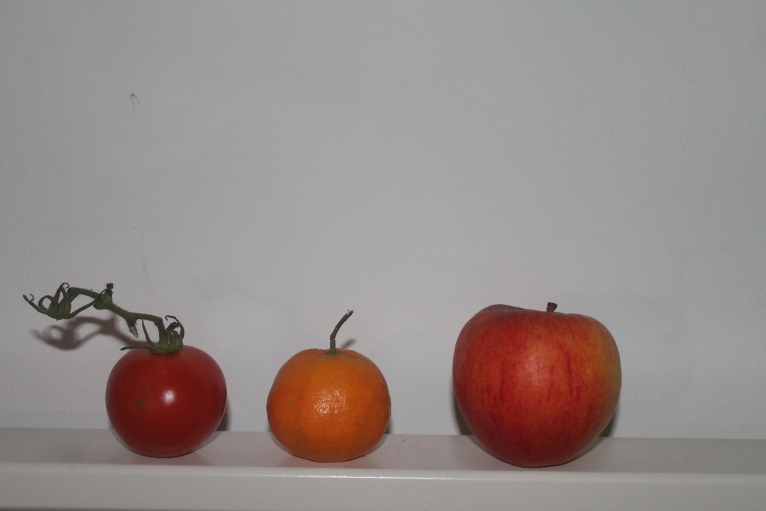
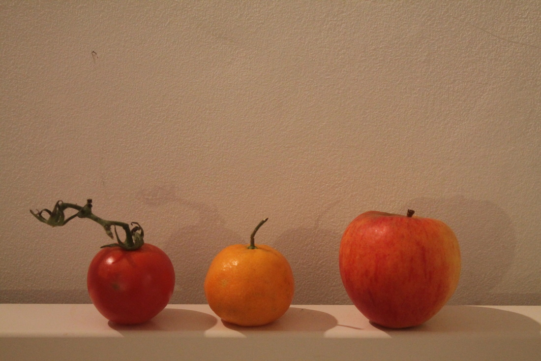
For example in the first page of the book I have used an image which makes a good starting photograph setting the scene for the rest of the story. The shadow of the figure casted on the wall looks like the he has just seen the three large fruits, it looks as though he is questioning his surroundings. The strong contrast between the colourful fruits and the black figure really gives the images more definition, making the figure stand out. I wanted the idea and concept to be clear through these images so that you can read the story properly and I think that this has been successful. The figure throughout is getting to know the three different fruits like they are becoming his friend. The very simple photographs are showing this through the person lying pointing and stroking the fruits.
These images are absurd not just because of the scale (for example fruit is not that big in comparison to an average human being) but because of the concept and details behind the image for example instead the figure being obvious I have used a dark shadow to represent the figure, resulting in a more mysterious outline making the viewer question what is really there,
Throughout the entire project I have been consistent and experimented with a similar idea to see through. This was an important goal for me as I often get sidetracked with makes my projects difficult to pin together. Therefore I sorted out this right at the start of my project by making a pinterest account so I could see which artists offer work related to the theme of disguise, I looked at a range of artists before persuing only a couple to help with my idea. My main idea, stemmed from the first evaluation of an orange was to see objects being used in different ways. For example at the beginning of the project I did a lot of work with mirrors, using a model to hold one to that that the reflection would be absurd. I used this idea to create a film.
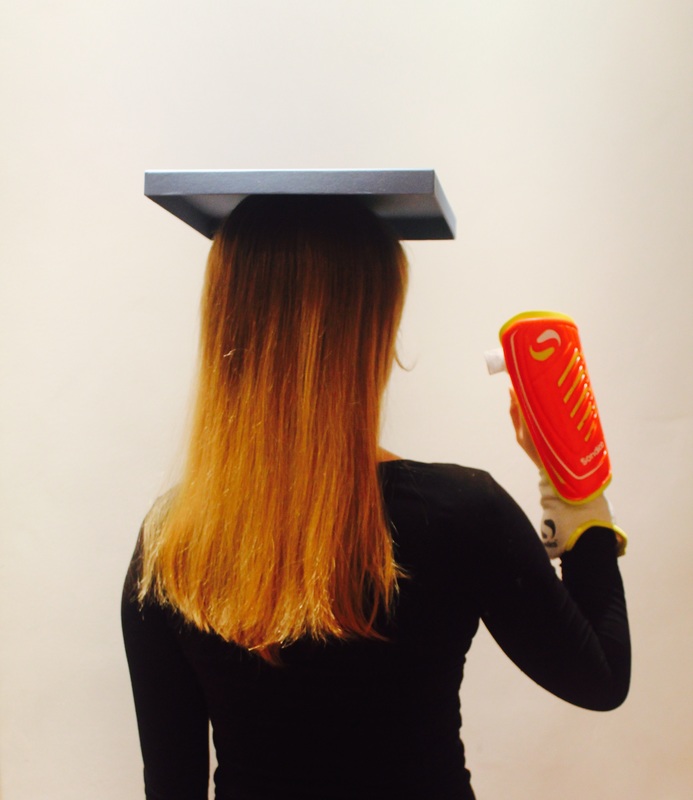
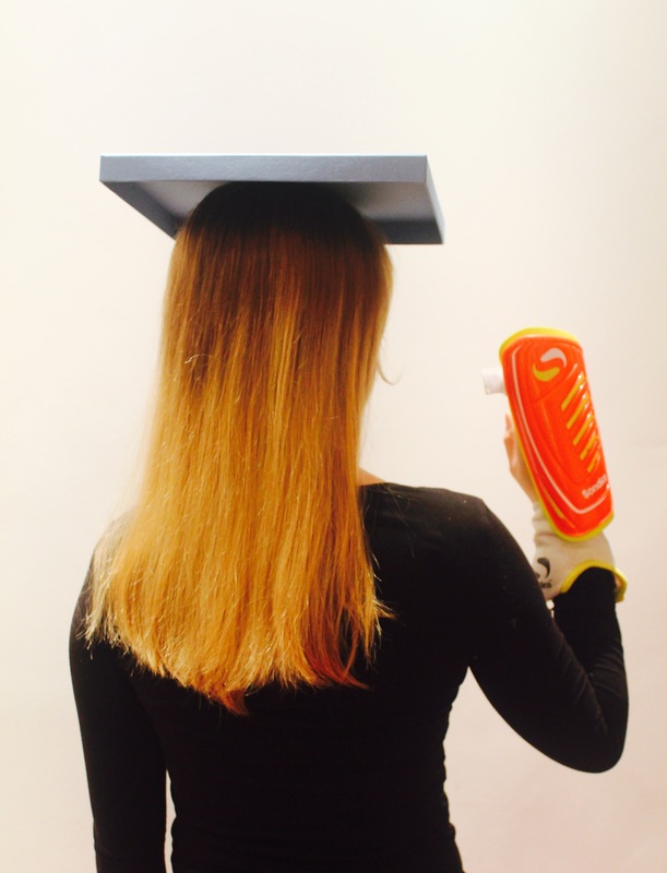
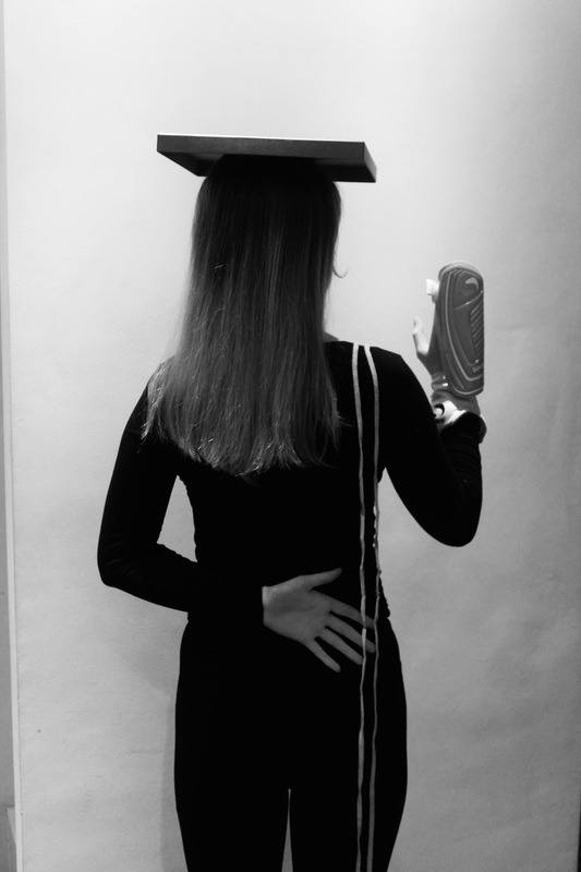
I then started to use more abstract objects such as football equipment, string, and a yoga mat and used them to hang of different parts of the body such as the shoulder instead of simply using the mat to sit on which is what it is designed to do. These created quite linear but absurd images however I felt like they were quite confusing to read as images. Therefore, I started to use my organic objects such as fruits which I thought made more successful images as I laid them on my back making them look like still lifes, however instead of using a plat or a flat surface I used my back to place the objects onto. I also tried experimenting with other objects however the fruits worked much better for me .
For example in the first page of the book I have used an image which makes a good starting photograph setting the scene for the rest of the story. The shadow of the figure casted on the wall looks like the he has just seen the three large fruits, it looks as though he is questioning his surroundings. The strong contrast between the colourful fruits and the black figure really gives the images more definition, making the figure stand out. I wanted the idea and concept to be clear through these images so that you can read the story properly and I think that this has been successful. The figure throughout is getting to know the three different fruits like they are becoming his friend. The very simple photographs are showing this through the person lying pointing and stroking the fruits.
These images are absurd not just because of the scale (for example fruit is not that big in comparison to an average human being) but because of the concept and details behind the image for example instead the figure being obvious I have used a dark shadow to represent the figure, resulting in a more mysterious outline making the viewer question what is really there,
Throughout the entire project I have been consistent and experimented with a similar idea to see through. This was an important goal for me as I often get sidetracked with makes my projects difficult to pin together. Therefore I sorted out this right at the start of my project by making a pinterest account so I could see which artists offer work related to the theme of disguise, I looked at a range of artists before persuing only a couple to help with my idea. My main idea, stemmed from the first evaluation of an orange was to see objects being used in different ways. For example at the beginning of the project I did a lot of work with mirrors, using a model to hold one to that that the reflection would be absurd. I used this idea to create a film.
I then started to use more abstract objects such as football equipment, string, and a yoga mat and used them to hang of different parts of the body such as the shoulder instead of simply using the mat to sit on which is what it is designed to do. These created quite linear but absurd images however I felt like they were quite confusing to read as images. Therefore, I started to use my organic objects such as fruits which I thought made more successful images as I laid them on my back making them look like still lifes, however instead of using a plat or a flat surface I used my back to place the objects onto. I also tried experimenting with other objects however the fruits worked much better for me .
