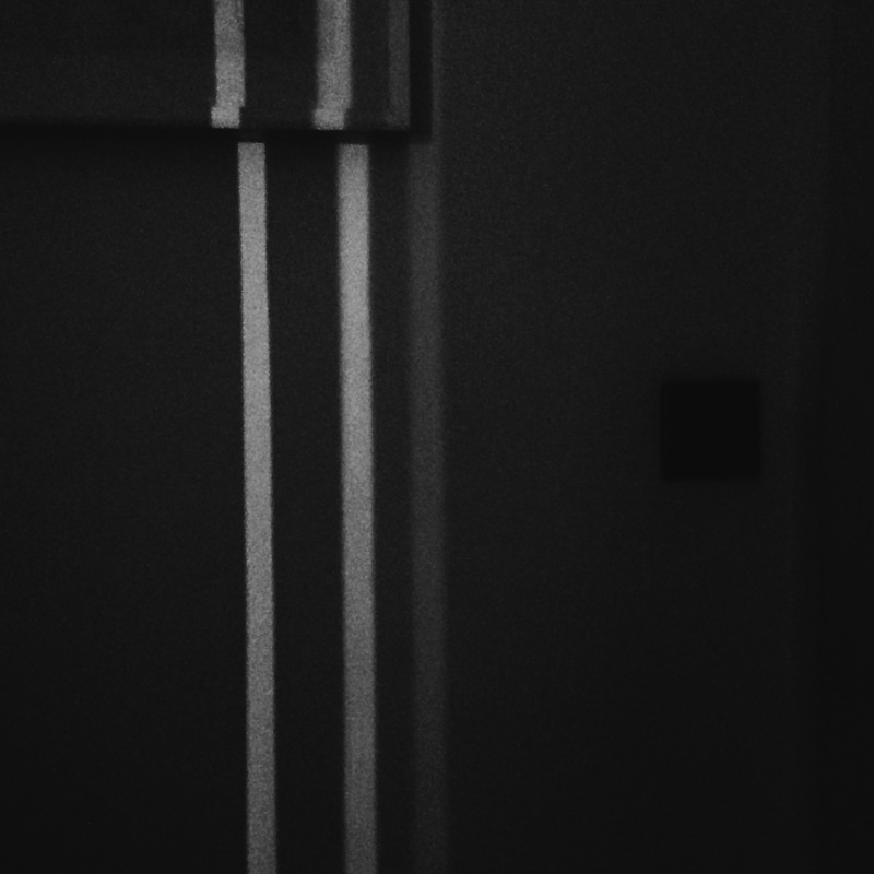
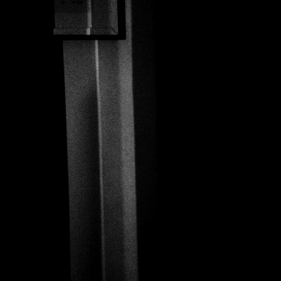
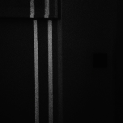
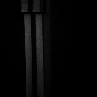
Contrast
|
Chiaroscuro (English pronunciation: /kiˌɑːrəˈskjʊəroʊ/; Italian: [kjarosˈkuːro]; Italian for light-dark) in art is the use of strong contrasts between light and dark, usually bold contrasts affecting a whole composition.
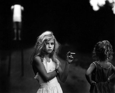
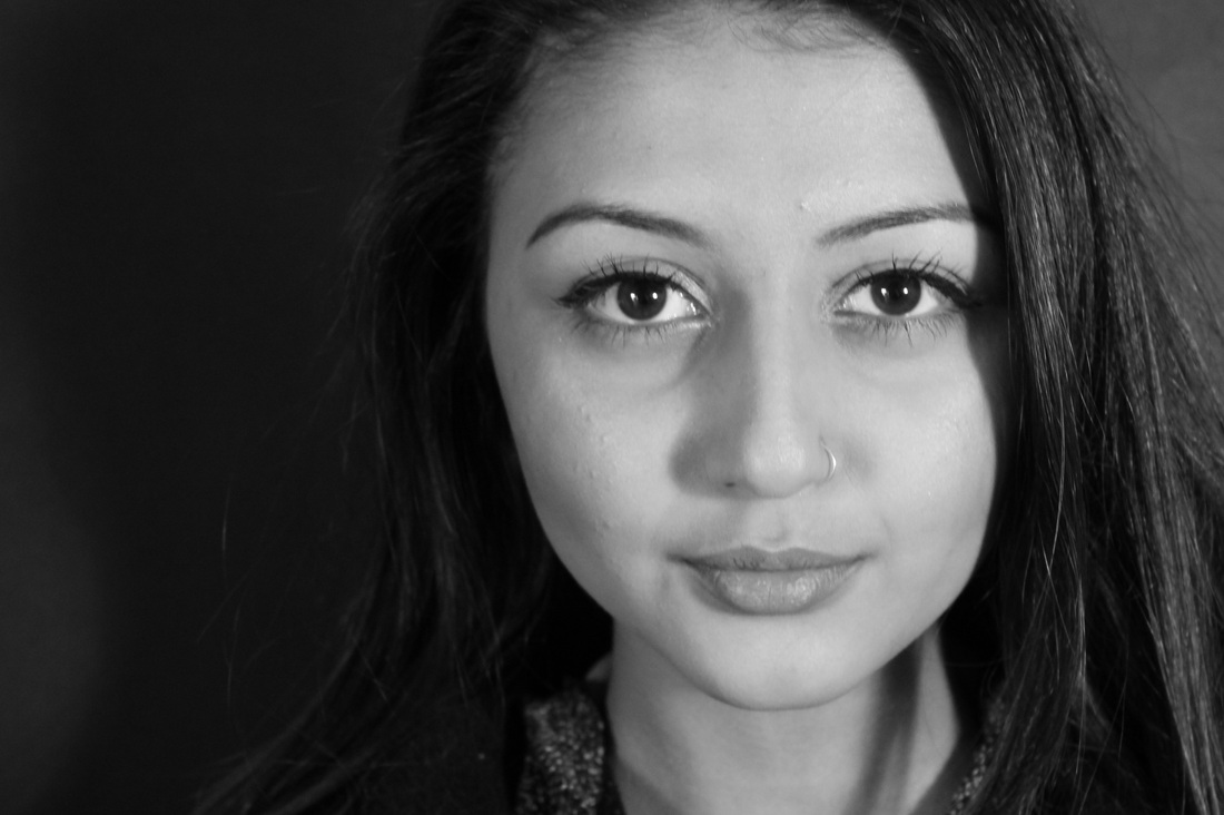
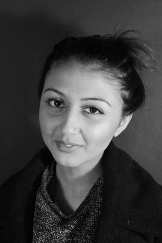
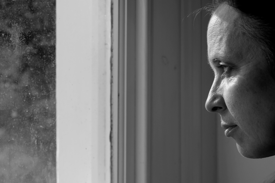
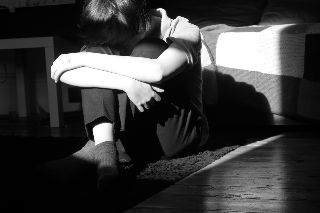
The italian word translates to light-dark in english, it refers to strong contrasts between light and dark. This term is often used by artists and art historians when describing photographs with an overall sense of volume, often in modelling or images including objects. This example shown here is by a photographer names Sally Mann. In this image there is a strong contrast between the lighter and darker tones. The photographer has chosen to use natural light to highlight the the figure. Although there is a strong light on the girl the surround area is very dark, this results in a strong contrast (chiaroscuro). |
|
Sally Mann
|
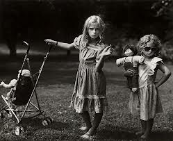
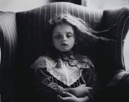
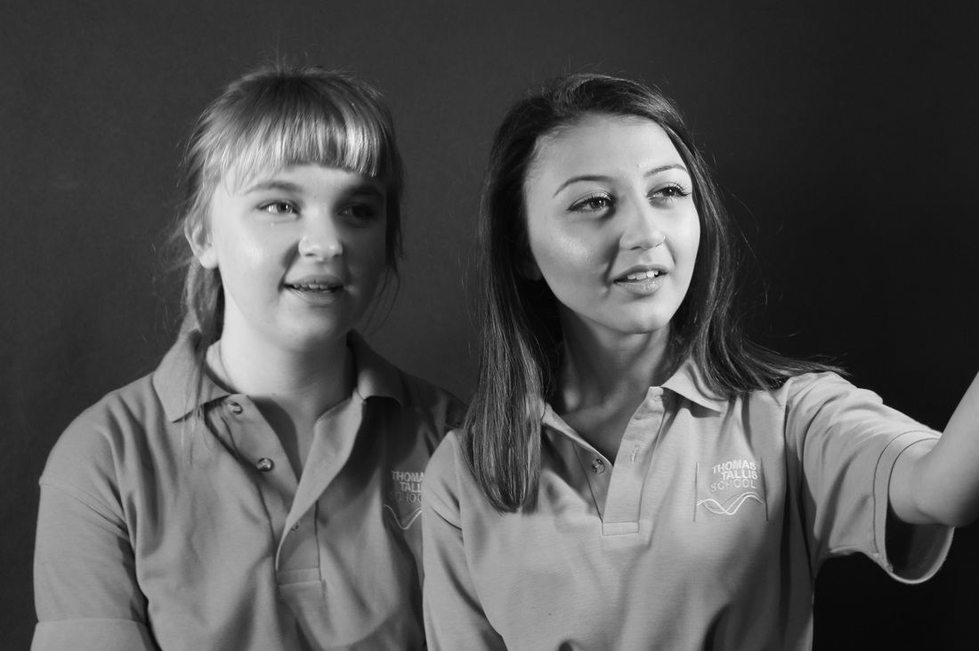
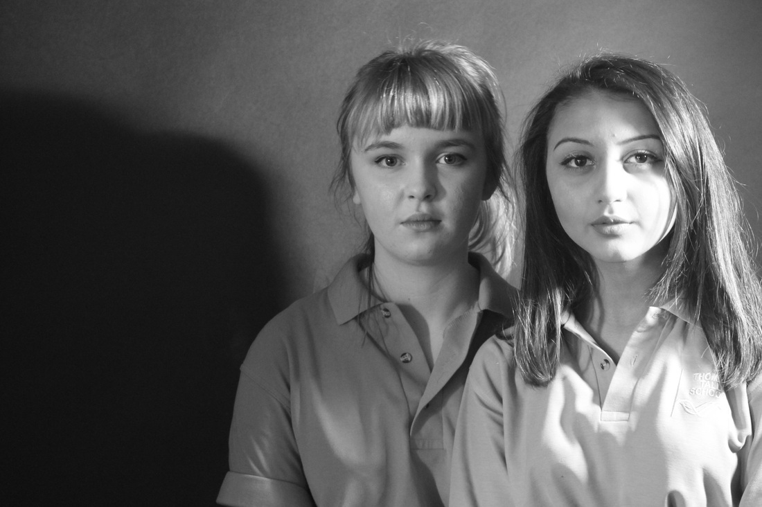
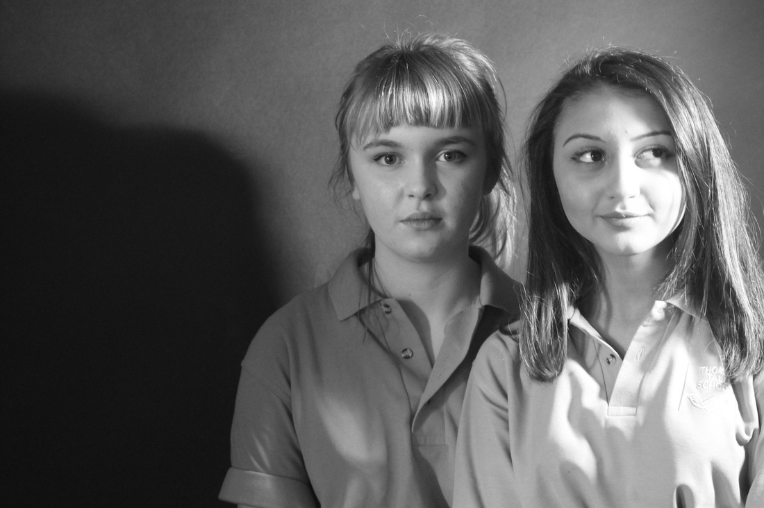
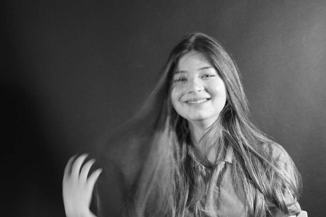
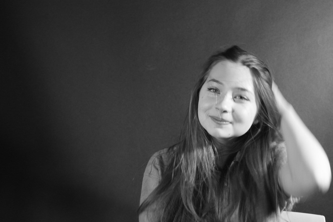
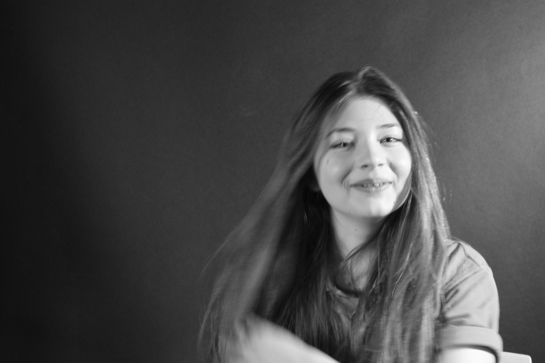
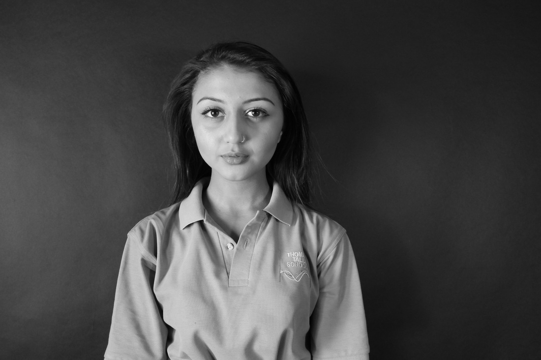
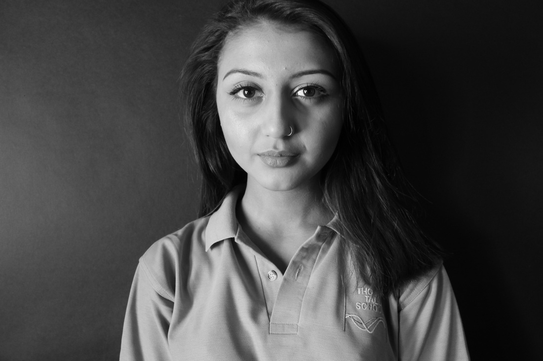
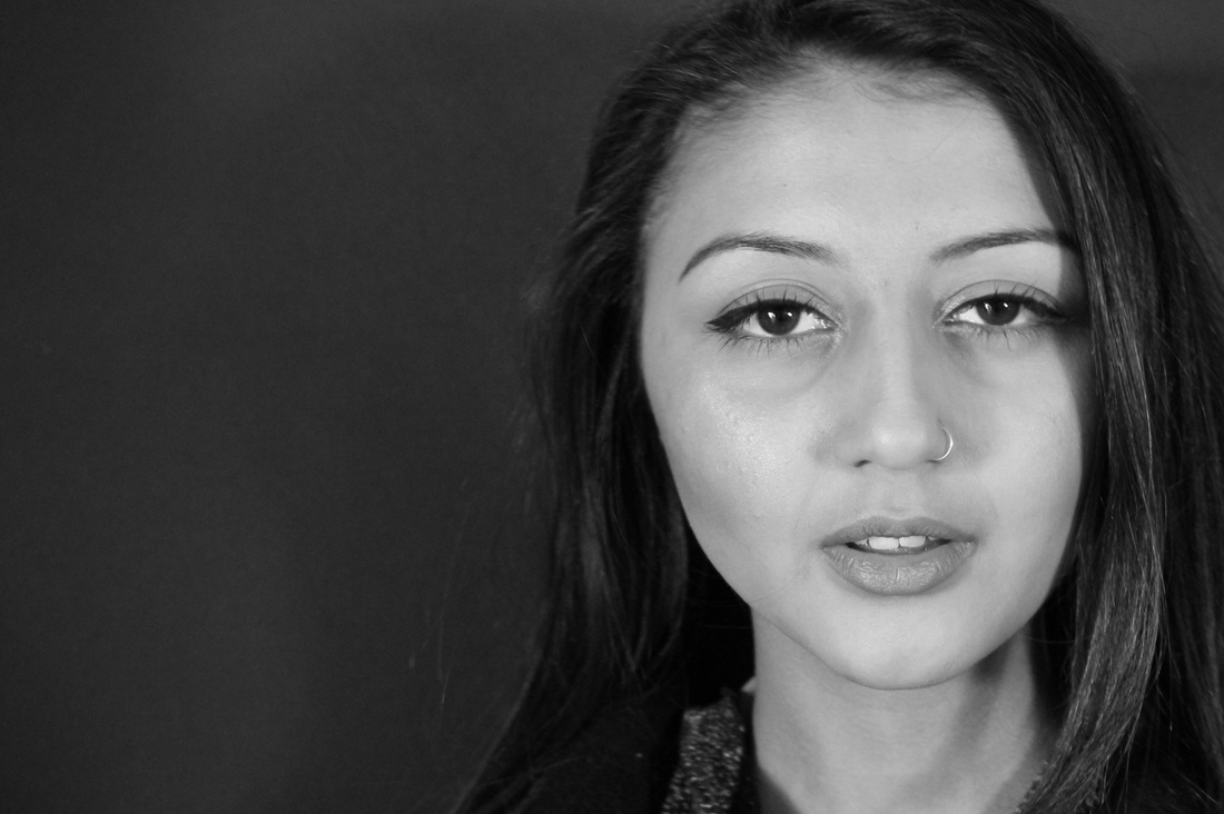
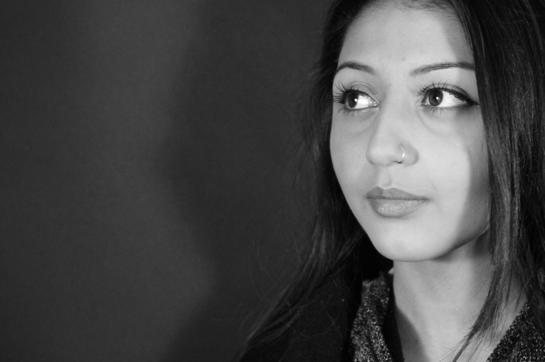
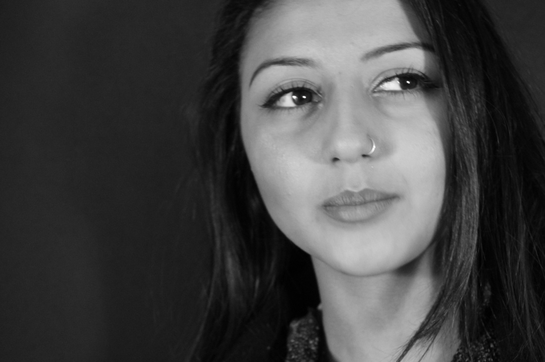
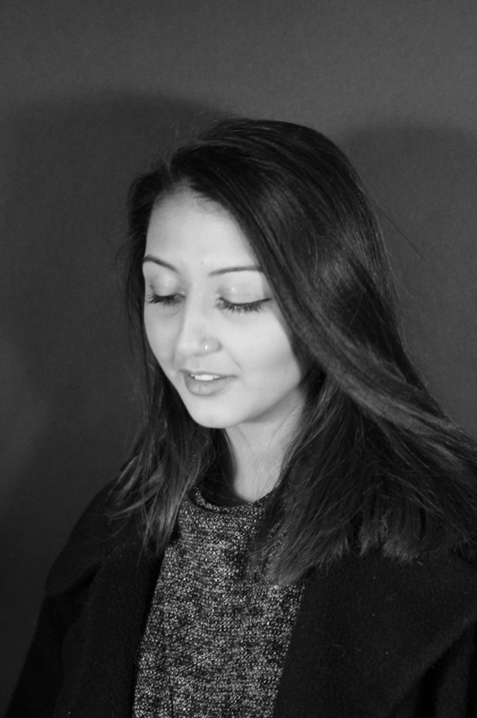
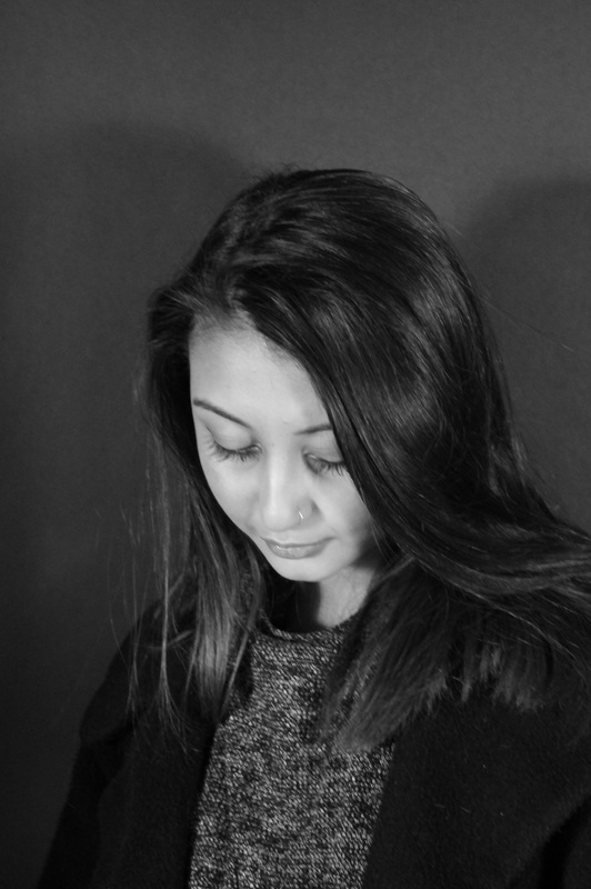
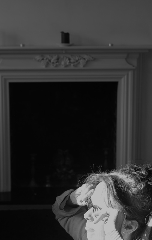
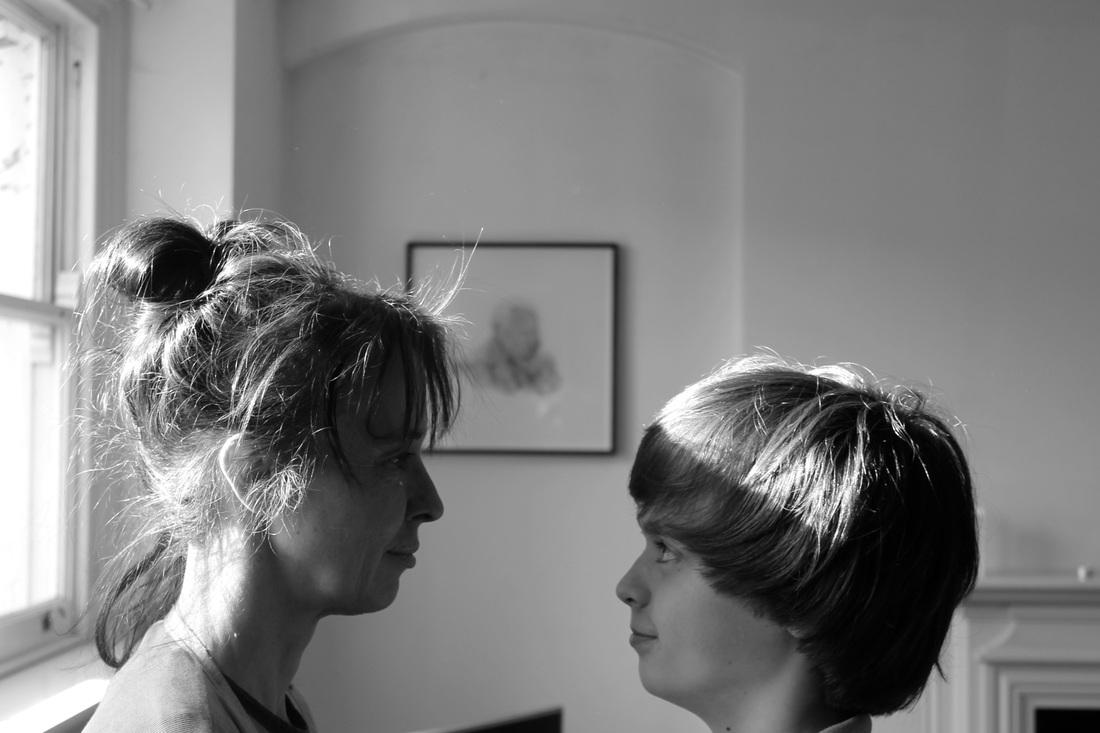
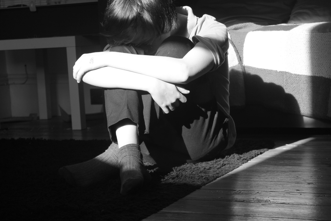
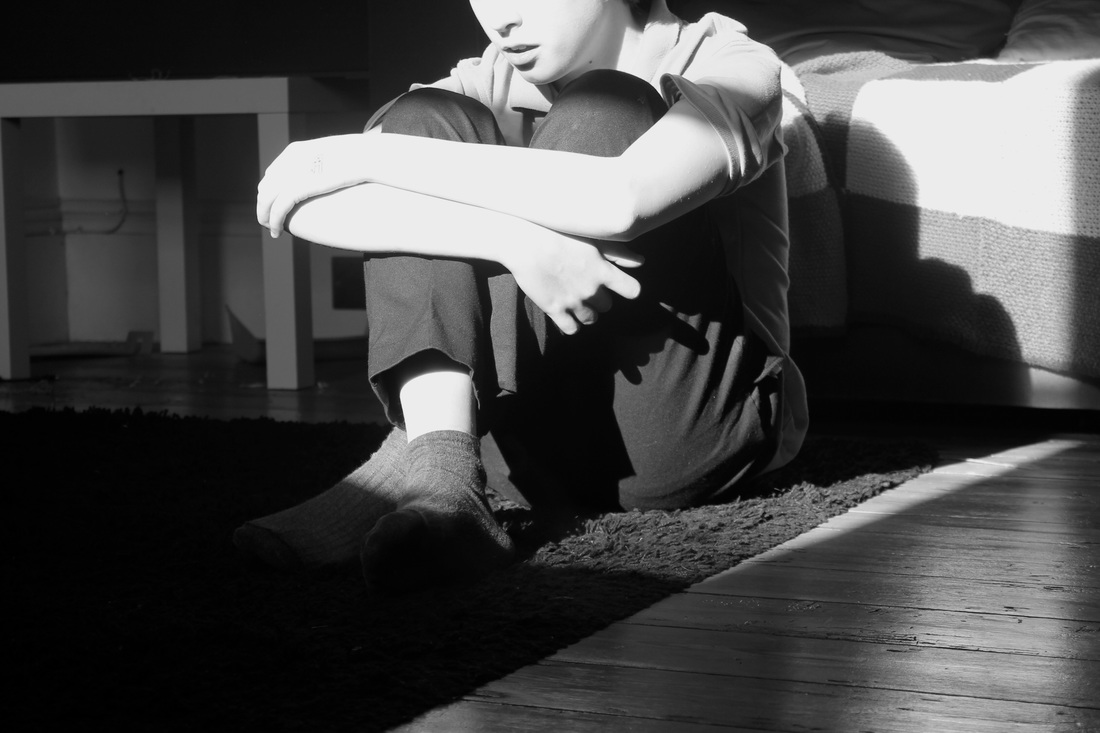
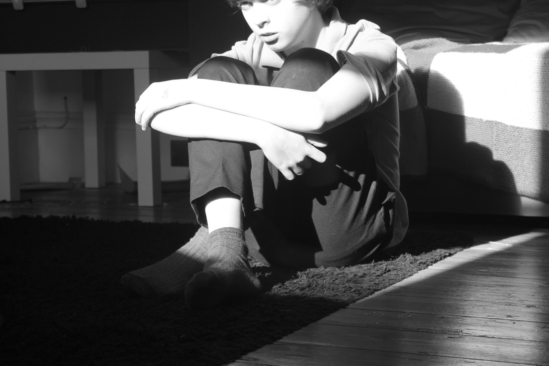
In these three images which are part of one of her most famous collections of her family, she uses her children as the main subject. You can tell just from looking at these photographs that the tone and contrast are important elements, the reason for this is because when using people as the main subject their bodies and faces need to be highlighted. She does this by using natural light and using the surrounding darkness to create contrasts. The fact that her images are black and white shows us her attention to detail, as we are able to notice small things in the images, such as skin.
|
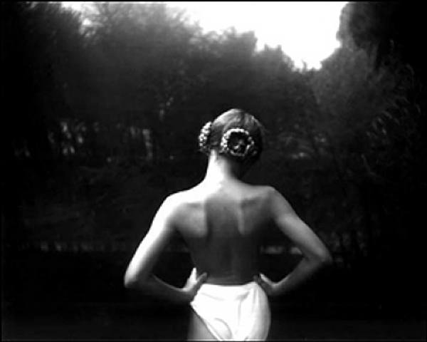
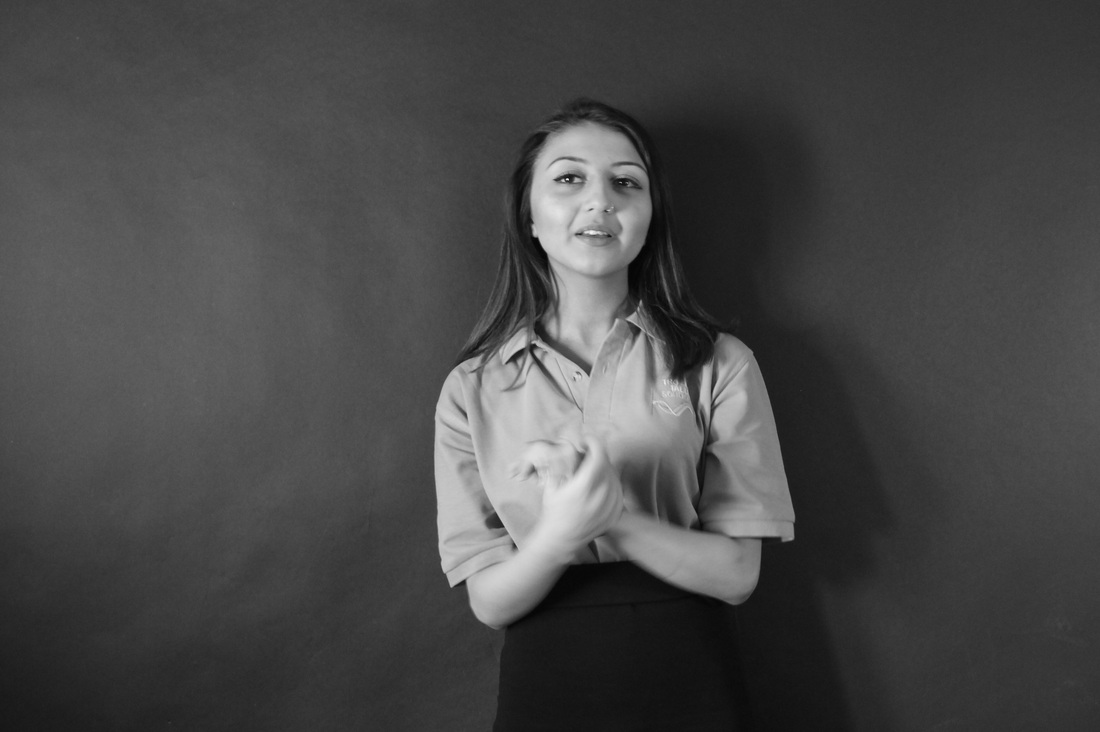
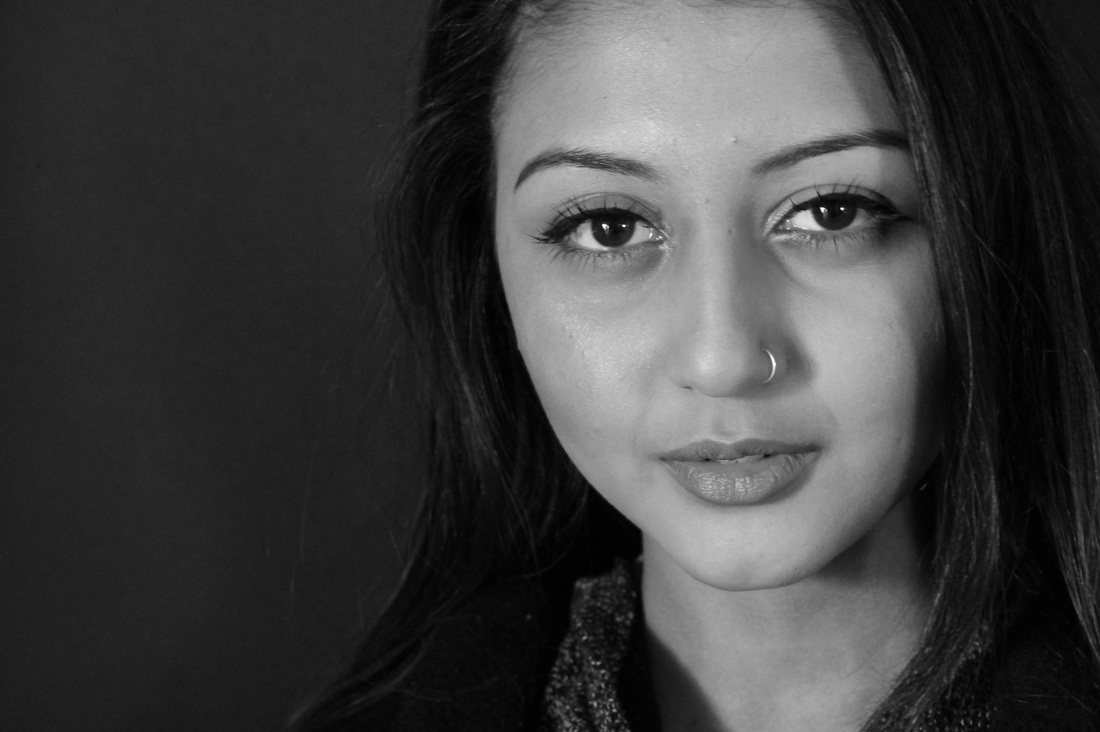
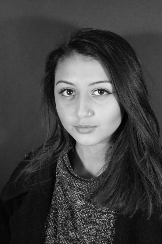
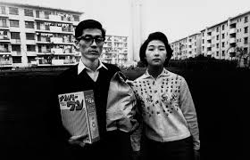
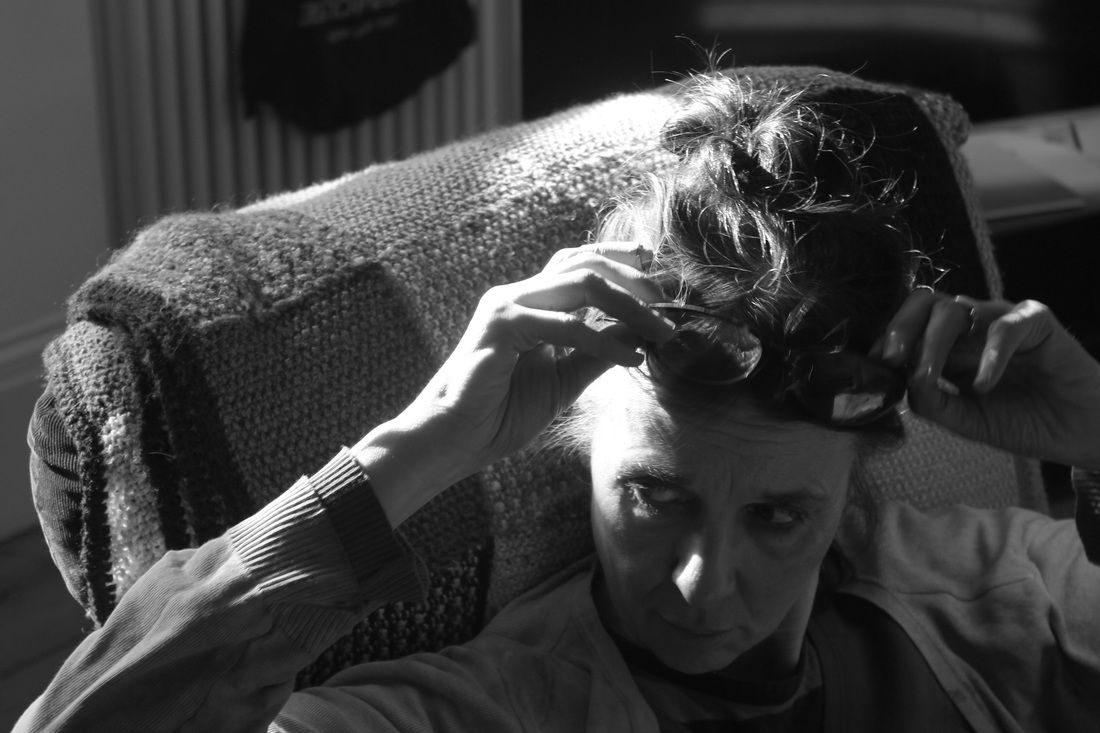
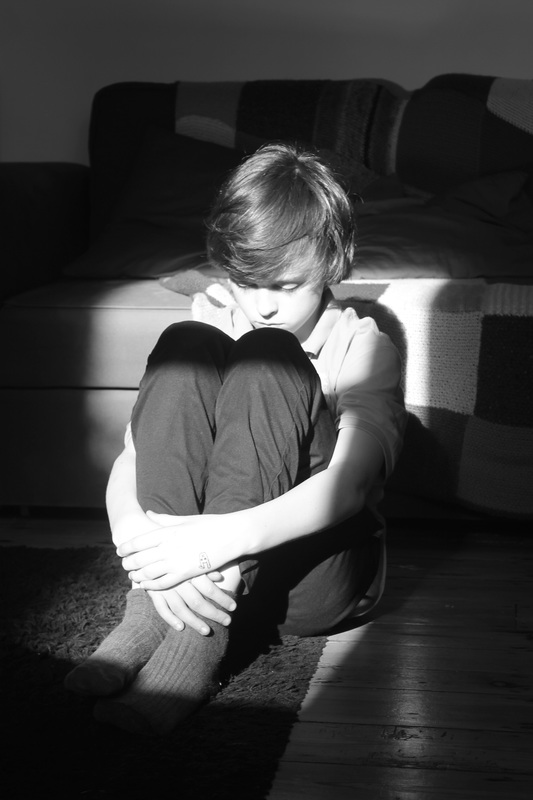
Sally Mann is an american photographer best known for her large black and white intimate portraits of her young children and family. The example in the image above shows a deep contrast between the outline of the figure and the very dark background. This image belongs to a series of work about her family which is a personal subject to her. However, she uses this sensitive subject as a way to create compelling black and white images.
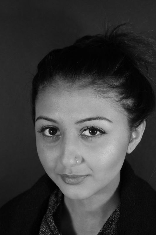
In this image above there are two young looking girls posing in very different positions. The figure holding a cigarette is the main subject in the image. Her body is being highlighted with the natural lighting using by the photographer, because of this natural light the rest of the image is significantly darker, this creates a deep contrast between the two tones. |
Edward Weston
|
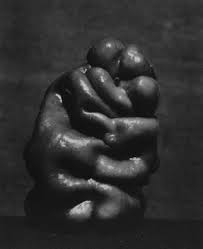
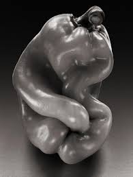
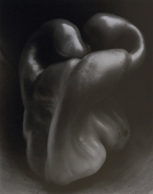
American photographer Edward Weston was known is one of the most influential photographers of the twentieth century. His most famous photographers feature unrecognisable vegetables such as green peppers. These images have been taken in a particular way to make them look like mysterious objects as at first glance we do not notice they are peppers, instead we trick ourselves into thinking they are human hands, or even bodies. This way of photographing is intriguing as we are not capturing moment in time, instead we are photographing an everyday object in a way that does not reveal itself properly.
I feel inspired to take some images using Edward Weston as an inspiration. I would like to use a natural form such as a vegetable as they are simple but distinctive objects, which is something Weston has experimented with in his photography |
|
Photoshoot #1 Edward Weston inspired images
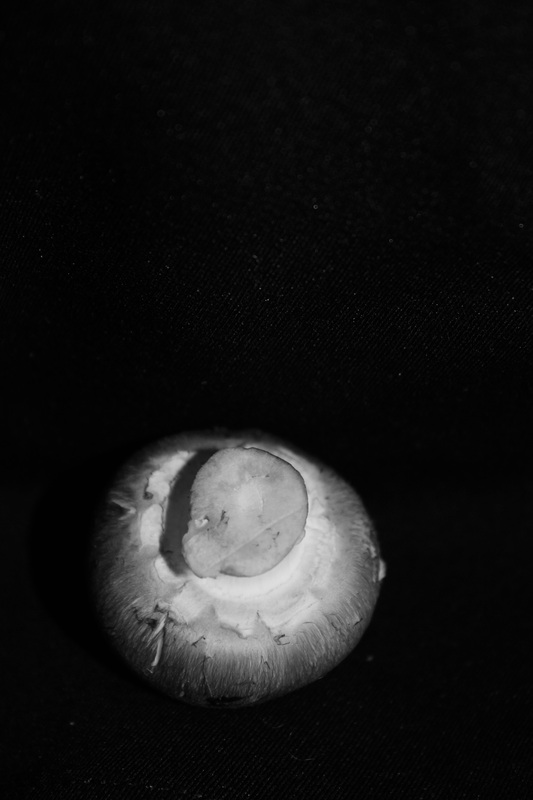
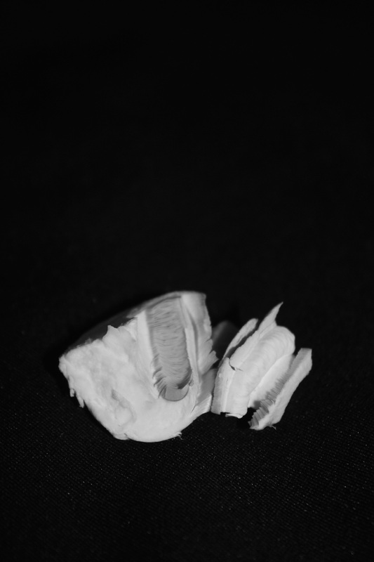
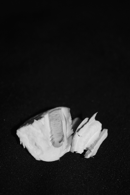
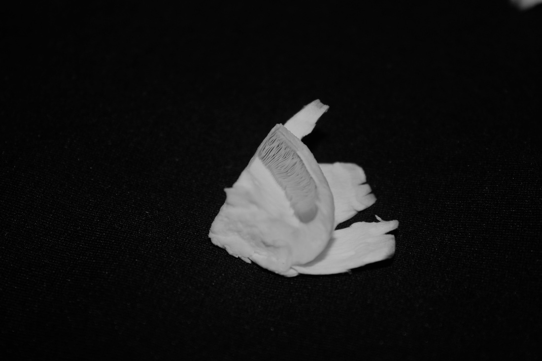
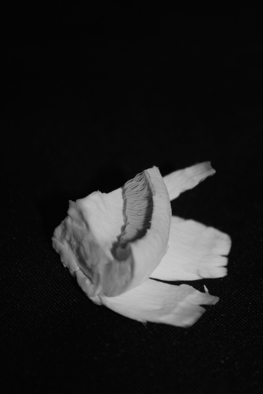
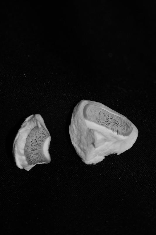
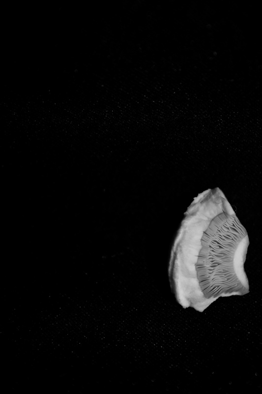
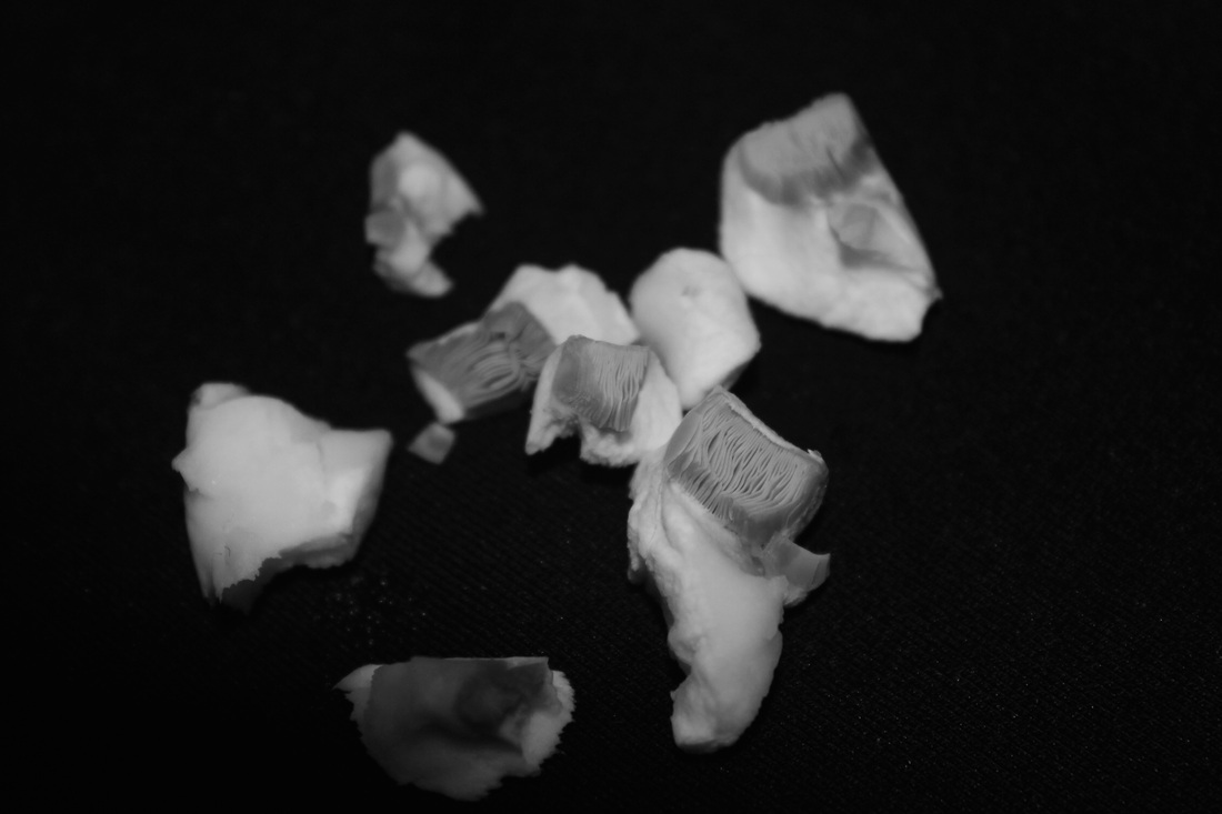
Inspired by the works of Edward Weston I decided to use a mushroom as my object to photograph. I was keen on using mushrooms because of their varied texture. I like the way something so natural and organic is actually so detailed and delicate, therefore Iwanted to try and put emphasise on this and take close attention to detail. Using a dslr I used a black background to create a contrast between the mushrooms and the background. To make this contrast more distant I used quite a strong flash to make the mushroom almost white looking without bleaching out the whole photograph. I am pleased with the outcome of these photos and particularly like the images of the mushroom where I have broken the pieces up. This not only makes you question the image but it makes you realise the tiny details in a mushroom. I now look forward to using a different subjects in my images such as portraits of people.
Robert Mapplethorpe
|
|
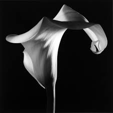
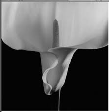
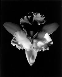
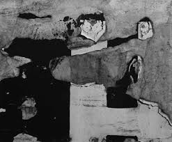
Known for his large scale, controversial and black and white images Robert Mapplethorpe was an american photographer in the 60's and 70's. His most famous work was not his deep contrasting images of flowers however they are still seen as profound pieces of work. However almost all of his work is exclusively black and white. His understanding of light and form is what helped him create truly beautiful images.
His photographs of orchids and calla lilies are very intense and shot in a controlled studio environment, using specific types of light to highlight parts of the flower. The light in his images are the spine to most of his work as they guide the viewer. I especially like the way he has not taken them in a collection instead he pays close attention to each individual one. Not only does this make the image more dramatic but it makes them look almost human as they feel more like portraits of people rather than flowers. I think this is also to do with the way the flowers are standing. In the bottom left images the flower has a sturdy base for the sproating flower on top, almost like a body and a head. |
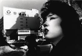
Elliot Erwin
Photoshoot #2 Portraiture
Portraiture is something thats links in with contrast, as it is quite popular to take portraits of people in black and white. Therefore I decided to take some like this using a digital SLR camera and studio lights.
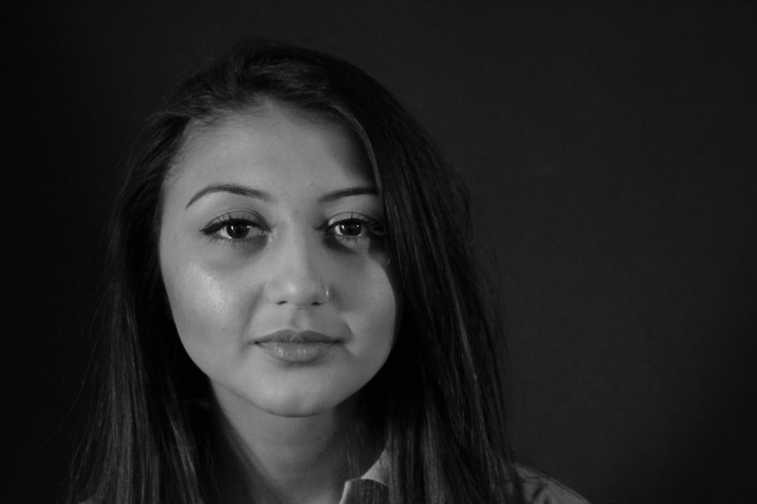
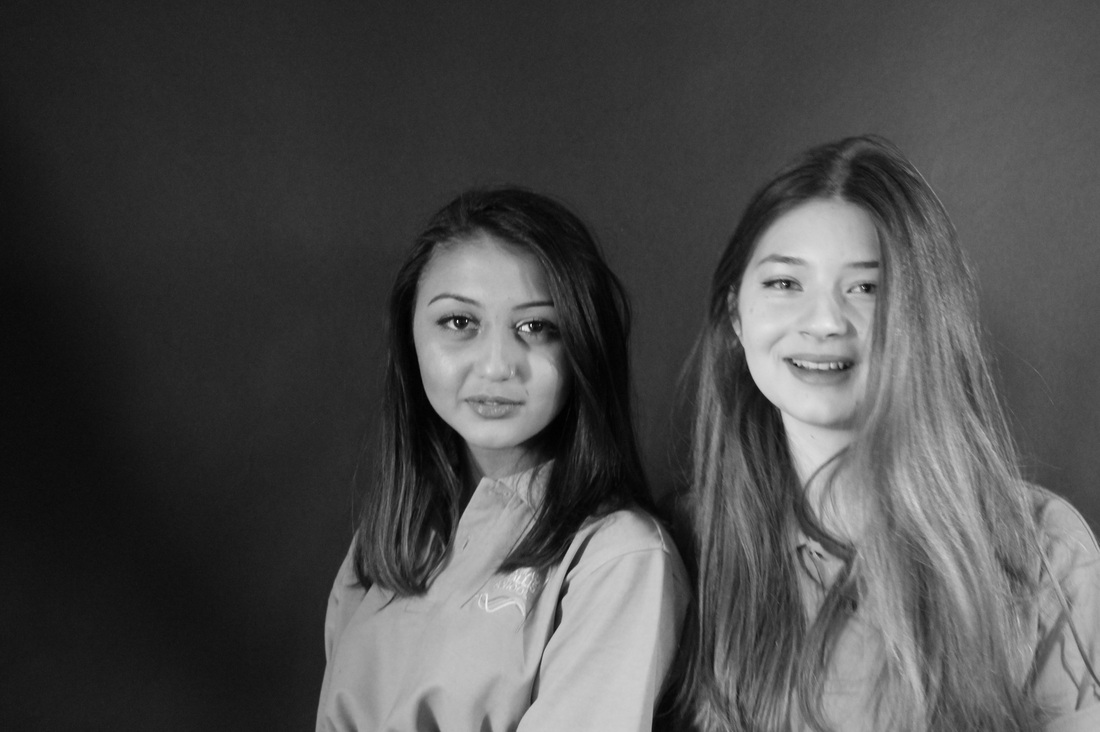
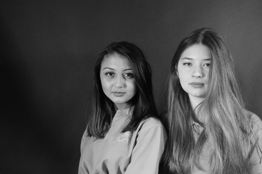
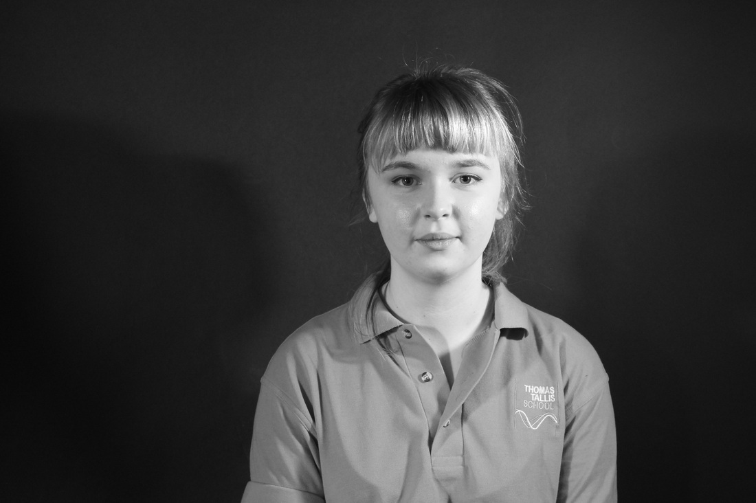
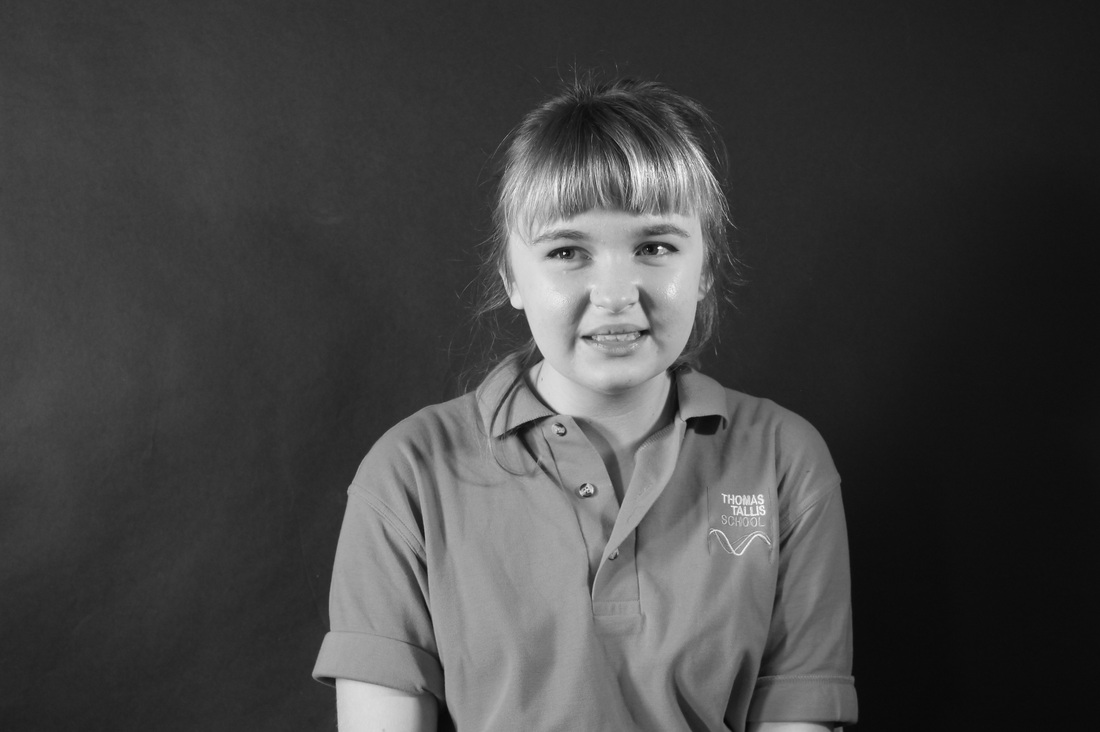
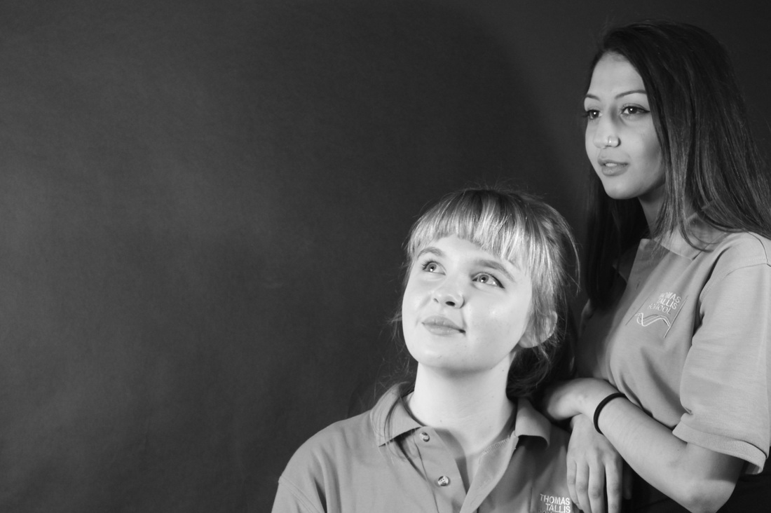
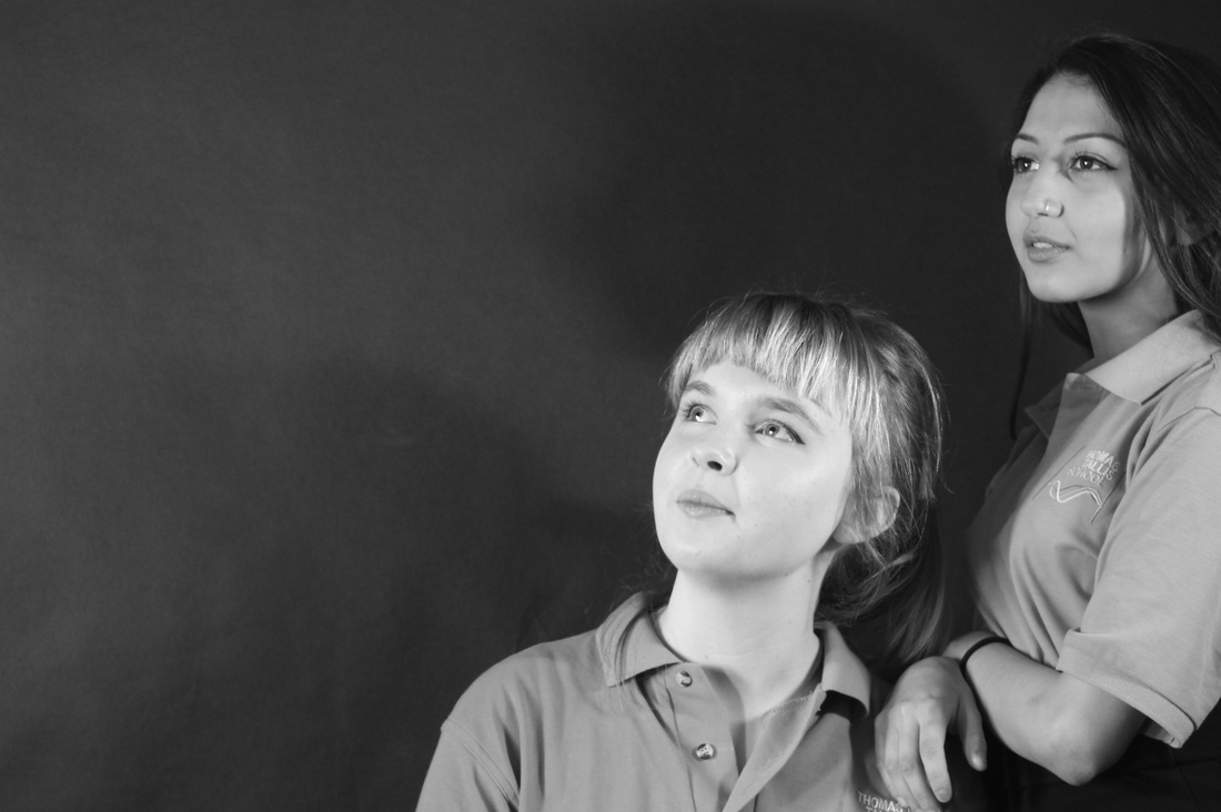
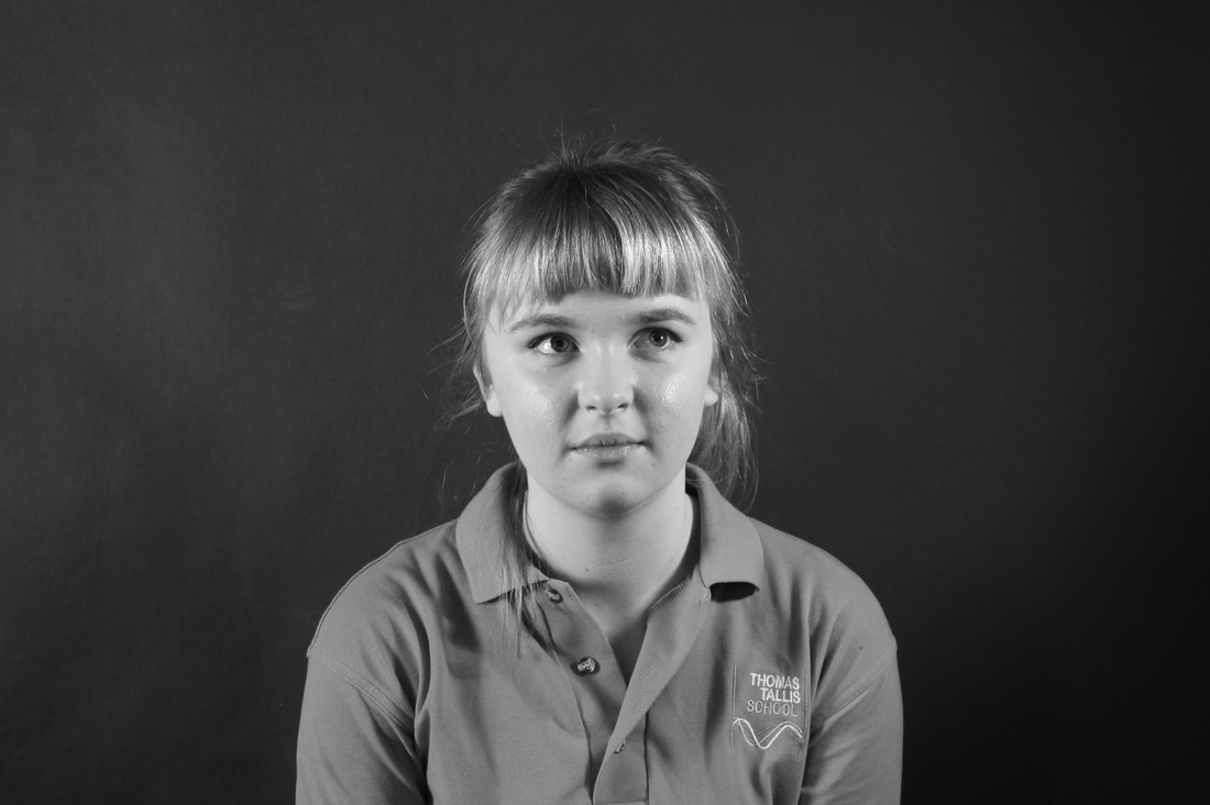
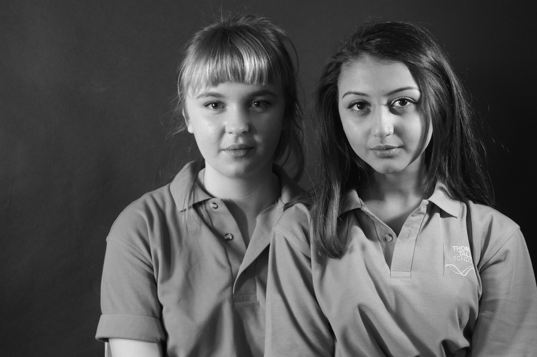
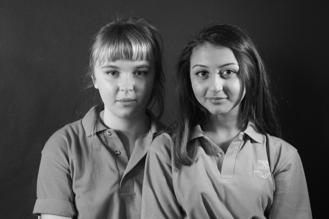
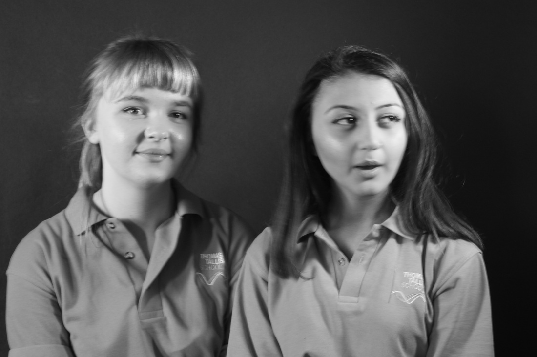
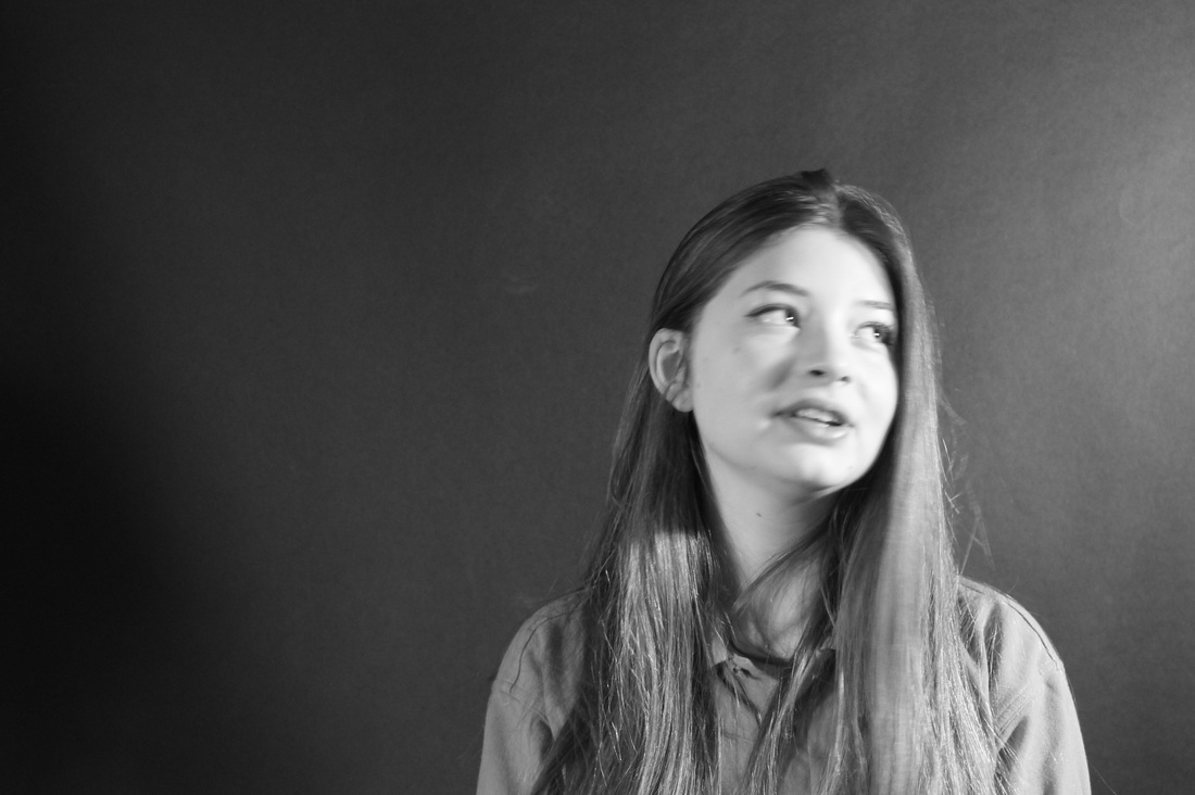
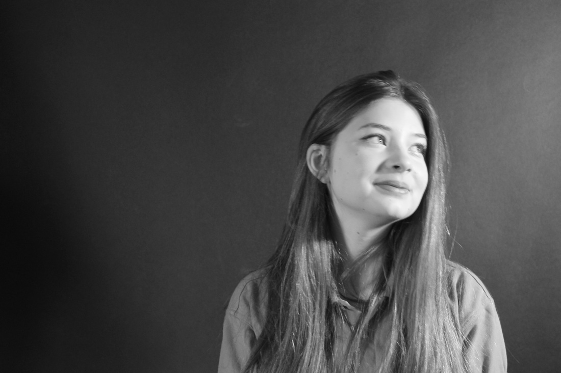
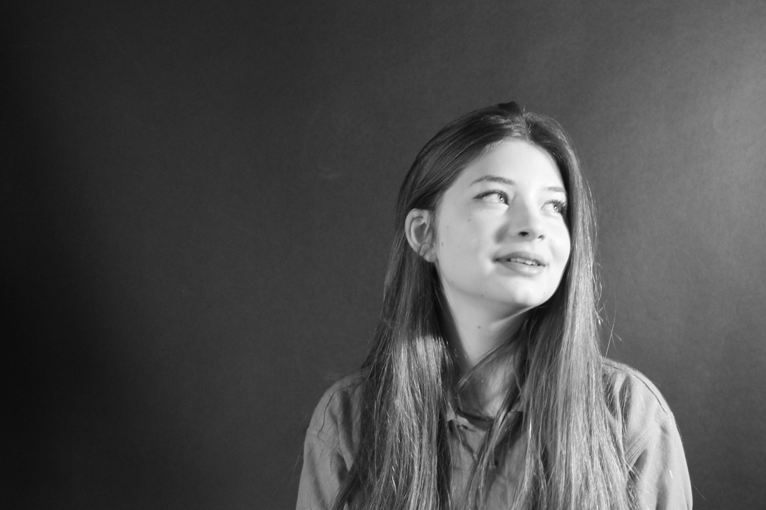
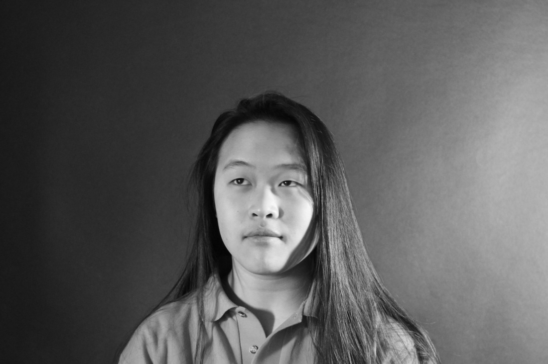
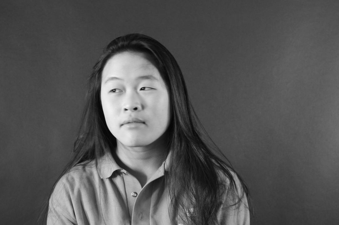
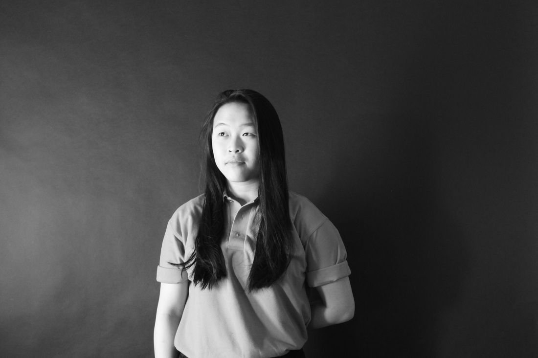
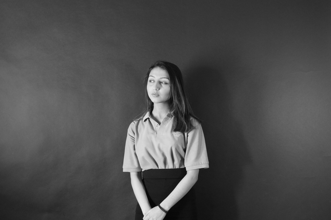
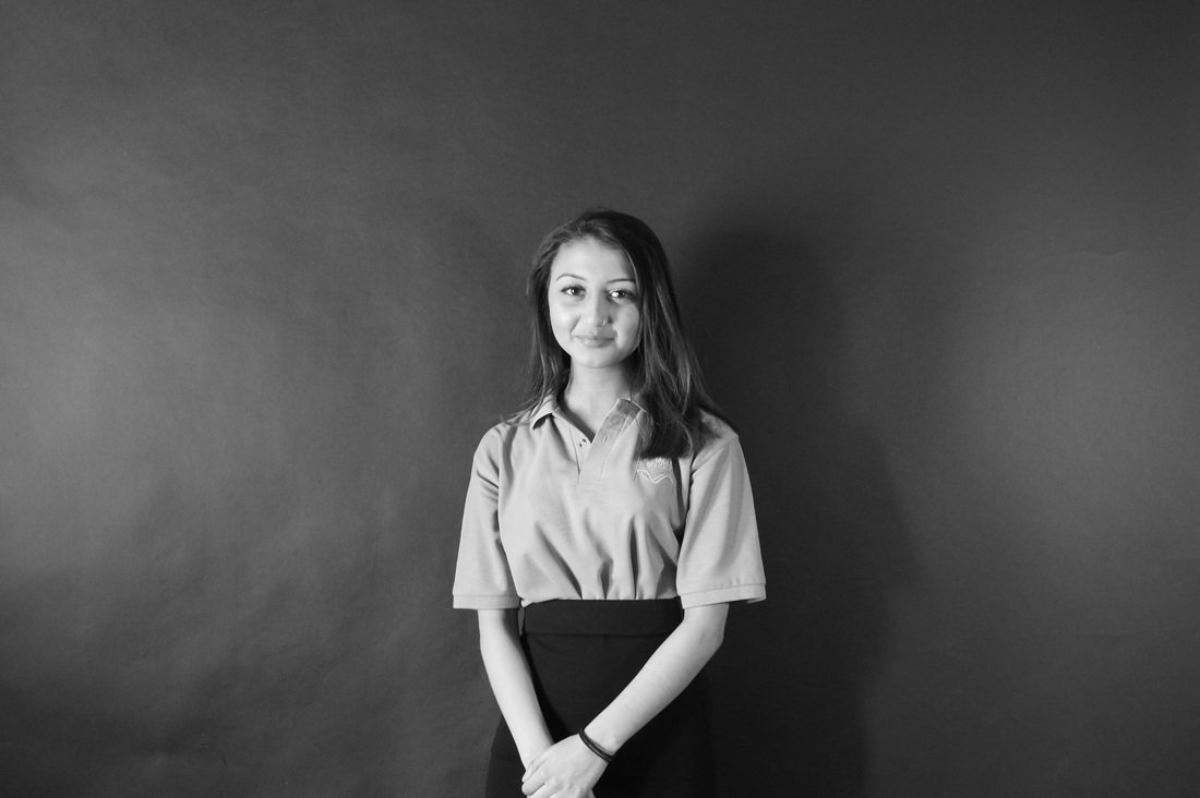
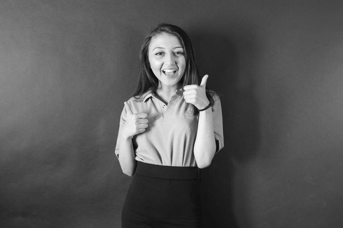
In our first photo shoot we decided to use only one person as our main subject. In my opinion these images were not successful as the lighting was too bright which made the some of the images over exposed. This meant that the background of the images were quite grey when we wanted them to be black so we could see the contrast between the tones of the face. The light was so bright you could see it hitting the black background which didn't compliment the rest of the image.
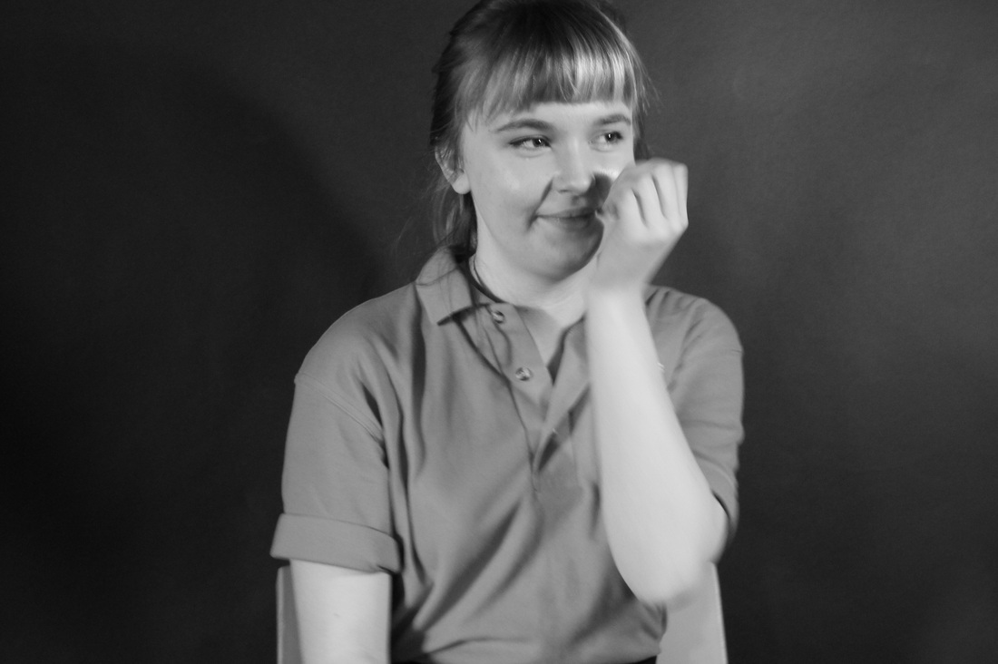
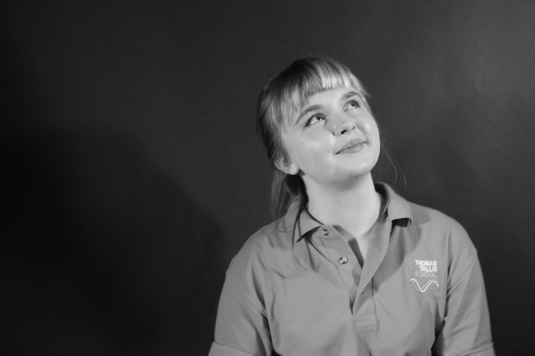
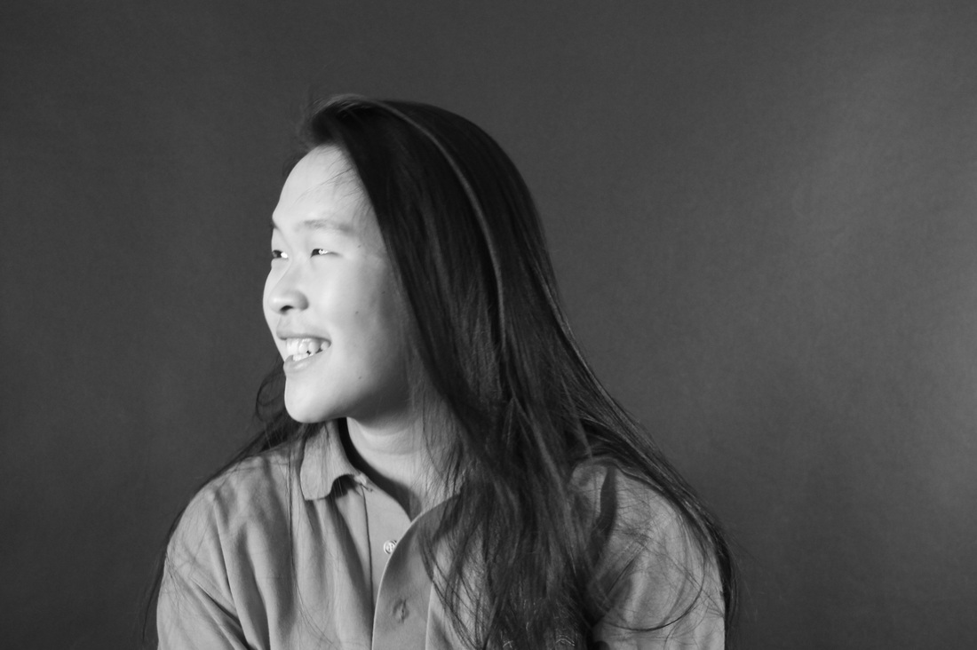
I would like to experiment with a white background next time using one model at a time. I could take these images in natural light also to contrast with these images where I have used actual lights. When taking these images I'm going to try and focus on the lighting of the images as I do like some of the composition in these images such as the last two images. By experimenting with close up shots and also wide range shots I get a variety of images.
I would like to experiment with a white background next time using one model at a time. I could take these images in natural light also to contrast with these images where I have used actual lights. When taking these images I'm going to try and focus on the lighting of the images as I do like some of the composition in these images such as the last two images. By experimenting with close up shots and also wide range shots I get a variety of images.
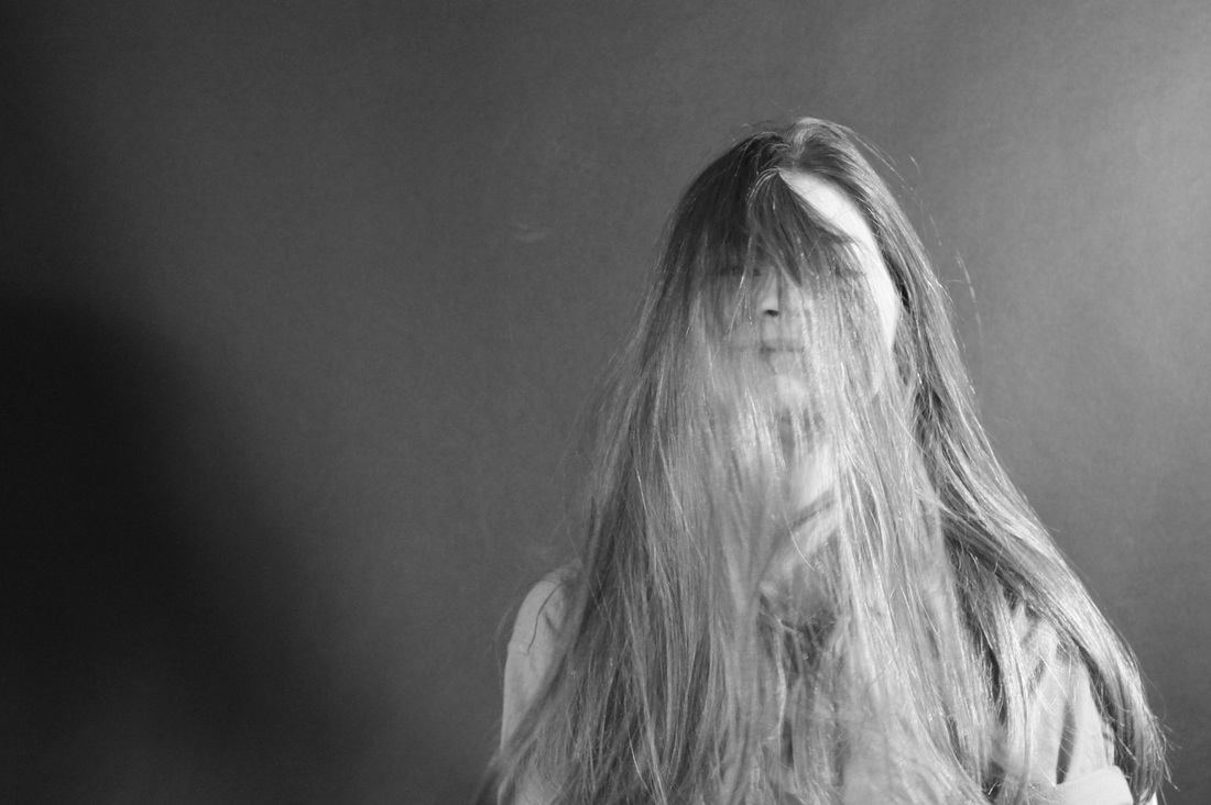
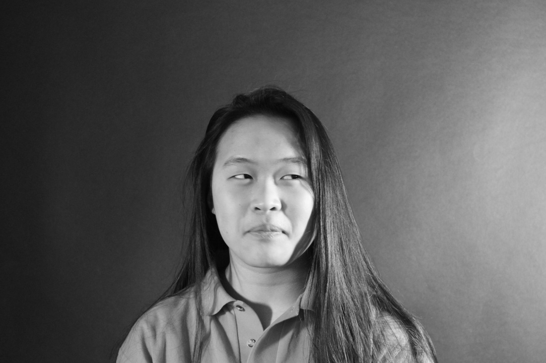
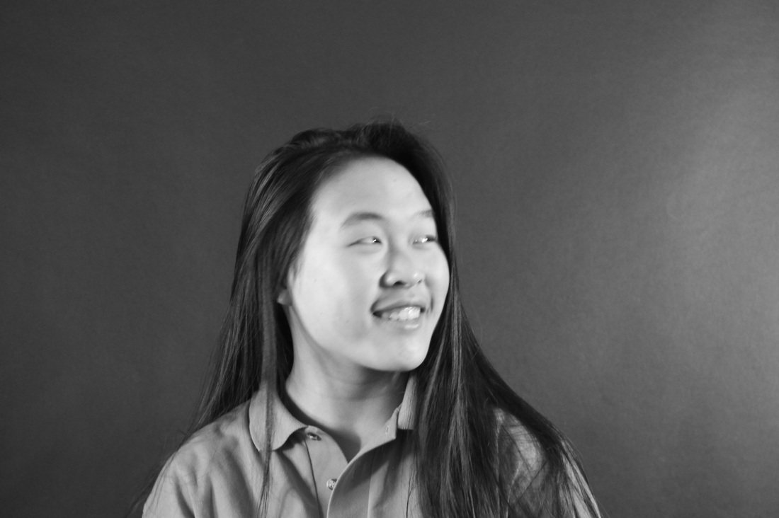
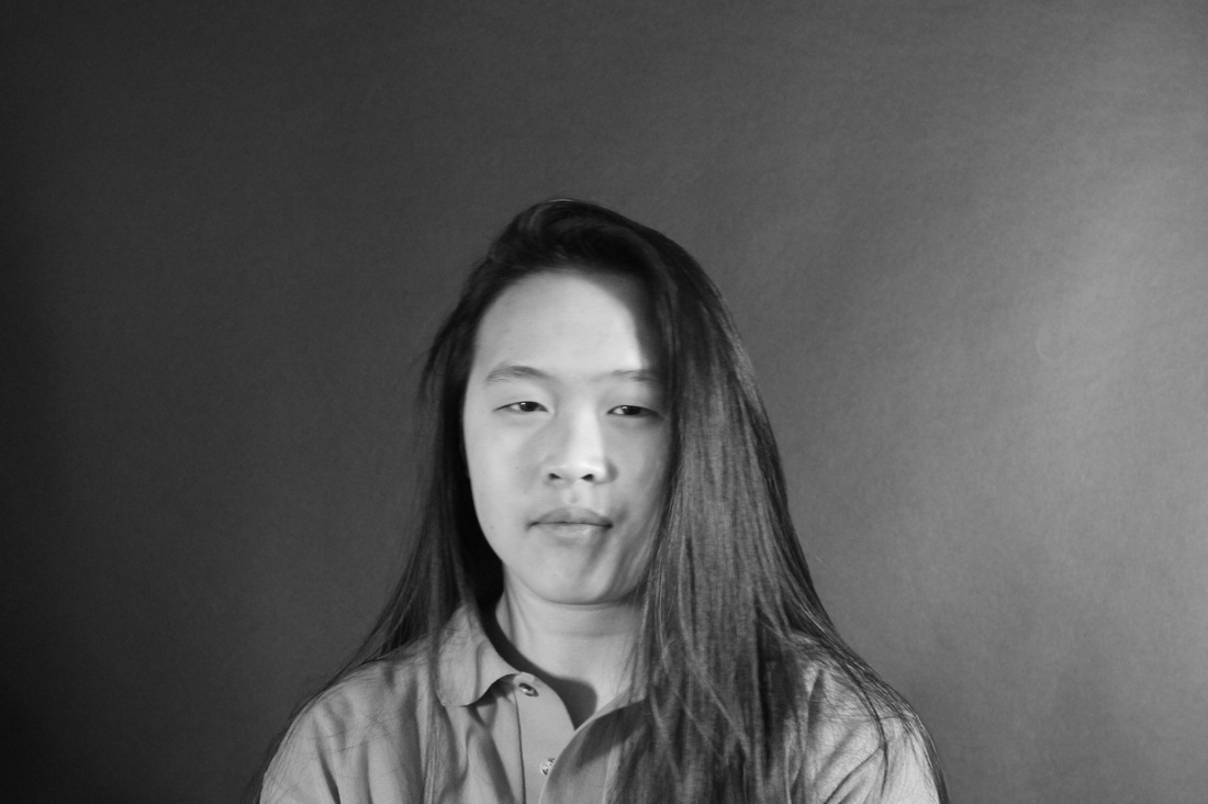
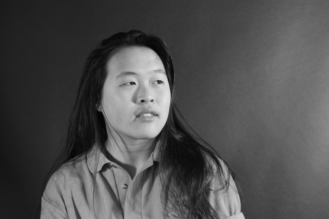
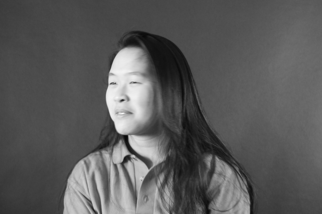
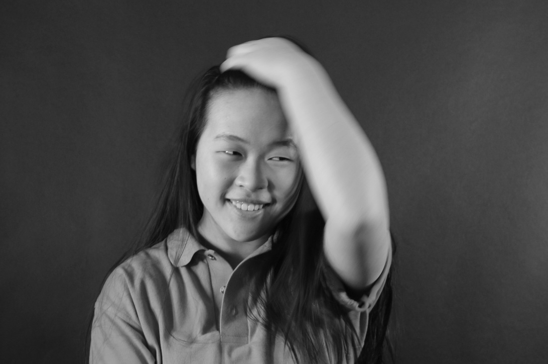
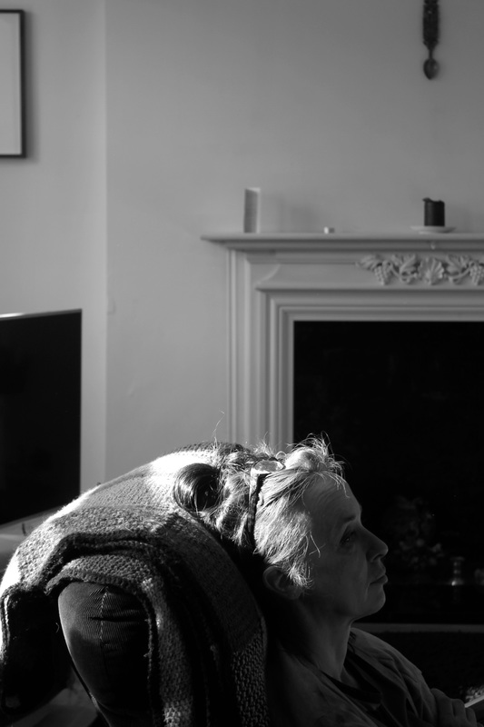
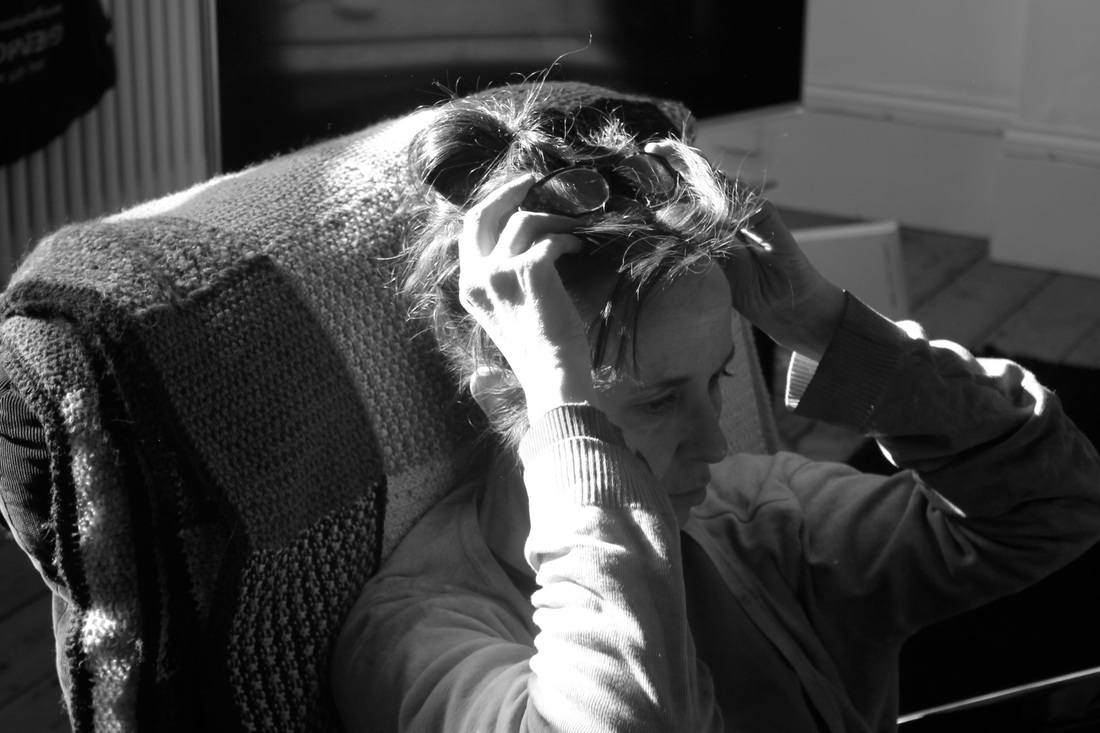
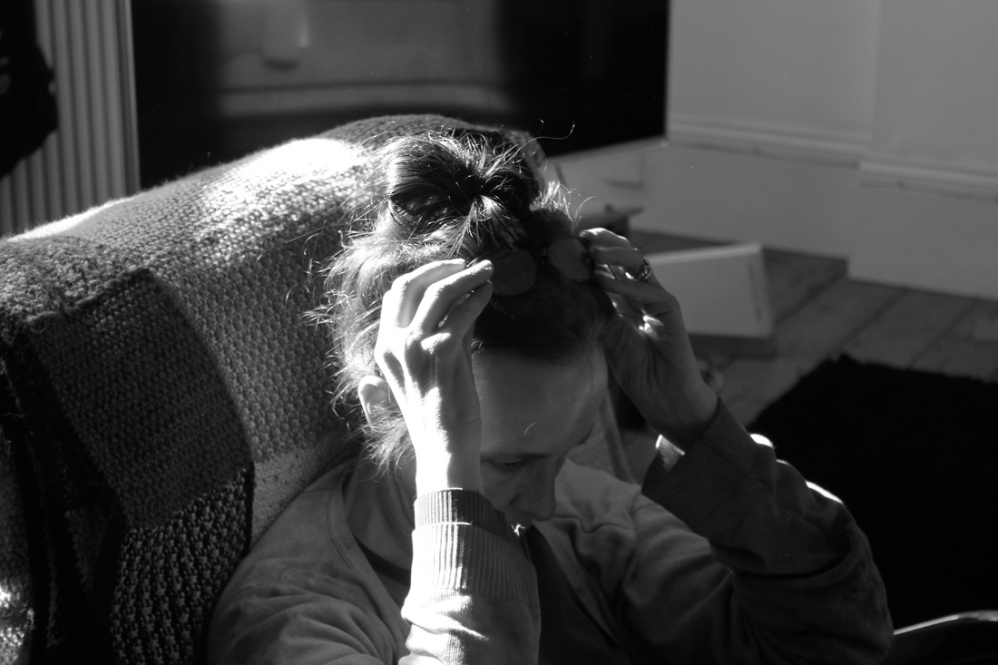
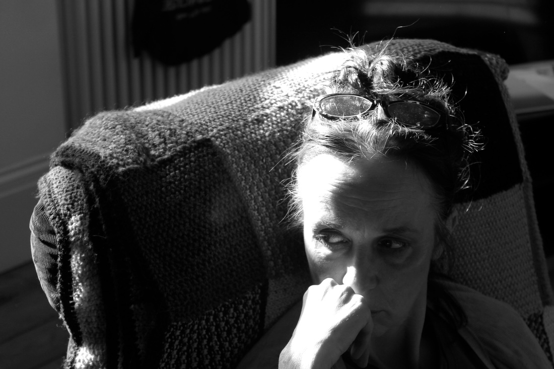
Photographing the whole in figure in black and white
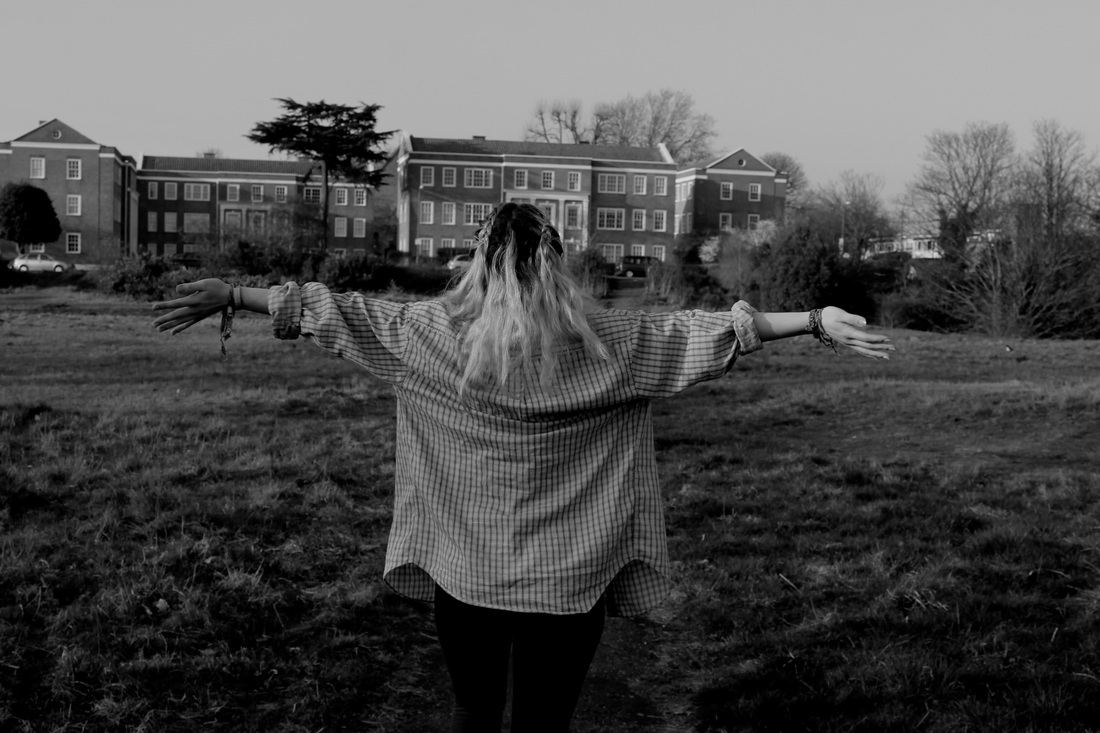
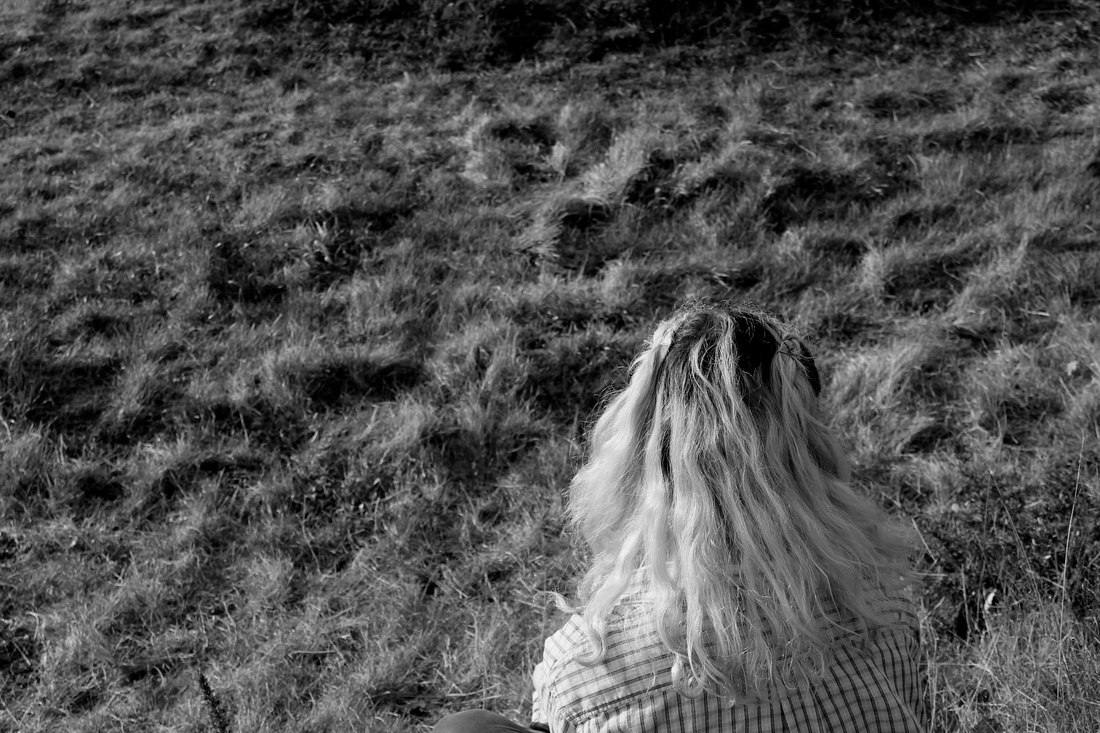
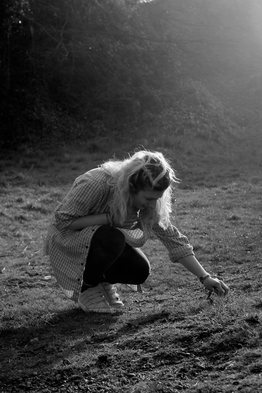
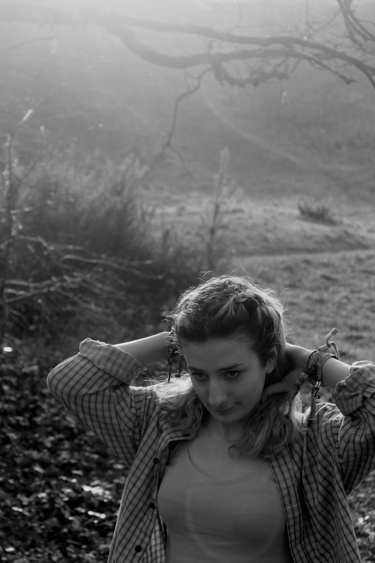
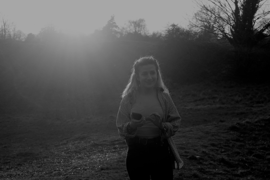
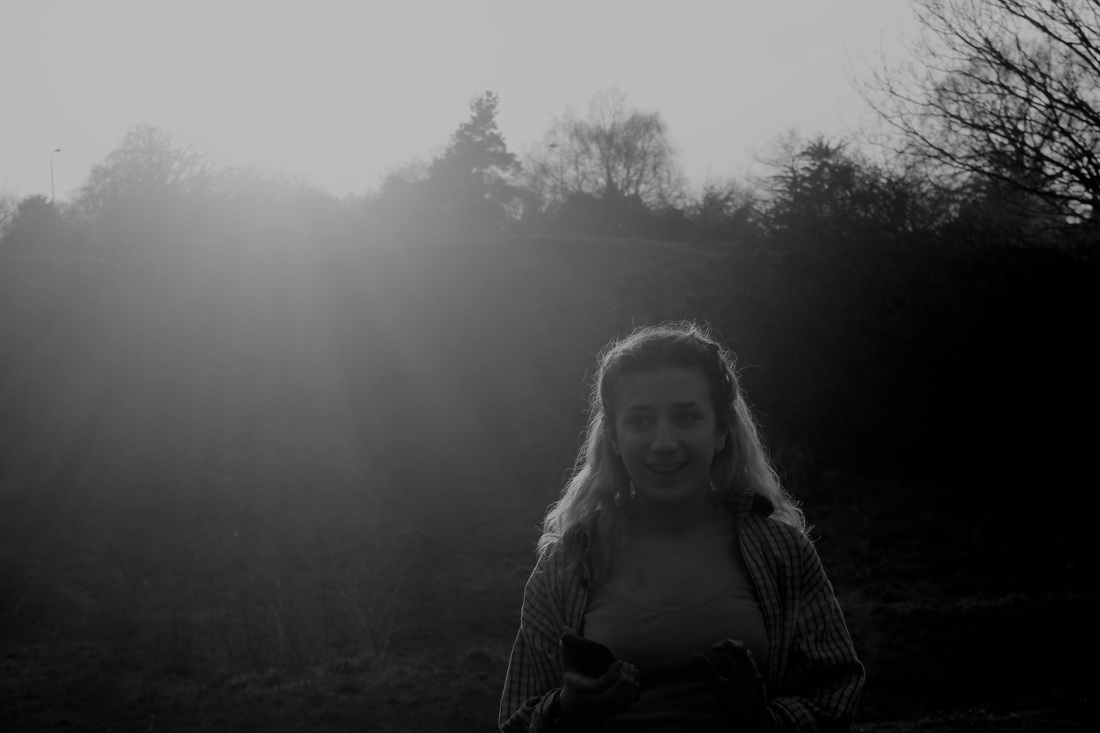
In latest collection of images I decided to focus on one person as my main subject. I wanted to take all the images of that one person to make it more personal. I wanted to use the light in different ways to create totally different images. I experimented with the light coming in from different angles to make the images look more abstract however I did remember to focus on the use of contrast in this collection. For example in the last two images I used the bleached out sun in the background and the figure in front to create a contrast of the trees in the right hand upper corner. There is also a contrast between the hairline and the black background.
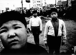
Daido Moriyama
|
Japanese photographer Daido Moriyama takes black and white images. His photographs often involve people with close attention to emotion and expression. Most his images are in black and white with high contrast which helps to highlight the main elements in the photos. His images have such a high contrast which helps to highlight facial expressions in his images.
I want to take more photographs that pay close attention to peoples facial expressions by getting up closer to the person I'm photographing. |
|
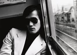
Photoshoot #4 Response to Daido Moriyama (Potraiture in different setting)
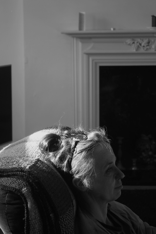
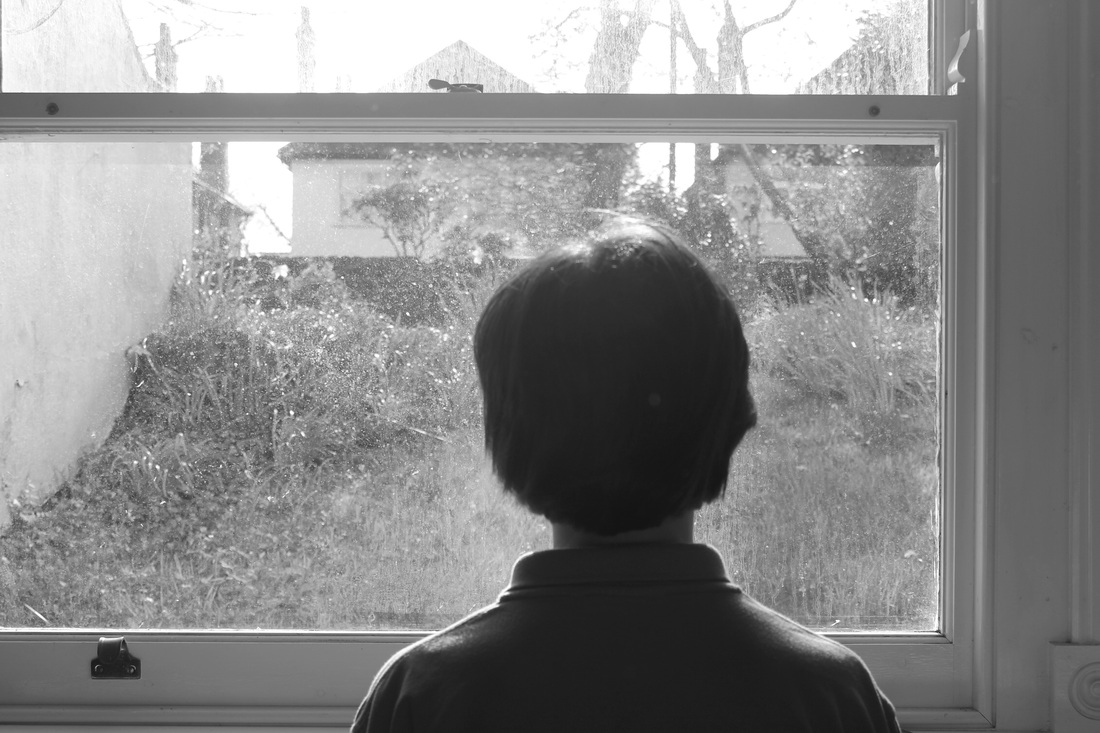
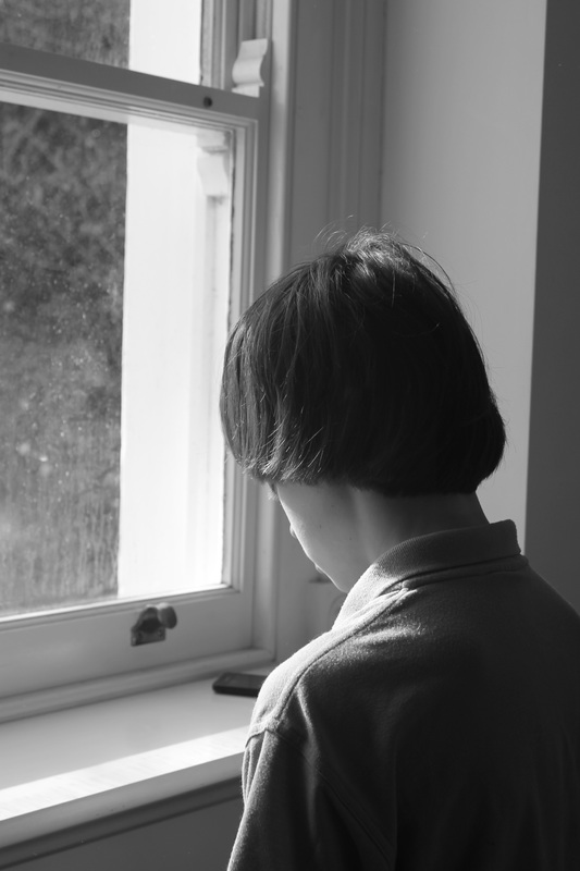
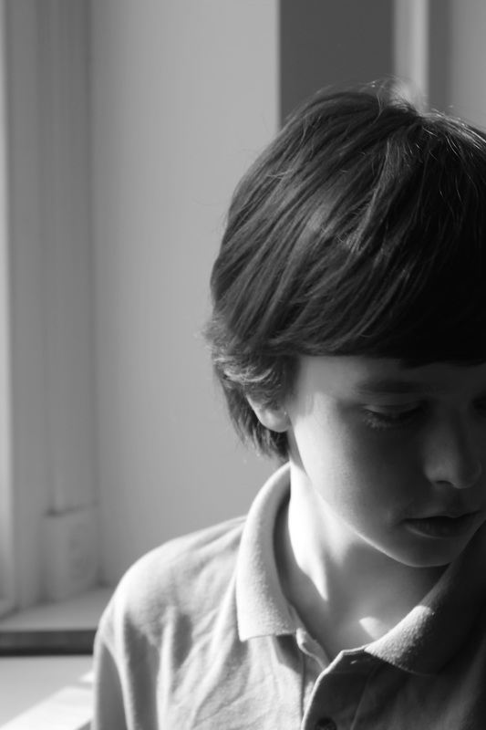
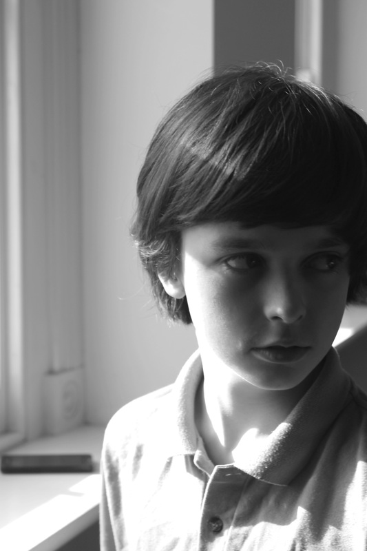
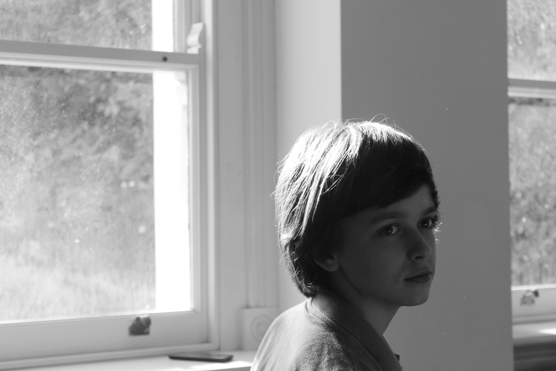
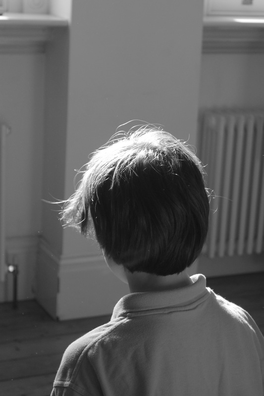
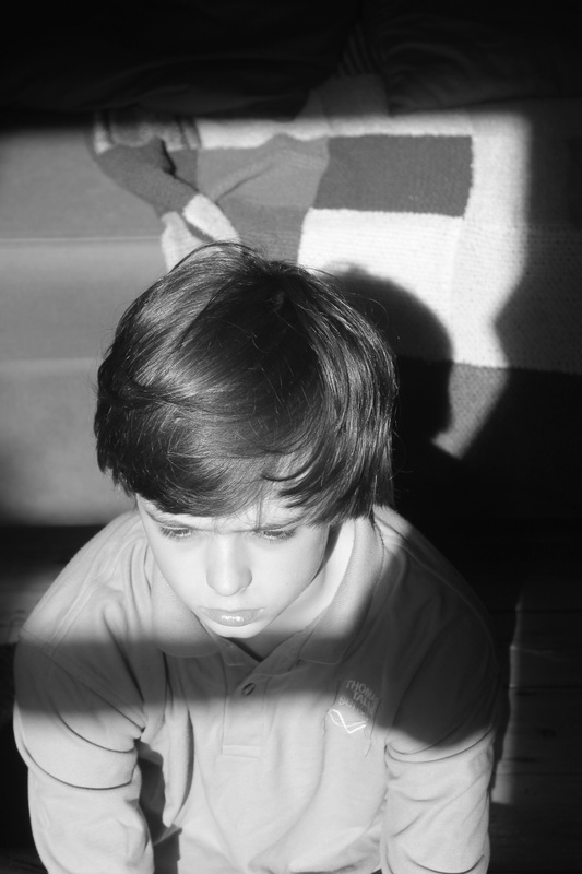
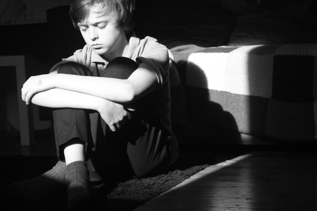
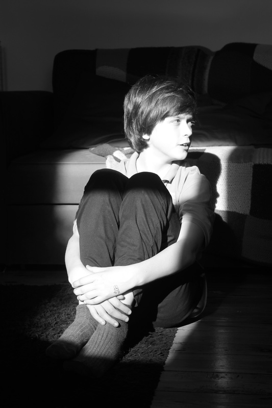
I am quite pleased with how these images turned out as the light on the figure almost looks like there has been a torch shone on his face when in actual fact I have used natural lighting through a window. I like the way the sun beaming on his face contrasts with the darkness of the rest of the image yet you can still see the texture of the wooden floors and carpet. I wanted the model to pose naturally so that it does' look too set up as the rest of the image (the lighting) does look set up. The model sitting in this position makes it look like he is trapped in the light, as if that is his space. He's looking out into the darkness as if it is a completely different place. I think these images are quite successful and I would like to experiment with them further
Photoshop experiments
|
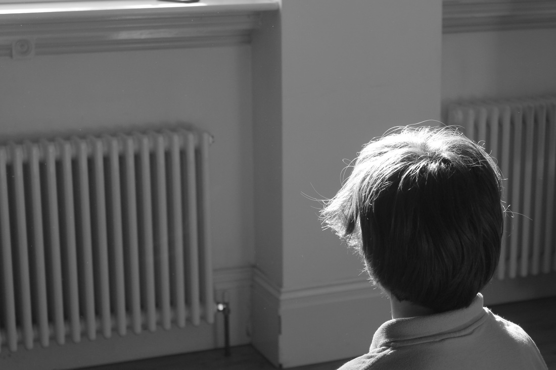
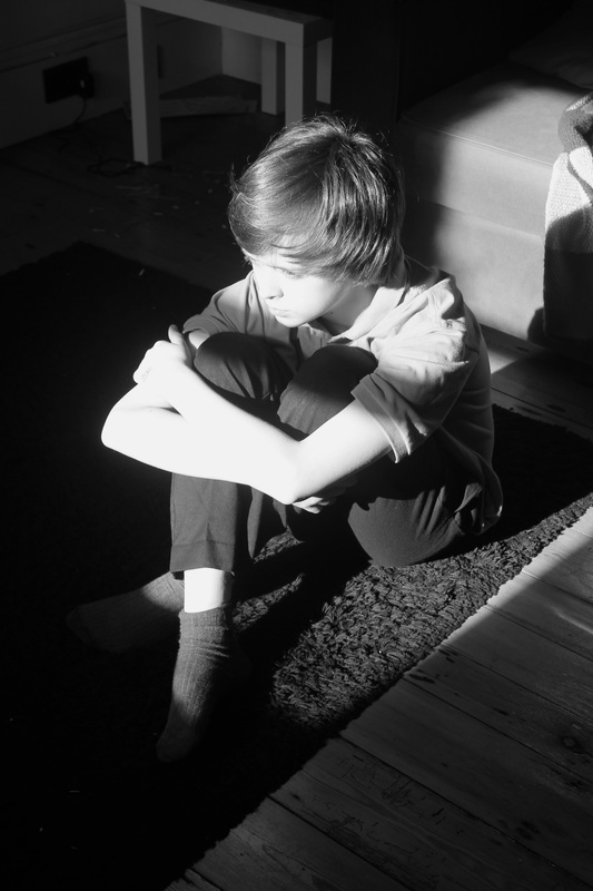
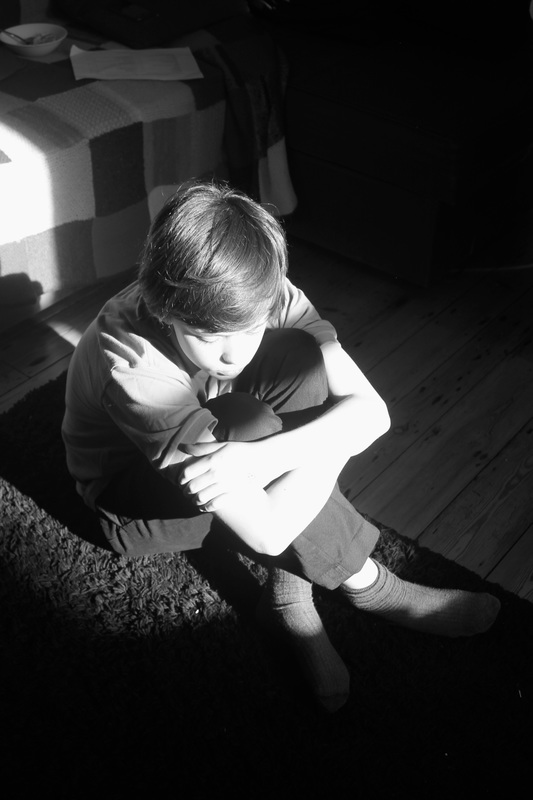
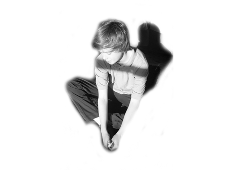
The original photograph of this reminded me a lot of isolation as the figure looks very seperate to the rest of the image. The shadow facing down on him, casting a shadow looks like he's trapped in the shadow. Therefore I wanted to push this idea further by using photoshop to make the figure look even more isolated
Has this experiment worked? I think is experiment was not successful and the image is quite confusing. It looks as if the figure is floating in the air but not even in an abstract way. Also, it was difficult on photoshop to erase the shadow surrounding the figure because the shadows are not clear lines. I do not want to continue experimenting with photoshop as I feel like these images are best in their original form where they are more dark and mysterious. |
Aaron Siskind
|
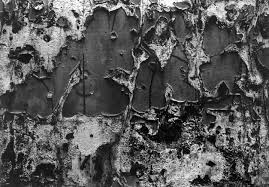
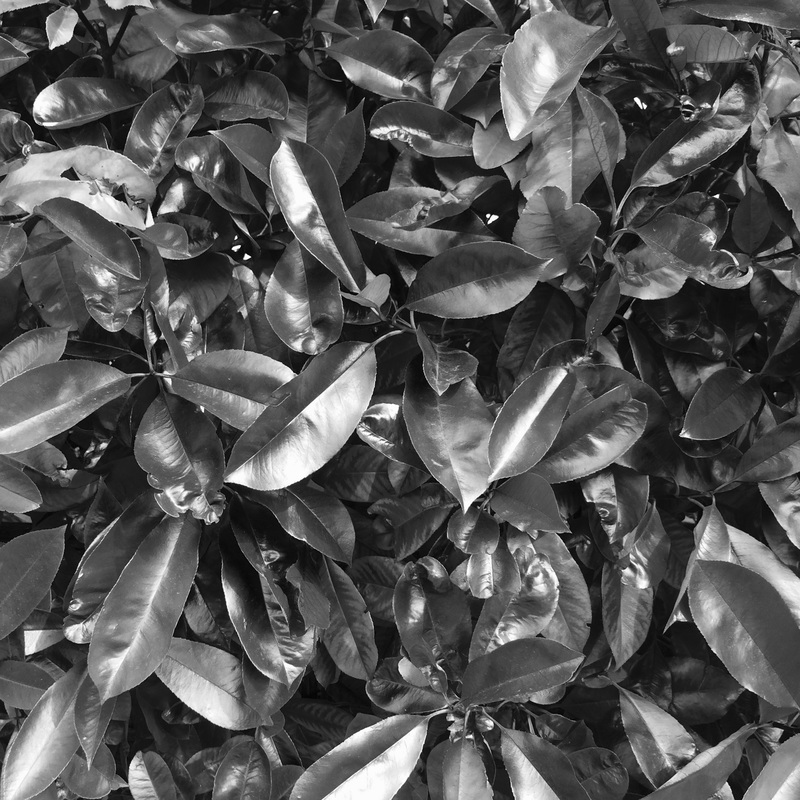
Aaron Siskind is an american photographer who played a major part in the abstract expressionist movement. His work explores themes such as nature and architecture. Many of his images are abstract close ups of peeling paint. One of the most important elements in these images is the use of tone, contrast and texture. The varied tone in the images creates depth, making the image look 3D. The paint curls look like tree bark contrasting with the exposed grey wall.
So far in my work I have mostly used just flat surfaces and haven't explored texture in much depth. Therefore, inspired by Siskind I would like to try and use more texture in my work. I could do this by using elements of nature. However I do not like the idea of just taking images of rough surfaces like Siskind as I feel there is not much going on in the image making them slightly dull. Although the way he using elements in his work is interesting I prefer using people in my work rather than simply taking images of already existing nature forms and architectural details. |
|
Photoshoot #5 Response to Asron Siskind
https://vimeo.com/129599218
FINAL PIECE: SHORT FILM
|
After taking many images using a digital camera I decided to make a short film inspired by the theme of contrast. Instead of showing contrast with black and white tones I wanted to use colour in my film building contrast between vivid colour and dark black and white images.
As well as the contrast between the colour and the black and white I wanted to build contrast between outside and inside. I showed this by filming some of the shots behind bars or windows. This made parts of the film seem dramatic and enclosed as the bars/windows are a barrier between me and the image behind. Initially I was going to film shots where the windows or bars were black and the image behind was bright and vivid however this was not effective and the images looked weak. Therefore, to highlight the contrast even more I made the entire image black and white if there was some kind of barrier between the camera and the rest of the image. The only problem with having a film split with using colour in some images and black and white in others. |
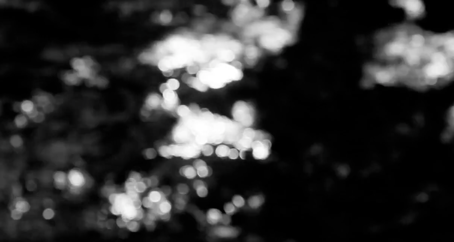
Screenshots from film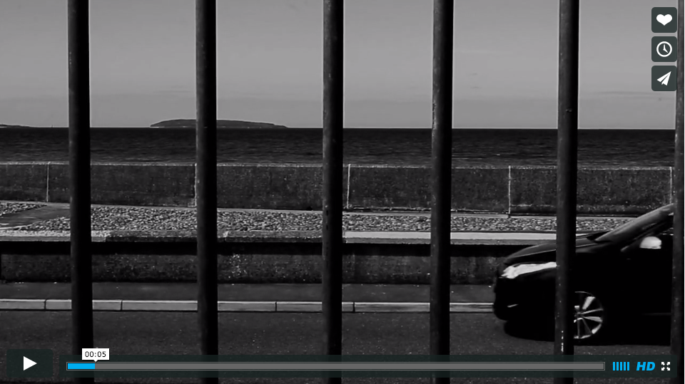
|
Photoshoot #6 Further experiments for second final piece
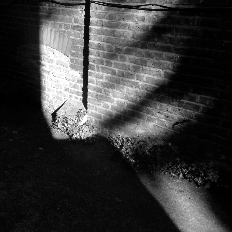
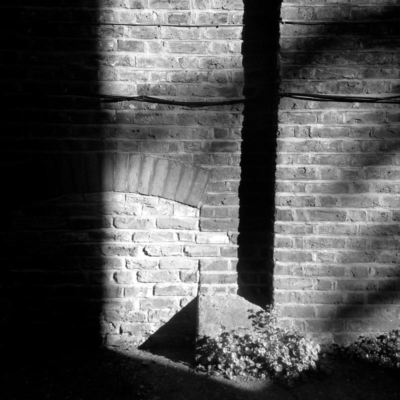
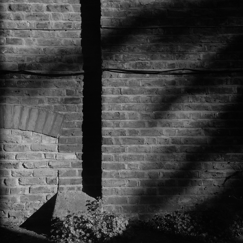
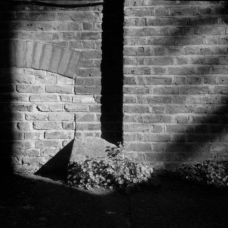
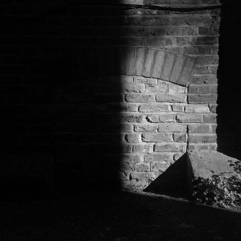
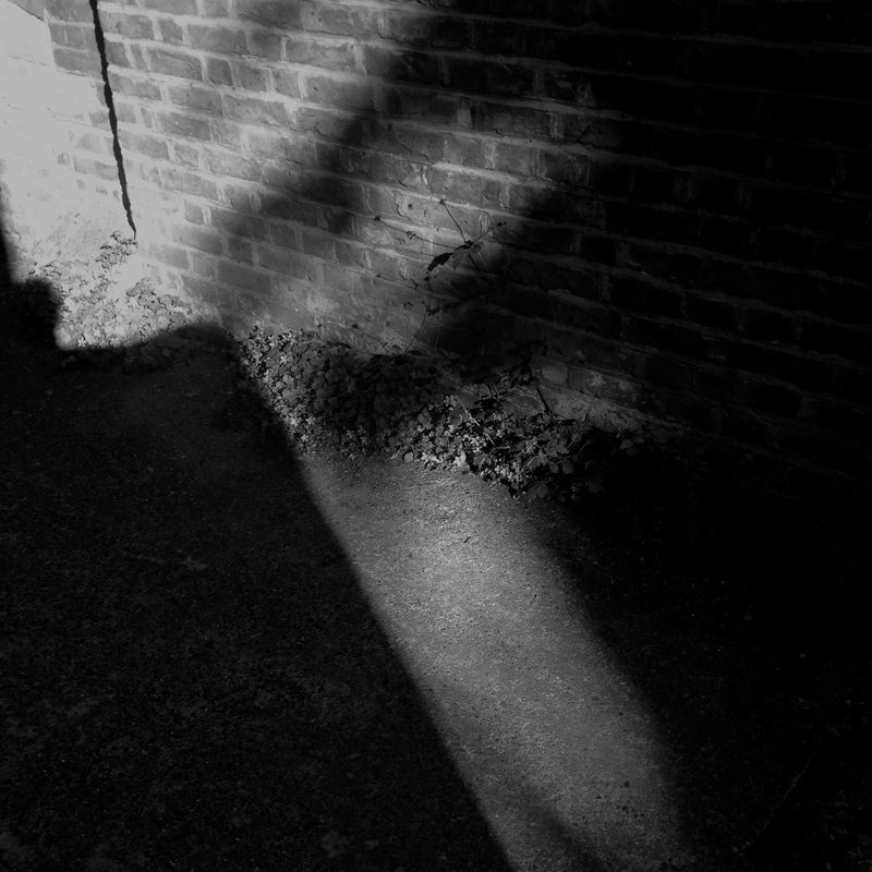
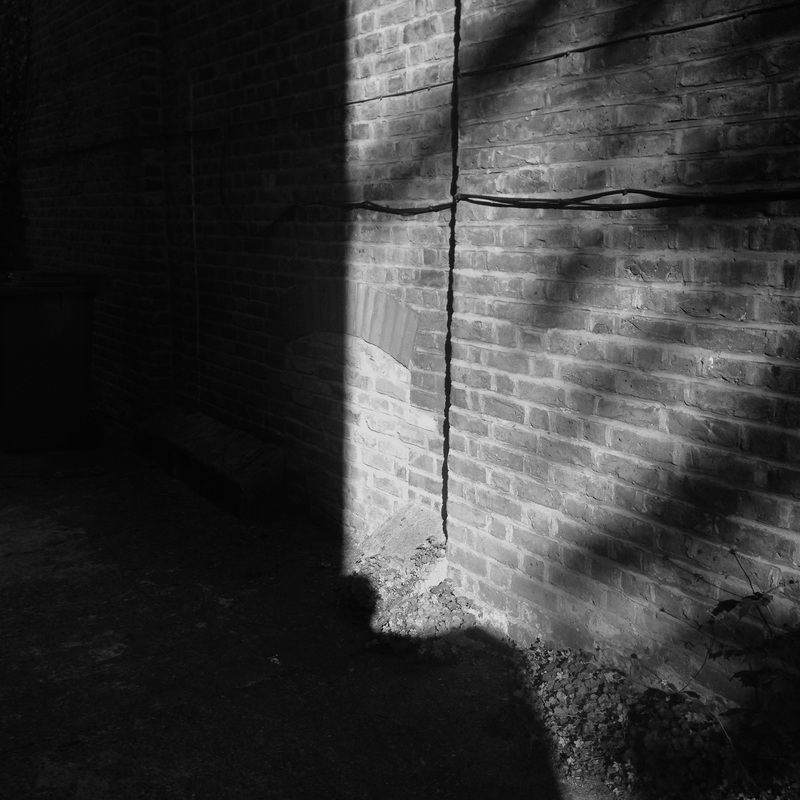
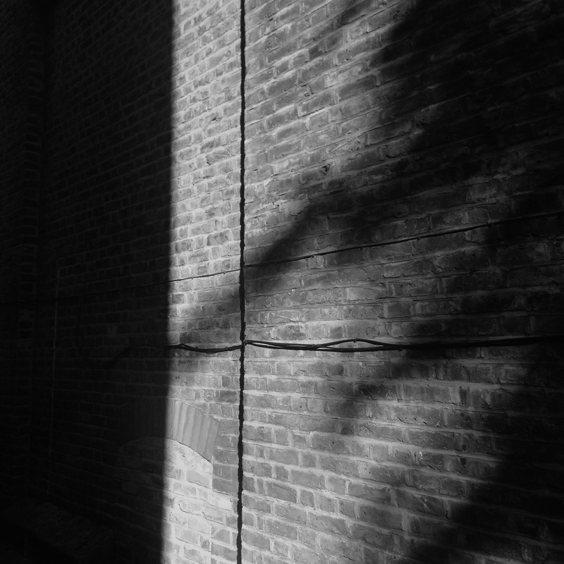
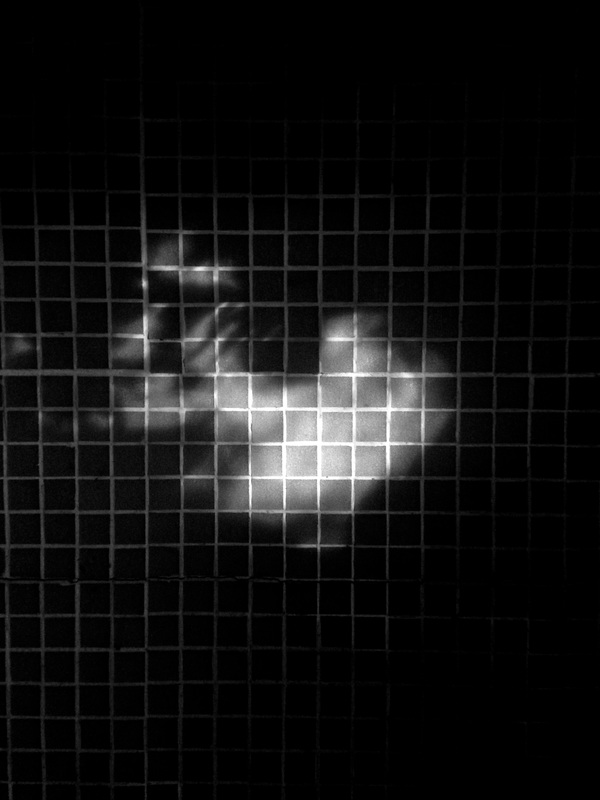
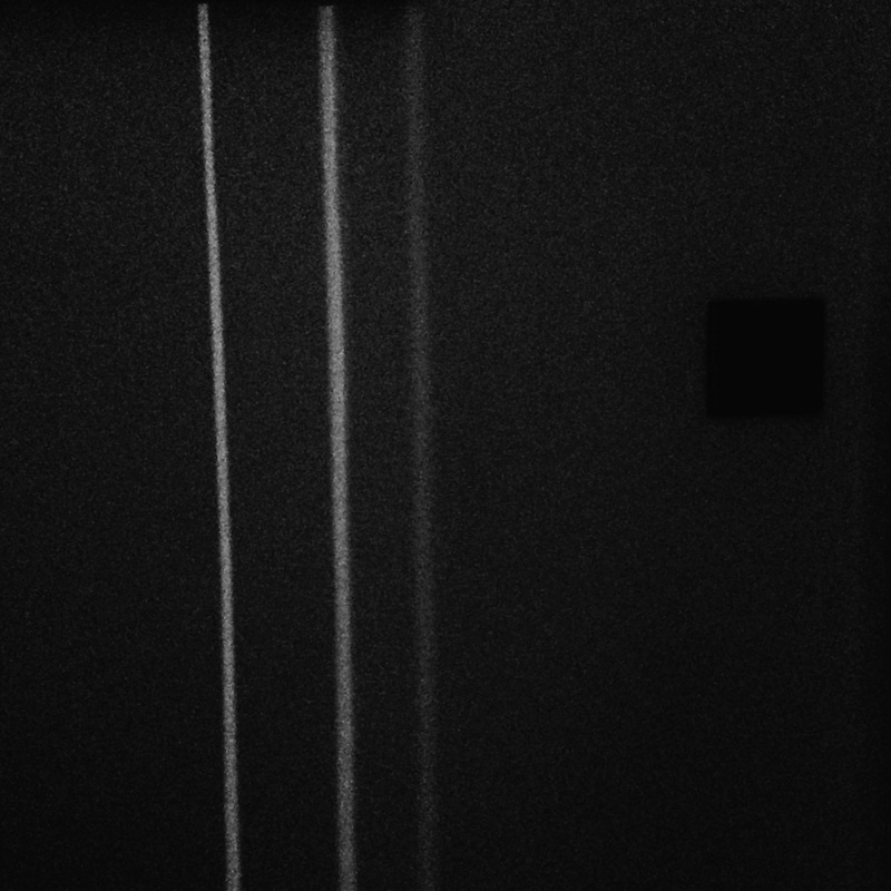
After making a short film I decided to take some still images inspired by my film as I am keen to carry on with this theme. However instead of using colour I decided to take the images with a black and white filter. I decided to do this as I wanted to see the difference between using colour and how it effects the image. Also, the images I took here originally were taken in colour. In this set of images I decided to focus on shadows and the contrast between them and the rest of the image. For example in most of these photographs I have photographed the shadow against the brick wall. I used the brick wall like a grid similar to in the film I made where I have filmed a bar in front of the foliage or people.
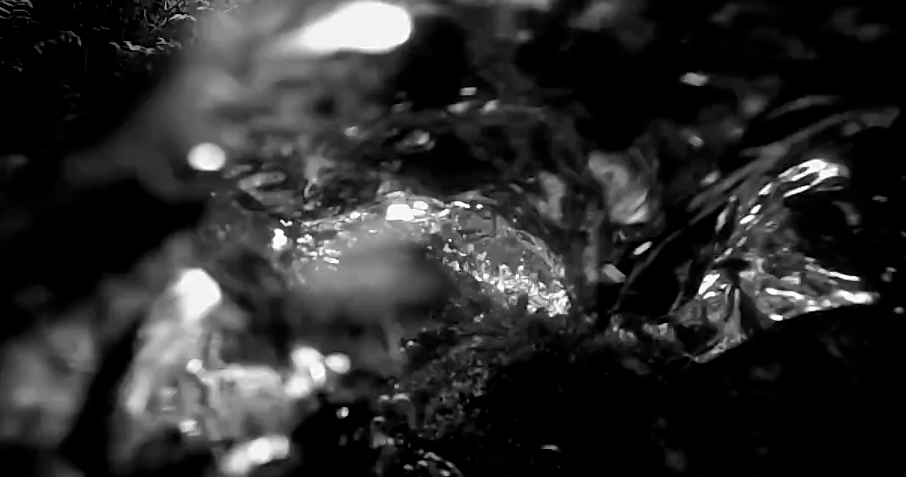
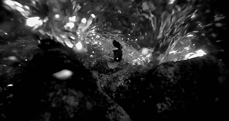
Photoshoot #7 Focussing on texture
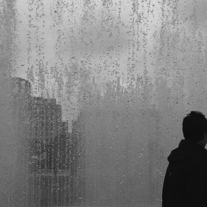
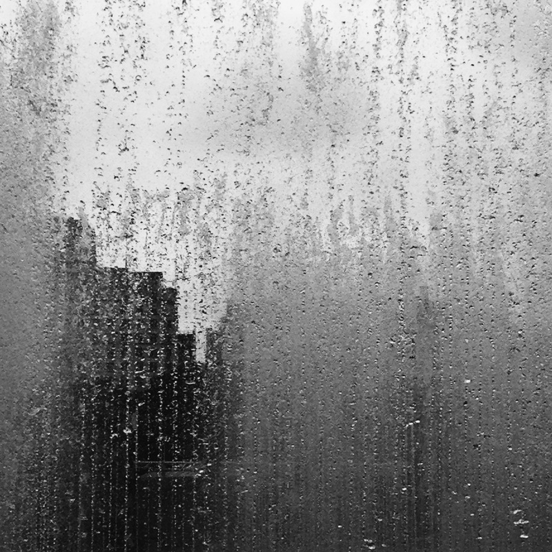
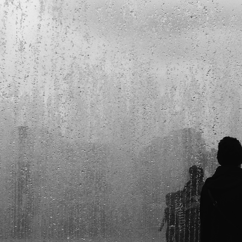
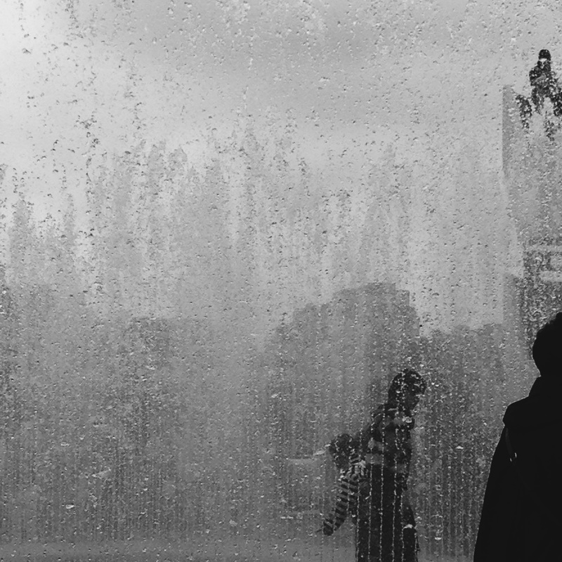
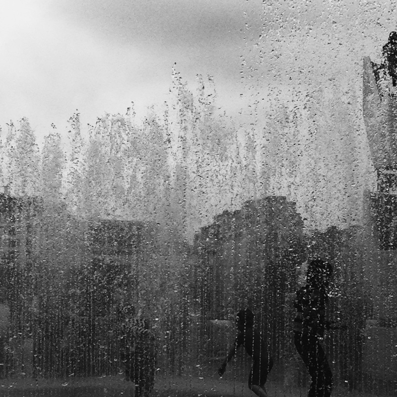
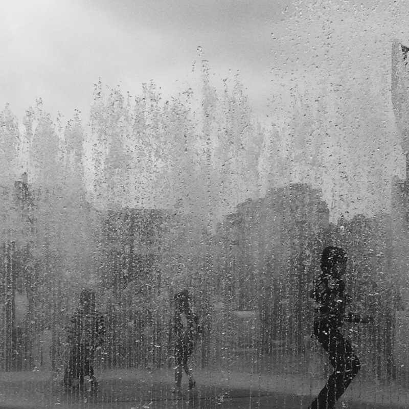
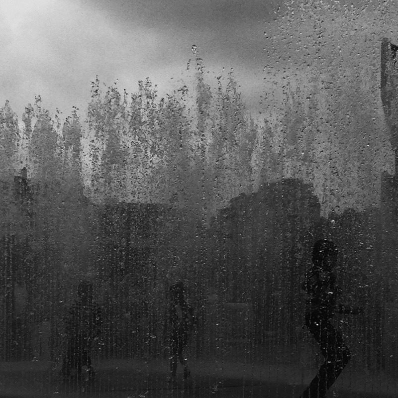
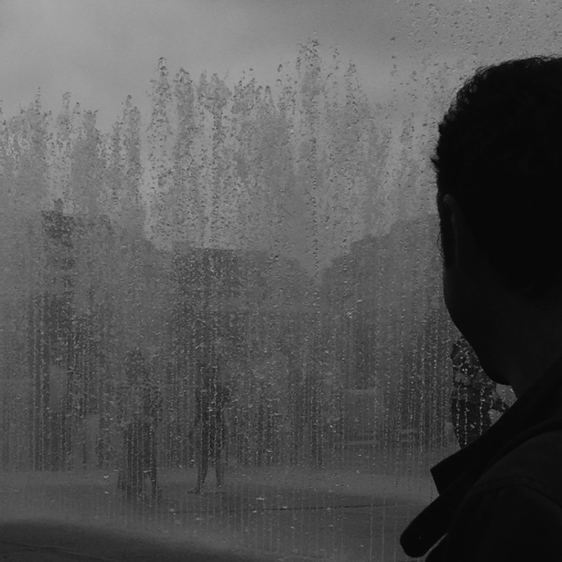
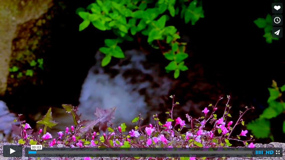
I decided to take some more images with larger depth of field in contrast to the rest of the images I have taken. I like the way I can see the different layers of the image such as the profile of the the persons face, the water and then the buildings in the background. These three components to the image make the image seem more three dimensional and textured- something I have not yet experimented with before. I feel like the atmosphere of the image changes when they are black white.
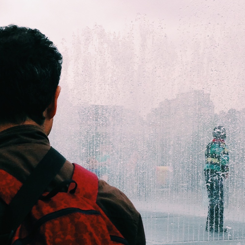
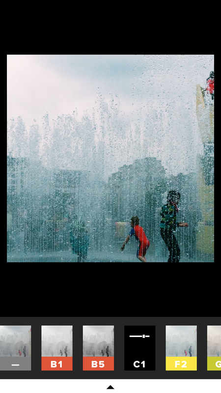
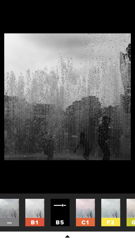
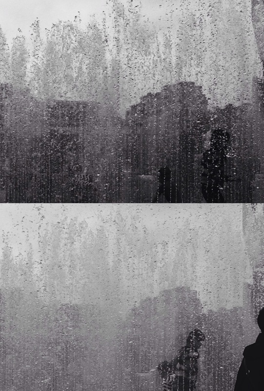
In these sets of images I have decided to use an app on my phone called VSCO cam which basically makes the photographs more saturated which gives them a more vibrant feel. Despite this, I still prefer the more contrasted, black and white images because they are more mysterious and intriguing. The fact that there is a barrier between the viewer and the figures behind the water gives us another perspective. I like the idea of having something in the way of us being able to see something because in most cases, you cant really see the figures facial expression, as the water is concealing it. Also, the water feature really gives the images a lot of movement. You can really the see the figures running around and having fun.
Rachel Howard
|
After taking these images I thought of an artist I like called Rachel Howard. Her work is very linear, similar to the photographs I took where there is a flow of water from the top to the bottom of the image.
Although this artist uses paint, she layers the paint up like I have layered elements in my photographs. The is a constant stream of light flowing through her paintings which I really like, usually with a brightly coloured shape, contrasting with the black and white. I want to take more more images like this to get more of a feel for making a film where I can create this line between the things in the background of the image and the foreground. |
|
Photoshoot #8 Response to Rachel Howard work
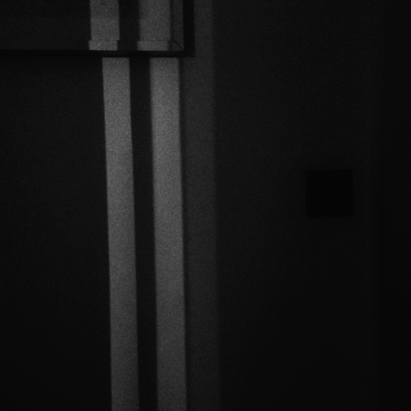
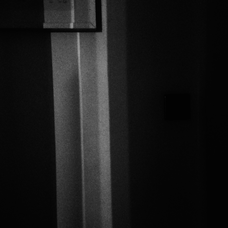
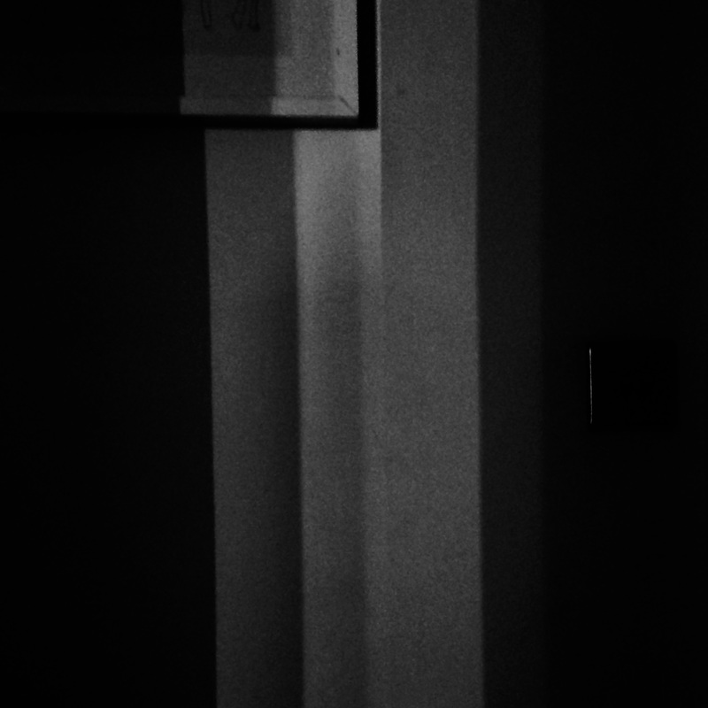
Here I have created a serious of photographs as a response to Rachel Howards work. These photographs were taking on a iPhone so the camera quality is not brilliant however I do really like the outcome. I have tried to photograph a shadow moving in different shapes. The shadows resemble slits as if there are cuts in the wall. The contrast of black and white is quite clear in these photographs despite there also being some grey tone in them. I quite like the idea of using these photographs in more of an abstract way rather than simply displaying them like this. However, I do like the fact that they are still images rather than me making them into a film because we see the different shaped lines from one photo to the next, almost like a sequence of events.
Final piece prep
After taking screenshots from my short film I wanted to find a way of using them in a different way to how I have done before, As another final piece, inspired by the use of shape in Rachel Howard's work I would like to create something 3D. For inspiration and brainstorming I have decided to create a board on pinterest.
Display Strategy

After looking at many different types of display strategies I decided to go ahead and create another final piece in a sculpture form.
I had already experimented with taking many still images and making a film so I wanted to use these images in some way. This was an interesting way to utilise these images without discarding them completely.
ACTION PLAN
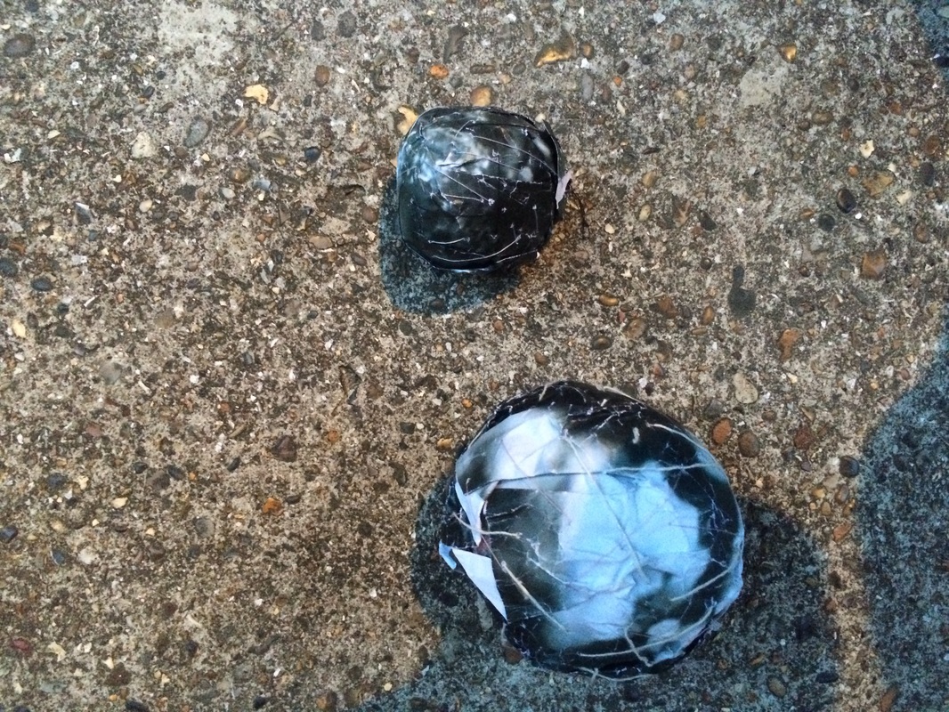
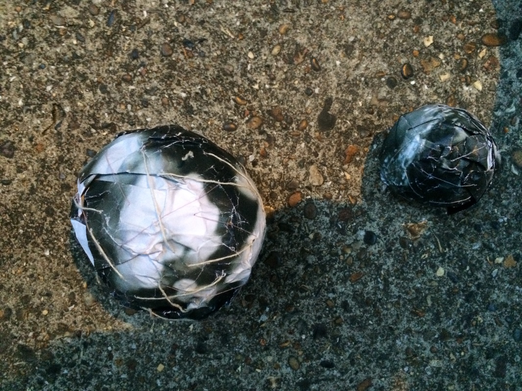
-Use clay to mould into spherical forms
-Use newspaper to mould into spherical forms
-Stick the photographs of the these spherical objects
-The final piece will be them hanging up
I had already experimented with taking many still images and making a film so I wanted to use these images in some way. This was an interesting way to utilise these images without discarding them completely.
ACTION PLAN
-Use clay to mould into spherical forms
-Use newspaper to mould into spherical forms
-Stick the photographs of the these spherical objects
-The final piece will be them hanging up
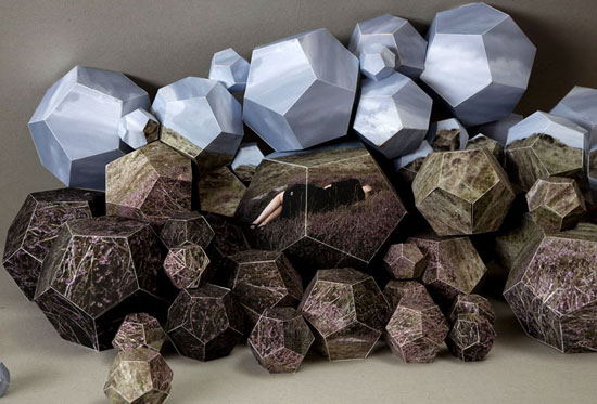
Photographs taken of a model holding my sculptures made out of the photographs I had taken
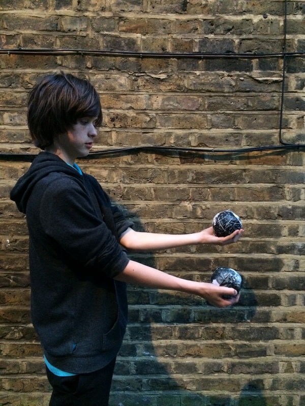
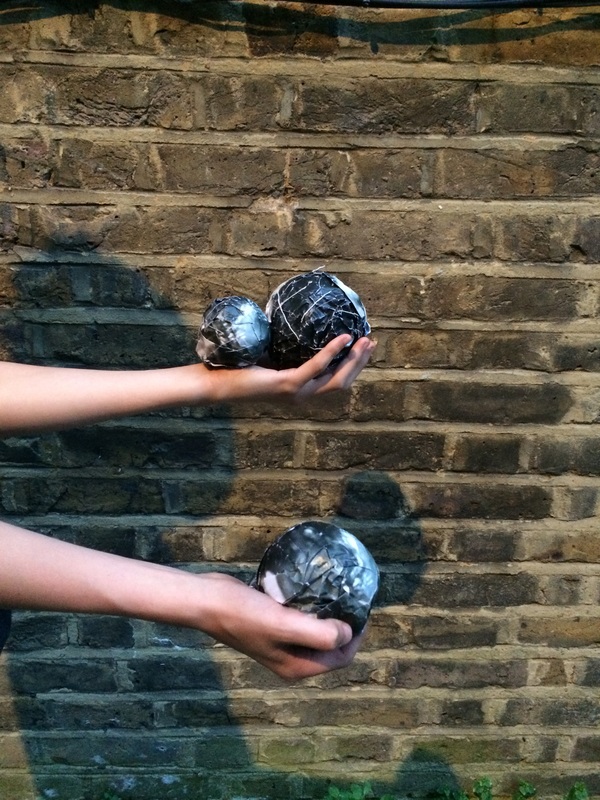
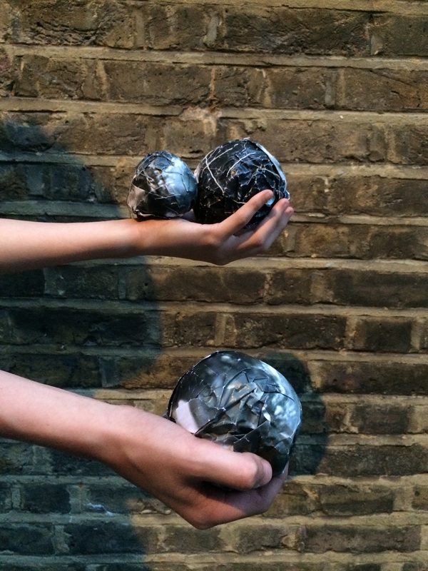
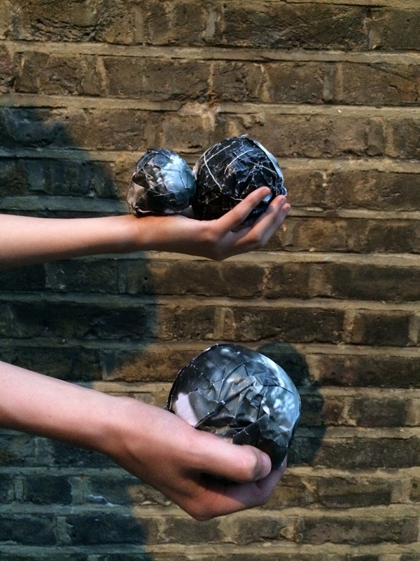
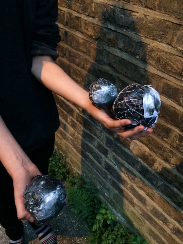

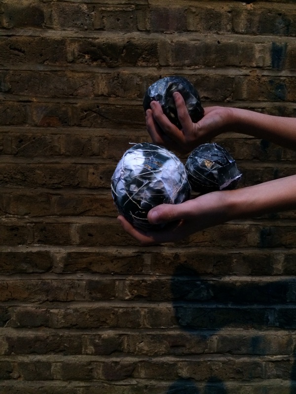
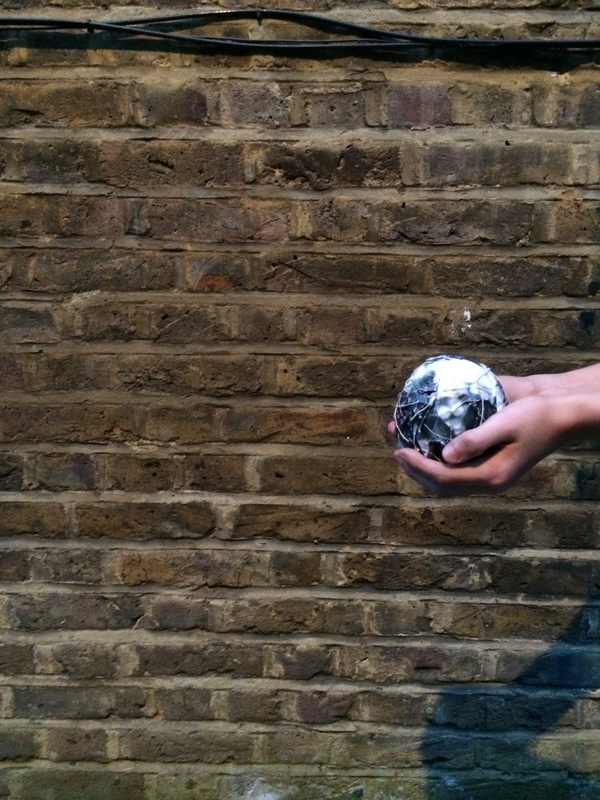
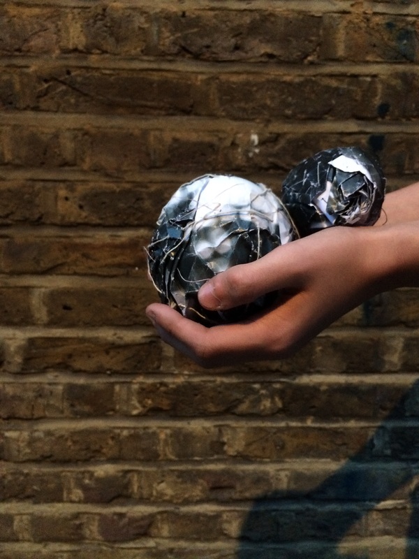
Edited image- Final Piece
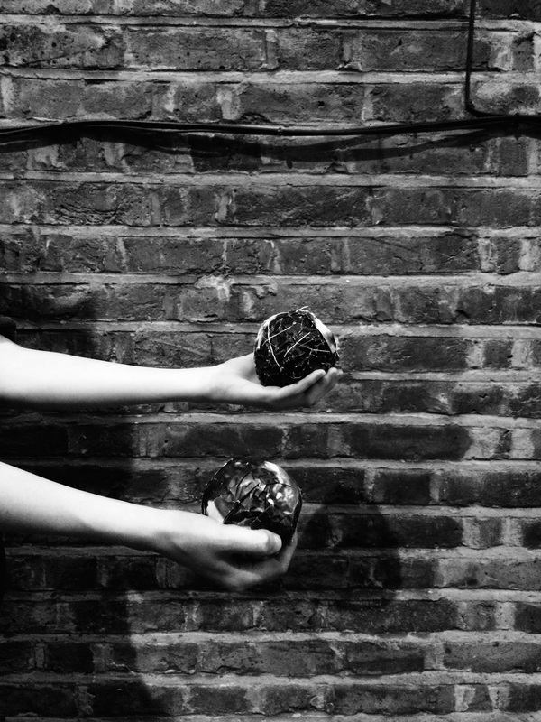
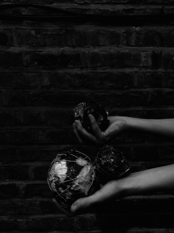
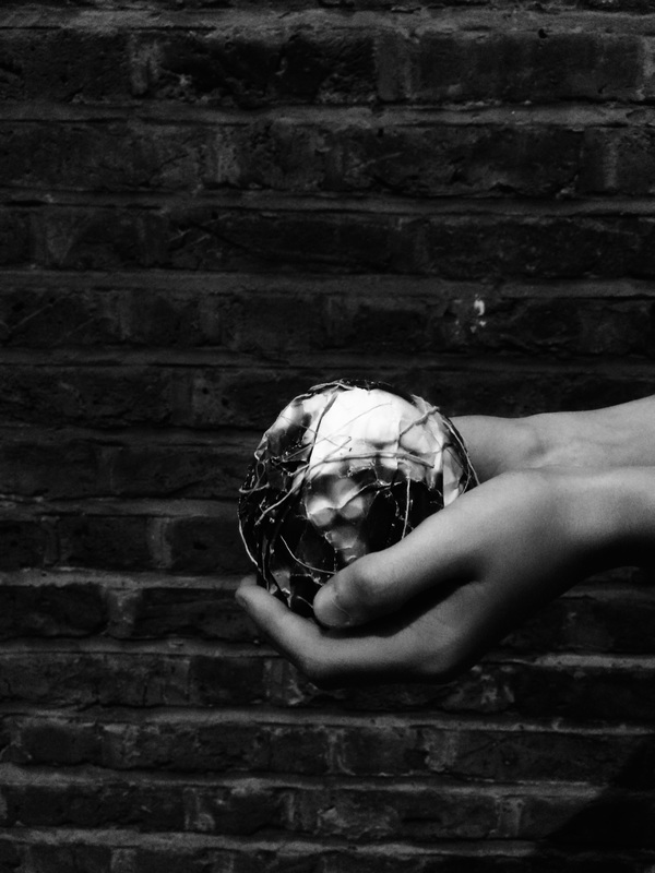
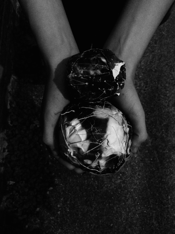
I am pleased with the final outcome of these images as I have taken an idea and really developed it, seeing the idea through. I like the way in this piece I have used a combination of images to wrap around these spherical forms creating sculptures. I am exploring the idea of taking a photograph and moulding it into something different as we are normally presented with photographs in their original form rather than using them to create another shape.
I have also tried to make these photographs dramatic and black and white to help give them a sense of mystery as we don't quite know what the person is holding in their hands so we question it. This is a nice element to this piece. The contrast between the black and white adds the the texture making the piece more interesting and refined.
I have also tried to make these photographs dramatic and black and white to help give them a sense of mystery as we don't quite know what the person is holding in their hands so we question it. This is a nice element to this piece. The contrast between the black and white adds the the texture making the piece more interesting and refined.
